library(tidyverse)
theme_set(theme_classic())Why we do macro-level comparisons
Many important questions that political scientists, sociologists, or economists are asking are about patterns at the macro- or country-level: Why do some countries have bigger welfare states than others (Esping-Andersen 1990; Allan and Scruggs 2004; Korpi and Palme 2003; Iversen and Soskice 2006) or how do the political structures of a country affect its economic or environmental performance (Roller 2005; Acemoglu, Johnson, and Robinson 2001; Scruggs 2003)? Answering these questions usually requires some form of cross-country comparison with macro-level data on the size and shape of welfare states, political institutions, environmental performance, or economic growth. This analysis can be quantitative — also known as a time series cross-sectional regression analysis (see e.g., Beck 2001) — but it can also be a qualitative comparative case study — and even in the latter case, a few nice graphs that show relevant developments, patterns, and trends at the country-level can make the case study much more convincing and easy to follow.
Luckily, we are now sitting on a mountain of (usually) freely available macro-level data on all kinds of economic, social, political, or environmental aspects for many countries and over long periods of time. To name just a few examples:
- International institutions such as the World Bank, the OECD, the European Union, or the UN offer free data on a vast number of economic, social, environmental, and political variables for their member countries.
- The V-DEM project provides very detailed data on how democratic countries are for many countries going back to the 17-hundreds.
- There are also many different datasets that measure countries’ political institutions, constitutional structures, party systems, election outcomes, and the representation of parties in parliaments and governments (see the Dataset of Political Datasets.)
- Researchers in international relations and peace & conflict studies have created many datasets on countries’ military strengths, alliances, conflicts, wars, terrorist attacks, and many other aspects (see https://github.com/erikgahner/PolData?tab=readme-ov-file#international-relations.)
In addition, many datasets come with associated R packages that allow you do directly import the datasets (see e.g., the vdemdata, WDI, or manifestoR packages).
There are different ways to work with macro-level data. A beginner-friendly way to work with macro-level data is to do descriptive analyses, and that is what the rest of this post is going to focus on.
More specifically, we will go over some example techniques using the Comparative Political Data Set (CPDS; https://cpds-data.org/), which is a very popular and fairly easy-to-work-with dataset in political science. It is a kind of Swiss army knife of macro-level data that includes the (usually) most relevant political, economic, and social macro-level indicators for a set of wealthy democracies in Europe, North America, and Australasia for the post-World War II period in one single source (e.g., GDP growth, the partisan composition of parliaments and governments, welfare state spending, or political institutions).
Setup
If you want to follow along, make sure you have the tidyverse loaded and, if you like, pre-set the ggplot2 graph theme to save time later:
What macro-level data (should) look like
The first important thing to understand is how a macro-level dataset should look like if you want to analyze it in R. As per Hadley Wickham’s Rules for Tidy Data (2014), all datasets should be structured in a way that:
- Every row is an observation
- Every column is a variable
This is easy when we work with a typical micro-level survey dataset like the European Social Survey, where the unit of observation is a single person. Here, every person is a row and every aspect that is recorded about them (their gender, income, age, etc.) is a column.
In a typical macro-level dataset, the unit of observation is usually a country-year: We observe Norway in 1990, 1991, 1992, and so on, and then we observe the France, Sweden, Japan, etc. in the same years.1 Here is a simple example of how this should look like using data on GDP growth (realgdpgr) from the CPDS dataset:
This is how your dataset should look like!
# A tibble: 12 × 4
    year country iso   realgdpgr
   <dbl> <chr>   <chr>     <dbl>
 1  1990 France  FRA       3.03
 2  1991 France  FRA       0.944
 3  1992 France  FRA       1.48
 4  1990 Japan   JPN       5.57
 5  1991 Japan   JPN       3.32
 6  1992 Japan   JPN       0.819
 7  1990 Norway  NOR       1.93
 8  1991 Norway  NOR       3.08
 9  1992 Norway  NOR       3.57
10  1990 Sweden  SWE       0.755
11  1991 Sweden  SWE      -1.15
12  1992 Sweden  SWE      -1.16
You see that the individual observations for each country and year (country-years) are “stacked” on top of each other, and that we have two variables, country and year telling us which year and which country a given row corresponds to. These are important: You absolutely need to keep these variables in your dataset, otherwise you no longer know what each row in your dataset corresponds to. In addition, it is important to be aware that country and year in combination identify each unique observation: There is one “Norway in 1990”, one “Norway in 1991”, etc. observation, and you need to have both the country and the year variable to identify these observations.
The table also shows countries in two different formats: The plain English name, and the three-digit ISO country code. Many datasets use either of them (or different country codes), which can sometimes be a hassle to work with. Luckily, there is the countrycode package, which allows you to convert different country codes and names to other formats with a few lines of code.
Sometimes, and this can happen often when you download data from international organizations, the data you get look different (e.g., each row corresponds to a country and the columns refer to variables and years):
This is how your dataset should not look like!
# A tibble: 4 × 4
  country realgdpgr_1990 realgdpgr_1991 realgdpgr_1992
  <chr>            <dbl>          <dbl>          <dbl>
1 France           3.03           0.944          1.48
2 Japan            5.57           3.32           0.819
3 Norway           1.93           3.08           3.57
4 Sweden           0.755         -1.15          -1.16
If you do have a dataset that looks like this, you need to learn how to pivot or reshape your dataset. Here, the pivot_longer() and pivot_wider() functions from the tidyr package (included in the tidyverse) are your best friends (see also Urdinez and Cruz 2020, chap. 2.5.1).
Importing the CPDS dataset
OK, enough theory — time to work with some data. If you want to follow along, you need to download the latest version of the CPDS dataset (https://cpds-data.org/data/). Ideally, download the Stata version, unzip the file, and store it in your RStudio project folder (or the folder that is your current Working Directory, which you can find out with the getwd() function). Once you have that, all you need to do is to use the haven package to import the dataset:
cpds <- haven::read_dta("CPDS_1960_2022_Update_2024.dta")The cpds object should now pop up in your Environment tab in RStudio. If you like, you can take a brief look at the data with glimpse. You should also download the official codebook and get familiar with the variables that are included in the dataset!
Another way to get a sense of what is contained is to look at the unique countries and years that are covered:
unique(cpds$year) [1] 1960 1961 1962 1963 1964 1965 1966 1967 1968 1969 1970 1971 1972 1973 1974
[16] 1975 1976 1977 1978 1979 1980 1981 1982 1983 1984 1985 1986 1987 1988 1989
[31] 1990 1991 1992 1993 1994 1995 1996 1997 1998 1999 2000 2001 2002 2003 2004
[46] 2005 2006 2007 2008 2009 2010 2011 2012 2013 2014 2015 2016 2017 2018 2019
[61] 2020 2021 2022unique(cpds$country) [1] "Australia" "Austria" "Belgium" "Bulgaria"
[5] "Canada" "Croatia" "Cyprus" "Czech Republic"
[9] "Denmark" "Estonia" "Finland" "France"
[13] "Germany" "Greece" "Hungary" "Iceland"
[17] "Ireland" "Italy" "Japan" "Latvia"
[21] "Lithuania" "Luxembourg" "Malta" "Netherlands"
[25] "New Zealand" "Norway" "Poland" "Portugal"
[29] "Romania" "Slovakia" "Slovenia" "Spain"
[33] "Sweden" "Switzerland" "United Kingdom" "USA" You see that we have, in principle, data for almost all of Europe and the other advanced democracies around the globe from the 1960s onwards. What this does not show, however, is that we only have data for the Central and Eastern European countries (Poland, Bulgaria, etc.) from 1990 on, after the collapse of the Soviet Union and the Warsaw Pact:
cpds |>
  filter(country == "Poland") |>
  select(year,country)
# A tibble: 32 × 2
year country
<dbl> <chr>
1 1991 Poland
2 1992 Poland
3 1993 Poland
4 1994 Poland
5 1995 Poland
6 1996 Poland
7 1997 Poland
8 1998 Poland
9 1999 Poland
10 2000 Poland
# ℹ 22 more rowsBecause such a large batch of countries was added at this one time point, it makes sense to limit the data to the post-1990 period — otherwise, comparisons over time might not make sense.
cpds |>
  filter(year>=1990) -> cpds
(An alternative, if the interest is in long trends since World War II, is to leave out the post-communist countries. Here, the poco — “post-communist” — variable in the CPDS dataset is useful within filter().)
Descriptive analyses with macro-level data
There are four basic ways to look descriptively at macro-level data:
- You can look at general trends across countries over time
- You can compare average patterns between countries
- You can compare trends within selected countries over time
- You can look at average relationships (correlations) between countries
Each of them tells you a different part of the entire story that is contained in the data. We will go over each of them and see how to aggregate and visualize the data. In most cases, your two best friends are the group_by() and summarize() functions from dplyr.
Aggregating by year to show general trends
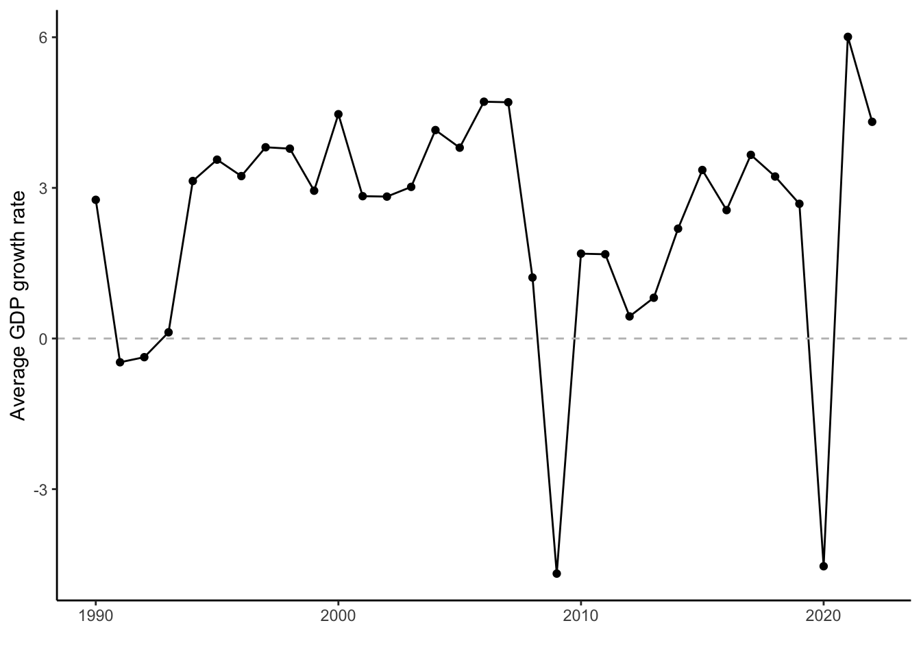
Sometimes, we want to show to our readers general trends that existed more or less in all countries in the dataset over a given period of time. For example, we might want to show general phases of economic boom and crisis that affected all the advanced democracies, without looking specifically at individual countries. To do that, we can calculate the average rate of economic growth over all countries per year and visualize the result.
This is easy to do with group_by() and summarize():
cpds |>
  group_by(year) |>
  summarize(avg_growth = mean(realgdpgr, na.rm = T))
# A tibble: 33 × 2
year avg_growth
<dbl> <dbl>
1 1990 2.76
2 1991 -0.473
3 1992 -0.372
4 1993 0.124
5 1994 3.14
6 1995 3.56
7 1996 3.23
8 1997 3.81
9 1998 3.78
10 1999 2.94
# ℹ 23 more rowsHere, we group the data by year and then calculate for each year the average of all GPD growth rates in all of the countries that are covered in the dataset. The result is an aggregated version of the dataset with average rates of GPD growth per year since the 1960s as individual observations.2
We can then visualize the result in a line graph:
cpds |>
  group_by(year) |>
  summarize(avg_growth = mean(realgdpgr, na.rm = T)) |>
  ggplot(aes(x = year, y = avg_growth)) +
    geom_line() +
    geom_point() +
    geom_hline(yintercept = 0,
               linetype = "dashed", color = "grey") +
    labs(x = "", y = "Average GDP growth rate") +
    scale_x_continuous(breaks = seq(1960,2020,10))
The graph clearly shows the last two big economic crises, the 2008 Financial Crisis (a.k.a., Great Recession) and the COVID-19 pandemic, but also the economic crisis of the early 1990s.
You may notice that we do not save the resulting aggregated dataset in a separate object — and we most definitely do not overwrite the original dataset with the aggregated version. We simply aggregate the data “on the fly”, visualize the result, and then let the aggregated version disappear into the ether. Sometimes, you might want to save an aggregated dataset so that you can use it in later analyses, but in that case you need to make sure that you give it a different name.
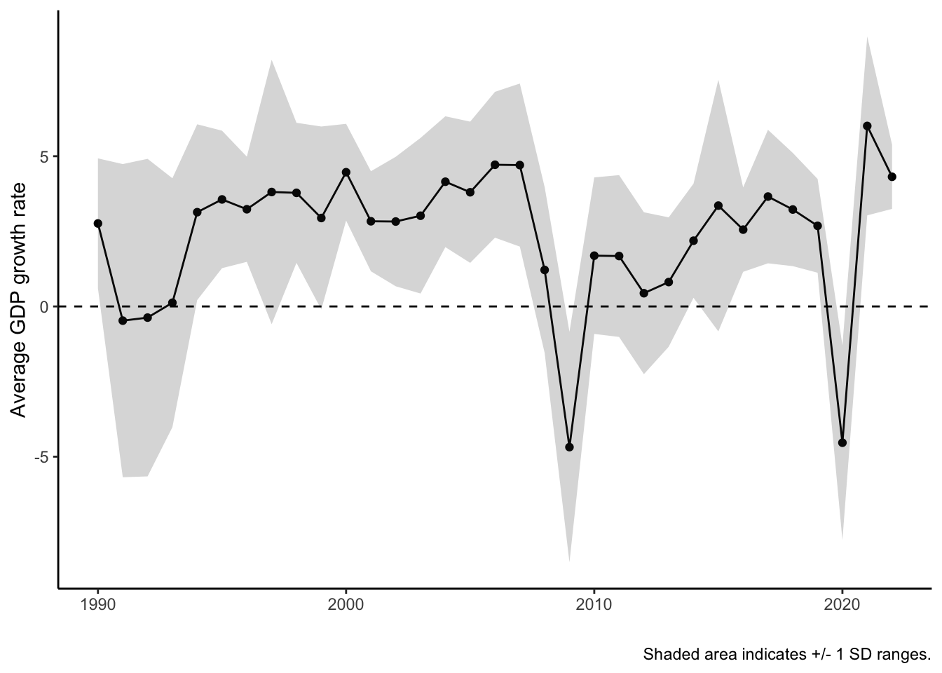
It is also important to be aware that we can also calculate other types of summary statistics like the median, the variance, or the standard deviation within summarize(). The latter is very helpful if we want to show not only average trends but also the variation around the trend line. To do that, we simply add the summary statistic we want within summarize():
cpds |>
  group_by(year) |>
  summarise(avg_growth = mean(realgdpgr, na.rm = T),
            sd_growth = sd(realgdpgr, na.rm = T))
# A tibble: 33 × 3
year avg_growth sd_growth
<dbl> <dbl> <dbl>
1 1990 2.76 2.17
2 1991 -0.473 5.21
3 1992 -0.372 5.28
4 1993 0.124 4.14
5 1994 3.14 2.93
6 1995 3.56 2.29
7 1996 3.23 1.75
8 1997 3.81 4.40
9 1998 3.78 2.33
10 1999 2.94 3.05
# ℹ 23 more rowsNow we get two summary statistics per year: The average growth rates and the standard deviation in growth rates (the average deviation from the average). To visualize this, we can calculate +/- 1 standard deviation ranges around the mean values and use geom_ribbon() in ggplot() to visualize the result:
cpds |>
  group_by(year) |>
  summarise(avg_growth = mean(realgdpgr, na.rm = T),
            sd_growth = sd(realgdpgr, na.rm = T)) |>
  mutate(upper = avg_growth + sd_growth,
         lower = avg_growth - sd_growth) |>
  ggplot(aes(x = year, y = avg_growth, ymin = lower, ymax = upper)) +
    geom_line() +
    geom_point() +
    geom_ribbon(alpha = .2) + # alpha makes the area transparent
    geom_hline(yintercept = 0,
               linetype = "dashed", color = "black") +
    labs(x = "", y = "Average GDP growth rate",
         caption = "Shaded area indicates +/- 1 SD ranges.") +
    scale_x_continuous(breaks = seq(1960,2020,10))
One new lesson we learn is that although the average growth rate dipped into the negative in the early 1990s, there was also increased variation in growth rates — the range got visibly bigger — which indicates that not all countries were equally strongly affected by the crisis.
Aggregating by country to show differences
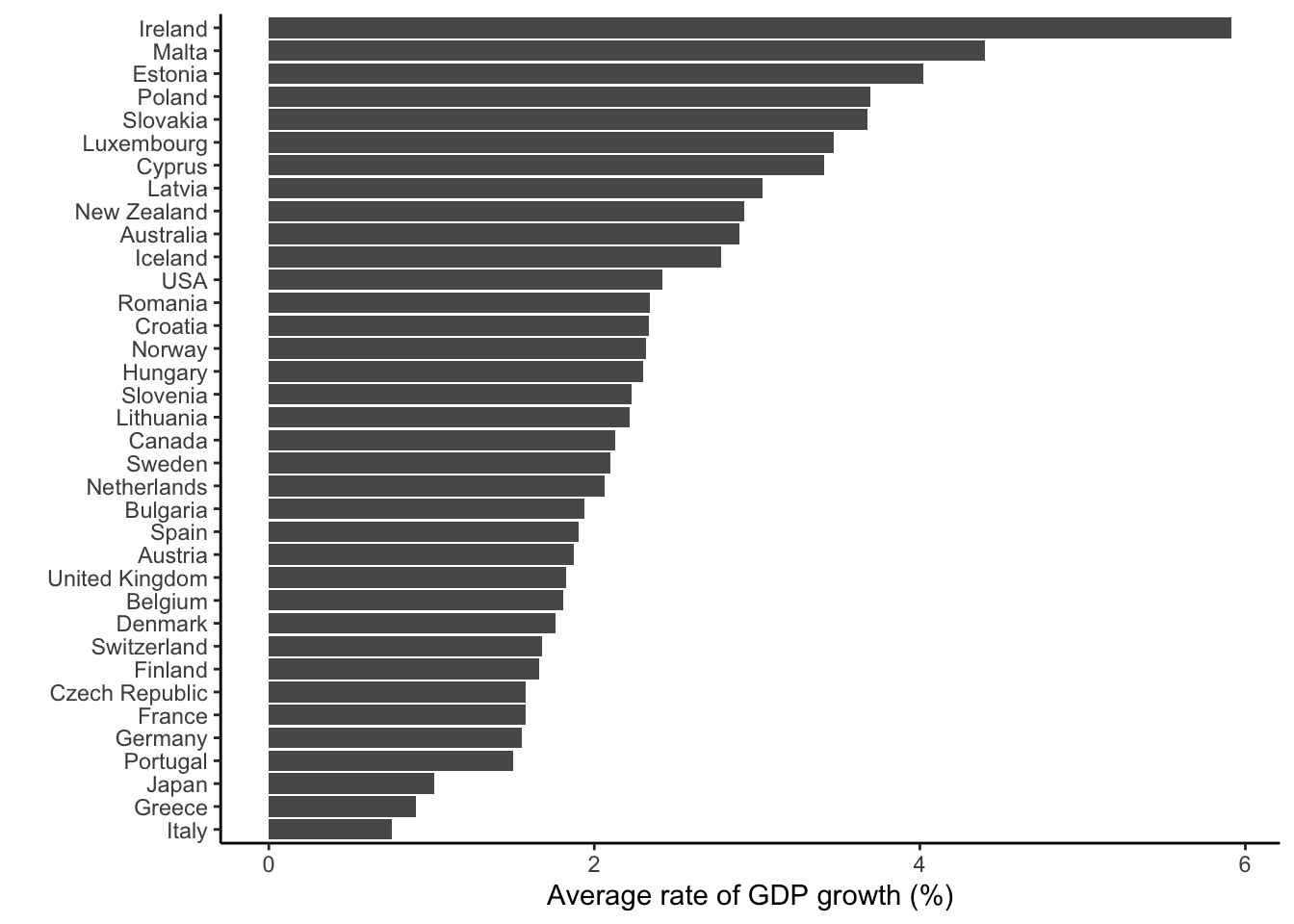
Another thing we might be interested in is which countries had, on average, the highest or lowest growth rates in the period between 1990 and today. To see this, we again use group_by() and summarize(), but we now group by country instead of year:
cpds |>
  group_by(country) |>
  summarise(avg_growth = mean(realgdpgr, na.rm = T))
# A tibble: 36 × 2
country avg_growth
<chr> <dbl>
1 Australia 2.89
2 Austria 1.87
3 Belgium 1.81
4 Bulgaria 1.94
5 Canada 2.13
6 Croatia 2.34
7 Cyprus 3.41
8 Czech Republic 1.58
9 Denmark 1.76
10 Estonia 4.02
# ℹ 26 more rowsAs before, we now get an aggregated version of the dataset — but now it is aggregated by country, not by year. We see that for example Australia had an average growth rate of arond 3.3% per year, while the rate in the Czech Republic was only around 1.6% per year.
We can again visualize the result, but here a bar graph makes most sense. We can also use reorder() to sort the bars according to the average growth rate:
cpds |>
  group_by(country) |>
  summarise(avg_growth = mean(realgdpgr, na.rm = T)) |>
  ggplot(aes(x = avg_growth, y = reorder(country, avg_growth))) +
    geom_col() +
    labs(x = "Average rate of GDP growth (%)", y = "")
You see that Ireland (the Irish Tiger) had by far the highest growth rate since the 1990s, followed by Malta and Estonia. Italy, Greece, and Japan had clearly the lowest average rates of growth.
Comparing selected countries over time
Sometimes, for example when you do a comparative case study of a few selected countries, you want to show relevant developments in those countries, without any aggregation. This is obviously also possible with this type of data, and here the filter() function is your best friend.
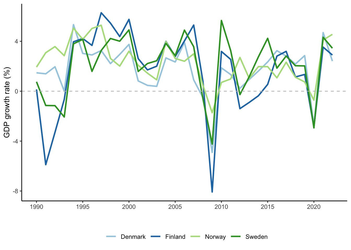
Let’s say we want to compare the development of economic growth rates in the four largest Nordic countries (Denmark, Finland, Norway, Sweden) since the 1990s. In that case, we just need to use filter() to subset the data to those countries:
cpds |>
  select(country,year,realgdpgr) |> # this is technically not necessary, but
  # sometimes useful to avoid losing overview over the data
  filter(country %in% c("Denmark","Finland","Sweden","Norway"))
# A tibble: 132 × 3
country year realgdpgr
<chr> <dbl> <dbl>
1 Denmark 1990 1.48
2 Denmark 1991 1.39
3 Denmark 1992 1.96
4 Denmark 1993 0.0107
5 Denmark 1994 5.33
6 Denmark 1995 3.03
7 Denmark 1996 2.90
8 Denmark 1997 3.26
9 Denmark 1998 2.21
10 Denmark 1999 2.95
# ℹ 122 more rowsThis is all there is to it — we now have limited the dataset to the four Nordic countries. Obviously, the result is not very informative, but we can again visualize the result in a line graph with ggplot():
cpds |>
  select(country,year,realgdpgr) |> # this is technically not necessary, but
  # sometimes useful to avoid losing overview over the data
  filter(country %in% c("Denmark","Finland","Sweden","Norway")) |>
  ggplot(aes(x = year, y = realgdpgr, group = country, color = country)) +
    geom_line(linewidth = 1) +
    geom_hline(yintercept = 0, linetype = "dashed", color = "grey") +
    scale_color_brewer(palette = "Paired") + # color-blind friendly palette
    scale_x_continuous(breaks = seq(1990,2020,5)) +
    labs(y = "GDP growth rate (%)", x = "", color = "") +
    theme(legend.position = "bottom")
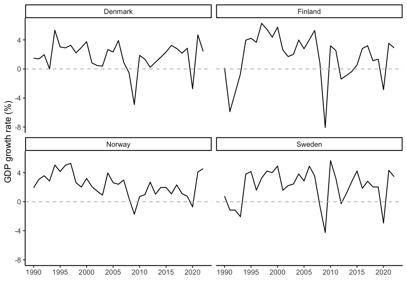
In general, growth rates in the four countries are (unsurprisingly) behaving quite similarly — when Denmark experiences a crisis, Sweden, Norway, and Finland do as well — but it does seem that Finland tends a bit more toward the extremes than the other countries. Crises tend to hit hardest in Finland, but the following recoveries are also stronger.
An alternative way to visualize the result is to use facet_wrap() to create a separate graph for each country. This helps if, as is the case here, the lines overlap strongly:
cpds |>
  filter(country %in% c("Denmark","Finland","Sweden","Norway")) |>
  ggplot(aes(x = year, y = realgdpgr)) +
    geom_line() +
    geom_hline(yintercept = 0, linetype = "dashed", color = "grey") +
    facet_wrap(~ country) +
    scale_x_continuous(breaks = seq(1990,2020,5)) +
    labs(y = "GDP growth rate (%)", x = "", color = "") +
    theme(legend.position = "bottom")
The more extreme up- and downswings in Finland are still visible.
Showing bivariate relationships across countries
Although the development of a single variable over time or its variation between countries is often relevant to look at, we are in most cases primarily interested in relationships between variables: Does one variable affect the other, or are they at least correlated with each other?
One wat to check for bivariate relationships between two variables is to aggregate both variables by country and then use a scatterplot to visualize the result.
Let’s say we wanted to test the hypothesis that a stronger presence of left parties in government is bad for economic growth (as some people claim). The gov_left1 variable from the CDPS dataset gives us the share of cabinet posts that are held by left-of-center parties in a given year and country, and we can simply aggregate this variable along with the one measuring economic growth within summarize():
cpds |>
  group_by(country) |>
  summarise(avg_growth = mean(realgdpgr, na.rm = T),
            avg_leftgov = mean(gov_left1, na.rm = T))
# A tibble: 36 × 3
country avg_growth avg_leftgov
<chr> <dbl> <dbl>
1 Australia 2.89 38.1
2 Austria 1.87 33.8
3 Belgium 1.81 38.2
4 Bulgaria 1.94 16.2
5 Canada 2.13 0
6 Croatia 2.34 20.7
7 Cyprus 3.41 13.8
8 Czech Republic 1.58 28.3
9 Denmark 1.76 38.8
10 Estonia 4.02 21.7
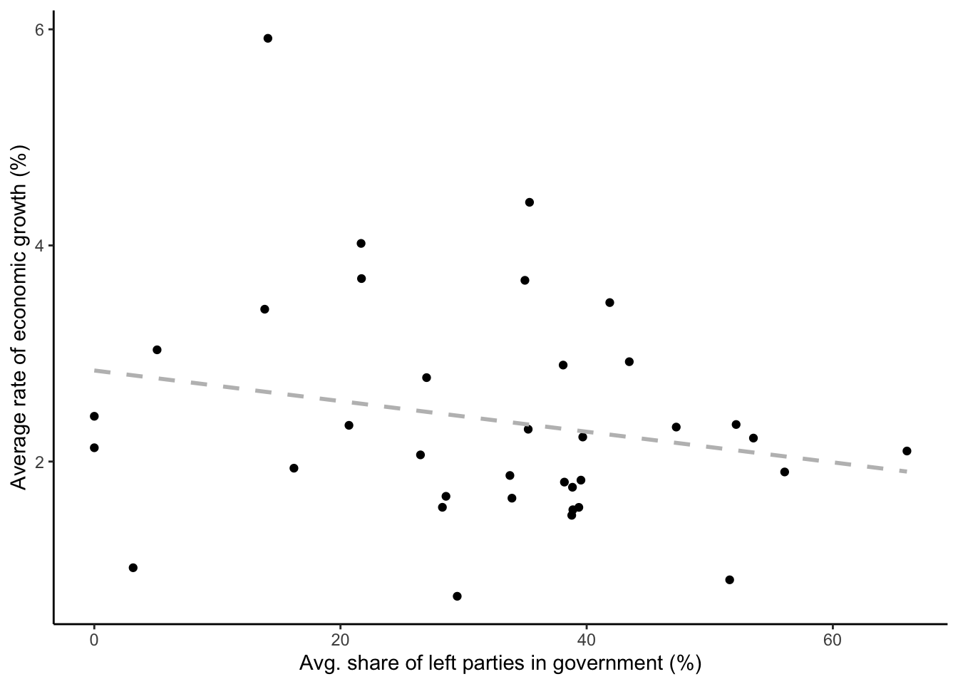
# ℹ 26 more rowsThe numbers give us the average growth rate and the average share of cabinet posts held by left parties in each country in the period since 1990. We can now use geom_point() to visualize the result in a scatterplot, and add geom_smooth() to get a fitted line that highlights the relationship between the variables:
cpds |>
  group_by(country) |>
  summarise(avg_growth = mean(realgdpgr, na.rm = T),
            avg_leftgov = mean(gov_left1, na.rm = T)) |>
  ggplot(aes(x = avg_leftgov, y = avg_growth)) +
    geom_point() +
    geom_smooth(method = "lm", se = F, color = "grey",
                linetype = "dashed") +
    labs(x = "Avg. share of left parties in government (%)",
         y = "Average rate of economic growth (%)")
`geom_smooth()` using formula = 'y ~ x'There is indeed a negative — but quite weak — relationship between the two variables. However, it important not to forget that the arrow of causality might run the other way: Maybe left parties get elected more often in times of economic crises? (What happens when you look at the relationship between economic growth and the share of right parties in government using gov_right1?)
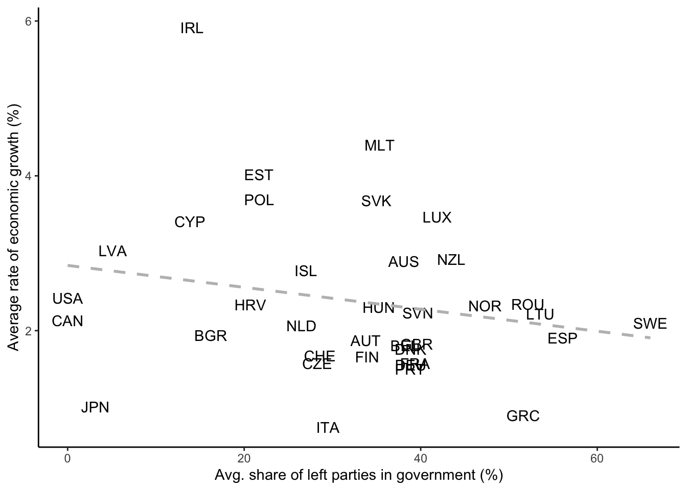
One way to still improve the graph is to add labels for each country instead of anonymous black dots to be able to see where the different countries are located. To do that, we can replace geom_point() with geom_text(), and we use the iso variable (which is equivalent to the country variable) to aggregate the data. By using iso, we later have handy short labels that we can use in the graph:
cpds |>
  group_by(iso) |>
  summarise(avg_growth = mean(realgdpgr, na.rm = T),
            avg_leftgov = mean(gov_left1, na.rm = T)) |>
  ggplot(aes(x = avg_leftgov, y = avg_growth)) +
    geom_text(aes(label = iso)) +
    geom_smooth(method = "lm", se = F, color = "grey",
                linetype = "dashed") +
    labs(x = "Avg. share of left parties in government (%)",
         y = "Average rate of economic growth (%)")
`geom_smooth()` using formula = 'y ~ x'This clarifies matters. It almost seems as if the slight negative relationship between left government participation and economic growth is mainly driven by the outlying case of Ireland…
What next?
This post showed you how you can do descriptive analyses of cross-country macro-level (or time series cross-sectional) datasets. This can help you spice up a comparative case study with descriptive statistics of relevant macro-level indicators, and it can be a stepping stone toward learning how to do regression analyses with this type of data.
More concrete steps you can take to advance further are:
- Get more of an overview over what macro-level datasets there are out there (see also the sources above).
- Learn how to combine (“merge”) different datasets. This is not as difficult as it might sound. Since all these datasets have the same underlying country-year structure, you just need to figure out how to work with the
left_join()function to merge datasets (see also the post on how to measure globalization exposure), and probably also how to convert different country codes and names between each other with thecountrycodepackage (see also Urdinez and Cruz 2020, chap. 11). - Explore other types of macro-level datasets. Relevant examples are the Manifesto Project Database, which provides quantitative estimates of the ideological positions of political parties in different countries (here, the unit of observation is a party at a given election or “party-election”) or different peace & conflict datasets (e.g., Raleigh et al. 2010; Uppsala Conflict Data Program 2014; Gibler and Miller 2023; Vogt et al. 2015).
- Learn how to do multivariate regression analyses with these datasets. Relevant works to read are Beck and Katz (1995, 1996, 2011), Beck, Katz, and Tucker (1998), Beck (2001), De Boef and Keele (2008), Wilson and Butler (2007), Carter and Signorino (2010), Honaker and King (2010), Birkel (2014), and for more advanced methods see Blackwell and Glynn (2018). Urdinez and Cruz (2020, chap. 7) and Croissant and Millo (2008) show how to implement the main techniques in
R.
References
Footnotes
An exception are many peace & conflict datasets, where the unit of observation is a country-pair (dyad) or a conflict-year. This can make these datasets a bit more difficult to work with.↩︎
Obviously, you should always make sure that you do not have large changes in the composition of your dataset — e.g., where many new countries are added from a given year on — because that can lead to sudden jumps or dips in the average values.↩︎
Citation
@online{knotz2025,
  author = {Knotz, Carlo},
  title = {Comparing Countries with Macro-Level Data},
  date = {2025-03-30},
  url = {https://cknotz.github.io/getstuffdone_blog/posts/compa_countries/},
  langid = {en}
}
