library(tidyverse)
theme_set(theme_classic())Conflicts, violence, and data
Why do countries or fellow citizens go to war with each other (Waltz 1959; Fearon and Laitin 2003)? Why do some wars and conflicts last longer and cause more suffering and loss than others (Balch-Lindsay and Enterline 2000)? What can be done to end wars and conflicts, and to stabilize conflict-prone countries (Fjelde and Smidt 2022)? Many political scientists, especially those in the subfield of peace and conflict research, care deeply about these and similar questions and try to find answers.
To do so, they can nowadays rely on a whole array of datasets that measure the occurrence, intensity, and duration of different types of violent conflicts within and between countries. Examples include the Uppsala Conflict Data Program (UCDP; https://ucdp.uu.se/), the Armed Conflict Location & Event Data project (ACLED; https://acleddata.com/), the Correlates of War project (COW; https://correlatesofwar.org/), or the International Conflict Data Project (https://internationalconflict.ua.edu/).1
Many of these datasets have relatively complicated structures, where the unit of analysis is a conflict-year or a single conflict event, and this can make them more difficult (but certainly not impossible) to work with for junior (political) data analysts. But there are some datasets that have simpler structures that are easier to work with, notably the typical country-year structure that is commonly used in comparative politics and comparative political economy (as introduced in this post).
One of these easier-to-work with datasets is the Country-Year Dataset on Organized Violence within Country Borders from the Uppsala Conflict Data Program (Davies et al. 2025; Sundberg and Melander 2013), which contains information about the number of fatalities and the actors involved in different types of conflicts (intrastate, interstate, and non-state violence, government and non-state group killings) in a large number of countries between 1989 and 2024.
The remainder of this post will show you how you can do some simple (descriptive) analyses with this dataset.
Setup & data import
Setup
This is a relatively simple descriptive analysis, so we just load the tidyverse package collection (and we can already set a default theme for all ggplot graphs).
Accessing and importing the dataset
You can access and download the dataset (as a ZIP file) via https://ucdp.uu.se/downloads/ (under “Other datasets”). Ideally, use the R version (.RDS), unpack the ZIP file, and save the dataset somehwere where you can easily find it again.
To import it, you can use the native R function to import .RDS files, readRDS():
ged <- readRDS("organizedviolencecy_v25_1.rds")Exploring the UCPD conflict dataset
As shown in some of the other posts, we should first get an overview over which countries are covered:
unique(ged$country_cy) [1] "Afghanistan" "Albania"
[3] "Algeria" "Andorra"
[5] "Angola" "Antigua & Barbuda"
[7] "Argentina" "Armenia"
[9] "Australia" "Austria"
[11] "Azerbaijan" "Bahamas"
[13] "Bahrain" "Bangladesh"
[15] "Barbados" "Belarus"
[17] "Belgium" "Belize"
[19] "Benin" "Bhutan"
[21] "Bolivia" "Bosnia-Herzegovina"
[23] "Botswana" "Brazil"
[25] "Brunei" "Bulgaria"
[27] "Burkina Faso" "Burundi"
[29] "Cambodia (Kampuchea)" "Cameroon"
[31] "Canada" "Cape Verde"
[33] "Central African Republic" "Chad"
[35] "Chile" "China"
[37] "Colombia" "Comoros"
[39] "Congo" "Costa Rica"
[41] "Croatia" "Cuba"
[43] "Cyprus" "Czech Republic"
[45] "Czechoslovakia" "DR Congo (Zaire)"
[47] "Denmark" "Djibouti"
[49] "Dominica" "Dominican Republic"
[51] "East Timor" "Ecuador"
[53] "Egypt" "El Salvador"
[55] "Equatorial Guinea" "Eritrea"
[57] "Estonia" "Ethiopia"
[59] "Federated States of Micronesia" "Fiji"
[61] "Finland" "France"
[63] "Gabon" "Gambia"
[65] "Georgia" "German Democratic Republic"
[67] "Germany" "Ghana"
[69] "Greece" "Grenada"
[71] "Guatemala" "Guinea"
[73] "Guinea-Bissau" "Guyana"
[75] "Haiti" "Honduras"
[77] "Hungary" "Iceland"
[79] "India" "Indonesia"
[81] "Iran" "Iraq"
[83] "Ireland" "Israel"
[85] "Italy" "Ivory Coast"
[87] "Jamaica" "Japan"
[89] "Jordan" "Kazakhstan"
[91] "Kenya" "Kingdom of eSwatini (Swaziland)"
[93] "Kiribati" "Kosovo"
[95] "Kuwait" "Kyrgyzstan"
[97] "Laos" "Latvia"
[99] "Lebanon" "Lesotho"
[101] "Liberia" "Libya"
[103] "Liechtenstein" "Lithuania"
[105] "Luxembourg" "Madagascar (Malagasy)"
[107] "Malawi" "Malaysia"
[109] "Maldives" "Mali"
[111] "Malta" "Marshall Islands"
[113] "Mauritania" "Mauritius"
[115] "Mexico" "Moldova"
[117] "Monaco" "Mongolia"
[119] "Montenegro" "Morocco"
[121] "Mozambique" "Myanmar (Burma)"
[123] "Namibia" "Nauru"
[125] "Nepal" "Netherlands"
[127] "New Zealand" "Nicaragua"
[129] "Niger" "Nigeria"
[131] "North Korea" "North Macedonia"
[133] "Norway" "Oman"
[135] "Pakistan" "Palau"
[137] "Panama" "Papua New Guinea"
[139] "Paraguay" "Peru"
[141] "Philippines" "Poland"
[143] "Portugal" "Qatar"
[145] "Romania" "Russia (Soviet Union)"
[147] "Rwanda" "Saint Kitts and Nevis"
[149] "Saint Lucia" "Saint Vincent and the Grenadines"
[151] "Samoa (Western Samoa)" "San Marino"
[153] "Sao Tome and Principe" "Saudi Arabia"
[155] "Senegal" "Serbia (Yugoslavia)"
[157] "Seychelles" "Sierra Leone"
[159] "Singapore" "Slovakia"
[161] "Slovenia" "Solomon Islands"
[163] "Somalia" "South Africa"
[165] "South Korea" "South Sudan"
[167] "Spain" "Sri Lanka"
[169] "Sudan" "Suriname"
[171] "Sweden" "Switzerland"
[173] "Syria" "Taiwan"
[175] "Tajikistan" "Tanzania"
[177] "Thailand" "Togo"
[179] "Tonga" "Trinidad and Tobago"
[181] "Tunisia" "Turkey"
[183] "Turkmenistan" "Tuvalu"
[185] "Uganda" "Ukraine"
[187] "United Arab Emirates" "United Kingdom"
[189] "United States of America" "Uruguay"
[191] "Uzbekistan" "Vanuatu"
[193] "Vatican City State" "Venezuela"
[195] "Vietnam (North Vietnam)" "Yemen (North Yemen)"
[197] "Yemen (South Yemen)" "Zambia"
[199] "Zimbabwe (Rhodesia)" Pretty much the entire world – impressive.
Next, we can check for how many years each country is covered (as also shown here):
ged %>%
  group_by(country_cy) %>%
  summarise(start_year = min(year_cy, na.rm = T),
            end_year = max(year_cy, na.rm = T)) %>%
  mutate(year_range = end_year - start_year) %>%
 ggplot(aes(xmin = start_year, xmax = end_year,
            y = reorder(country_cy, year_range))) +
    geom_linerange(linewidth = 3, color = "grey30") +
    labs(y = "")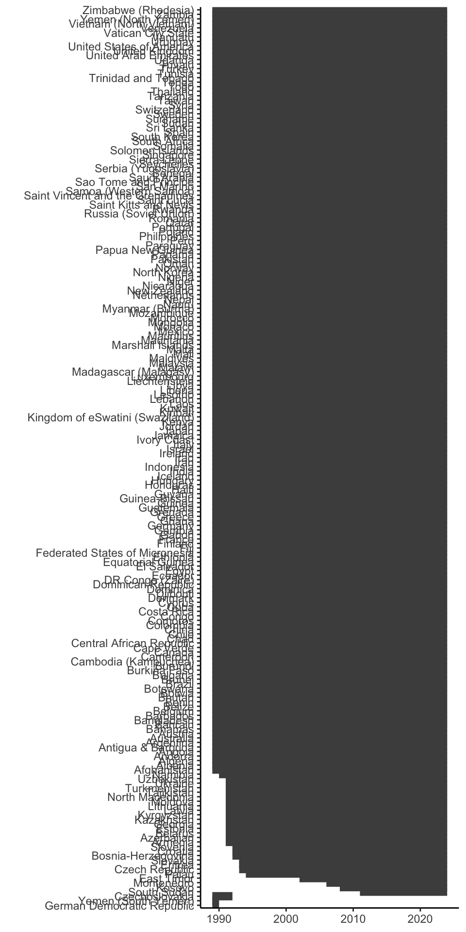
This graph is a bit messy and difficult to read, but is clear that most countries are covered for the entire period. Let’s have a closer look at those that have less than full coverage:
ged %>%
  group_by(country_cy) %>%
  summarise(start_year = min(year_cy, na.rm = T),
            end_year = max(year_cy, na.rm = T)) %>%
  mutate(year_range = end_year - start_year) %>%
  filter(year_range<(2024-1989)) %>%
 ggplot(aes(xmin = start_year, xmax = end_year,
            y = reorder(country_cy, year_range))) +
    geom_linerange(linewidth = 3, color = "grey30") +
    labs(y = "")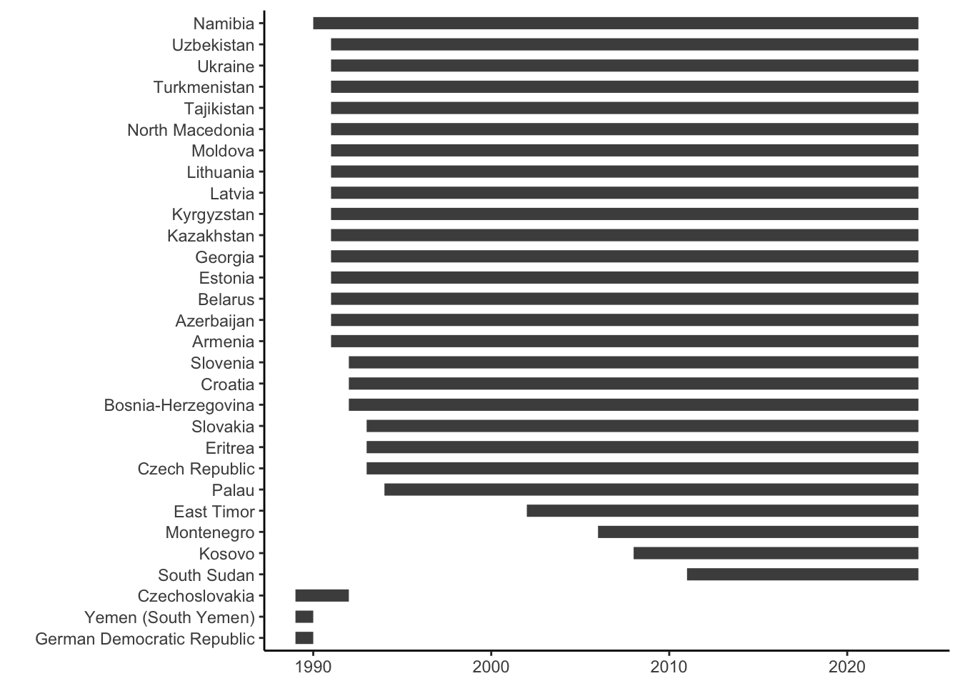
Here again, only a few countries are covered for substantively shorter time periods than the others. One of them is the no longer existing German Democratic Republic (“East Germany”). To make things simpler, we can just drop these countries from the dataset:
ged %>%
  filter(!(country_cy %in% c("German Democratic Republic","Yemen (South Yemen)","Czechoslovakia"))) -> ged
Conflict fatalities over time and across countries
Now that we have an overview over the main dimensions of the dataset, we can get to the actual contents. If you have a look at the codebook, you’ll see that the dataset contains mainly estimates of the number of deaths (“fatalities”) associated with different types of violence within a given country and in a given year (see also Sundberg and Melander 2013):
- State-based violence (variables starting with
sb_), meaning conflicts between two organized actors where one is a government. This is further divided into:- Intra-state conflicts (indicated with
intrastate) - Inter-state conflicts (indicated with
interstate)
- Intra-state conflicts (indicated with
- Non-state violence (variables starting with
ns_), meaning conflicts between two or more groups that are not state or government actors - One-sided violence against unarmed civilians (variables starting with
os_), which is further divided according to who perpetrated it:- Killings by the government of a given country (indicated with
gvt_killings) - Killings by any state actor in a given country (indicated with
any_gvt_killings) - Killings by non-state groups in a given country (indicated with
nsgroup_killings)
- Killings by the government of a given country (indicated with
There are also estimates of the total number of fatalities for each of the major types of violence (ns, sb, and os), indicated with total in the variable name.
Since, as a famous saying goes, “the first casuality in war is the truth”, the fatality numbers in the dataset are estimates, and at least the main variables are available as best, low, and high estimates so that users can decide for themselves which estimate(s) they want to rely on.
In the illustrative analysis here, we’ll focus on the total number of fatalities from state-based violence (both between states and between states and non-state actors) in a given country and year, and here the best estimate – i.e., the sb_total_deaths_best_cy variable.
Conflict fatalities over time
Let’s first have a look at the variation in conflict fatalities over time – i.e., which years since 1989 were the bloodiest in terms of state-based violence?
If you read the other post on how to work with cross-country macro-level data, you might have an idea as to how to do this: We aggregate the data by year (year_cy) and then use summarize() to calculate relevant summary statistics (here the overall sum or total of the sb_total_deaths_best_cy variable) for each year. Once we have that, we visualize the result with ggplot(), and we use the pipe operator (%>%) to do all of this in a single operation or “pipeline”:
ged %>%
  group_by(year_cy) %>%
  summarise(tdeaths = sum(sb_total_deaths_best_cy, na.rm = T)) %>%
  ggplot(aes(x = year_cy, y = tdeaths)) +
    geom_bar(stat = "identity") +
    scale_y_continuous(breaks = seq(0,300000,50000),
                       limits = c(0,300000),
                       labels=function(tdeaths) format(tdeaths,
                                                       big.mark = "'",
                                                       scientific = FALSE)) +
    labs(x = "", y = "Total fatalities from state-based violence (best estimate)")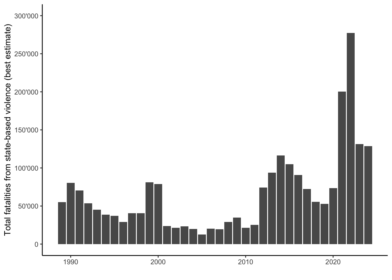
Notice that we adapt the y-scale with scale_y_continuous() to range from 0 to 500’000 and we add a single quotation mark to indicate thousands in the labels.
Overall, global state-based fatalities declined intitially from the 1990s to the 2000s (despite the onset of the Global War on Terror after 2001), and then increased noticeably again in the 2010s and especially in 2021 and 2022.
To get a better sense of what is behind this variation, we can calculate fatality numbers by both year and world region (region_cy) and then visualize the result in the form of a stacked bar plot (notice the position = "stack" option within geom_bar()) and the scale_fill_viridis_d() setting to use the colorblind-friendly viridis color scale for discrete variables.
ged %>%
  group_by(year_cy,region_cy) %>%
  summarise(tdeaths = sum(sb_total_deaths_best_cy, na.rm = T)) %>%
  ggplot(aes(x = year_cy, y = tdeaths, fill = region_cy)) +
    geom_bar(stat = "identity", position = "stack") +
    scale_fill_viridis_d() +
    scale_y_continuous(breaks = seq(0,300000,50000),
                       limits = c(0,300000),
                       labels=function(tdeaths) format(tdeaths,
                                                       big.mark = "'",
                                                       scientific = FALSE)) +
    labs(x = "", y = "Total fatalities from state-based violence (best estimate)",
         fill = "") +
    theme(legend.position = "bottom")
`summarise()` has grouped output by 'year_cy'. You can override using the
`.groups` argument.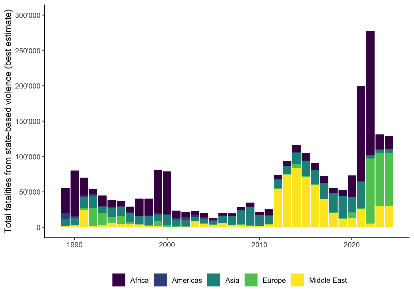
When we disaggregate the figures by region, we can get a better sense of what is going on in the data. During the 1990s, many state-based fatalities occurred in Africa, but the second Gulf War in 1991 (between the US-led coalition and Iraq under Saddam Hussein) is clearly visible, as are the protracted conflicts in the Balkan countries following the collapse of Jugoslavia in the mid-1990s. During the 2000s, Asia and the Middle East were most strongly affected, which arguably reflects the Global War on Terror and the US-led interventions in Afghanistan and Iraq. The 2010s are clearly dominated by conflicts in the Middle East, which reflects the aftermath of the Arab Spring and the resulting conflicts in Syria, Iraq, and Libya. Russia’s invasion of Ukraine in 2022 is clearly visible as a massive rise in fatalities in Europe, and so is the conflict in Ethiopia in 2021 and 2022 as a rise in fatalities in Africa.
Conflict fatalities across countries
We can check if the interpretation of the over-time graphs above makes sense by looking more in detail at the variation across countries. The main change we need to make is to group the data by country (country_cy) so that summarize() calculates summary statistics by country. Then we also filter the data so that countries that never had any fatalities due to state-based violence between 1989 and 2024 are excluded – this avoids the earlier issue that the graph becomes unreadable when too many countries are shown on the y-axis.
ged %>%
  group_by(country_cy) %>%
  summarise(tdeaths = sum(sb_total_deaths_best_cy, na.rm = T)) %>%
  filter(tdeaths>0) %>%
  ggplot(aes(x = tdeaths, y = reorder(country_cy, -tdeaths))) +
    geom_col() +
    scale_x_continuous(breaks = seq(0,500000,100000),
                       limits = c(0,500000),
                       labels=function(tdeaths) format(tdeaths,
                                                       big.mark = "'",
                                                       scientific = FALSE)) +
    labs(x = "Total fatalities from state-based violence",
         y = "", caption = "1989-2024; best estimate")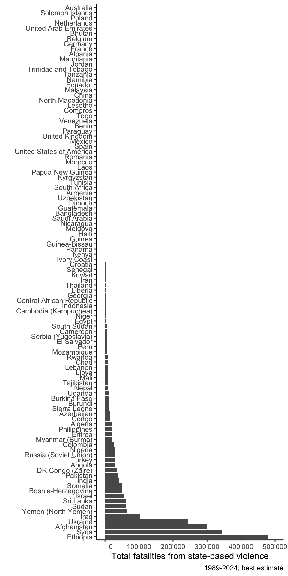
The resulting bar graph covers still many countries, but it also shows that fatalities from state-based violence are quite concentrated in a handful of countries, mainly Ukraine, Afghanistan, Syria, and Ethiopia. The group of high-fatality countries includes exclusively countries in Africa, the Middle East, Asia, and the post-Soviet world, but when we go up to countries that had relatively few fatalities, we find some high-income democracies from the “Global North” such as the United States, the United Kingdom, Germany, Belgium, or Australia.
Finally, we can also show disaggregated over-time trends of conflict fatalities in a given country. To do so, we don’t group and summarize the data but create separate graphs per country with facet_wrap(). It can make sense to do this with the entire dataset, but it is often better to do this only with a selected number of countries and time points to avoid getting many very tiny and unreadable graphs. In this case, we use filter() to limit the time period to 2020 and after and focus on observations (country-years) that had more than 1000 fatalities.
ged %>%
  filter(year_cy>=2020 & sb_total_deaths_best_cy>=1000) %>%
  ggplot(aes(x = year_cy, y = sb_total_deaths_best_cy)) +
    geom_col() +
    facet_wrap(~country_cy) +
    scale_y_continuous(breaks = seq(0,200000,50000),
                       limits = c(0,200000),
                       labels=function(tdeaths) format(tdeaths,
                                                       big.mark = "'",
                                                       scientific = FALSE)) +
    labs(x = "", y = "Total fatalities from state-based violence (best estimate)")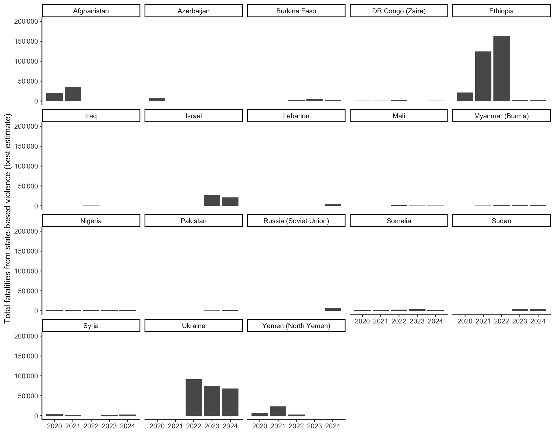
The resulting graph shows some of the major developments in international relations of the last years, including the drawdown of the US-led intervention in Afghanistan, the conflicts in Ethiopia and Yemen, the conflict in Israel following the October 7 attacks by Hamas in 2023, and Russia’s invasion of Ukraine.
Next steps
If you are now thinking something like “well, this was not really more advanced that working with any other macro-level dataset”, then you are correct. That was precisely the point. This particular the UCDP dataset is just a typical country-year macro-level dataset, just like the Comparative Political Dataset or many other datasets used in comparative politics and comparative political economy. Therefore, if you can work with one of them, you can potentially work with all of them. The main difficulty is really only to understand what the different variables in the dataset measure and which one is the most relevant for a given research question or hypothesis – and this is why we have codebooks and research articles that present datasets and what they contain.
An obvious next step is now to try to explain some of the variation in conflict fatalities by looking, for example, at their relation to how democratic a country is (Maoz and Russett 1993; Oneal and Russett 1997) or their welfare states (Burgoon 2006), or to see what political consequences conflicts and fatalities can have (e.g., Obinger and Schmitt 2020). To be able to do so, you need to merge the UCDP data with some relevant other datasets, for example the V-DEM data on democracy (Lindberg et al. 2014; Coppedge et al. 2011) or the Quality of Government dataset (Teorell et al. 2025) that contains a wide range of variables on political actors, institutions, and public policies.
To merge these data, you just need to make sure that all countries are named or coded exactly equally (e.g., that the United States are called “United States” in both datasets, and not “US”, “USA”, or “United States of America” in one but not the other). The countrycode package can help with that (Arel-Bundock et al. 2018). After that, you just use left_join() to combine the datasets by country and year (see also this post).
If you then want to do more advanced regression analyses with the combined datasets, you can have a look at the book by Urdinez & Cruz (2020).
References
Arel-Bundock, Vincent, Nils Enevoldsen, and CJ Yetman. 2018. “countrycode: An R package to convert country names and country codes.” Journal of Open Source Software 3 (28): 848.
Balch-Lindsay, Dylan, and Andrew J Enterline. 2000. “Killing Time: The World Politics of Civil War Duration, 1820–1992.” International Studies Quarterly 44 (4): 615–42.
Burgoon, Brian. 2006. “On Welfare and Terror: Social Welfare Policies and Political-Economic Roots of Terrorism.” Journal of Conflict Resolution 50 (2): 176–203.
Coppedge, Michael, John Gerring, David Altman, et al. 2011. “Conceptualizing and Measuring Democracy: A New Approach.” Perspectives on Politics 9 (2): 247–67.
Davies, Shawn, Therése Pettersson, Margareta Sollenberg, and Magnus Öberg. 2025. “Organized Violence 1989–2024, and the Challenges of Identifying Civilian Victims.” Journal of Peace Research 62 (4).
Fearon, James D., and David D. Laitin. 2003. “Ethnicity, Insurgency, and Civil War.” American Political Science Review 97 (1): 75–90.
Fjelde, Hanne, and Hannah M Smidt. 2022. “Protecting the Vote? Peacekeeping Presence and the Risk of Electoral Violence.” British Journal of Political Science 52 (3): 1113–32.
Lindberg, Staffan I, Michael Coppedge, John Gerring, and Jan Teorell. 2014. “V-Dem: A New Way to Measure Democracy.” Journal of Democracy 25 (3): 159–69.
Maoz, Zeev, and Bruce Russett. 1993. “Normative and Structural Causes of Democratic Peace, 1946–1986.” American Political Science Review 87 (3): 624–38.
Obinger, Herbert, and Carina Schmitt. 2020. “Total War and the Emergence of Unemployment Insurance in Western Countries.” Journal of European Public Policy 27 (12): 1879–901.
Oneal, John R., and Bruce M. Russett. 1997. “The Classical Liberals Were Right: Democracy, Interdependence, and Conflict, 1950-1985.” International Studies Quarterly 41 (2): 267–94.
Sundberg, Ralph, and Erik Melander. 2013. “Introducing the UCDP Georeferenced Event Dataset.” Journal of Peace Research 50 (4): 523–32.
Teorell, Jan, Aksel Sundström, Sören Holmberg, et al. 2025. The Quality of Government Standard Dataset, v. Jan25. The Quality of Government Institute, University of Gothenburg.
Urdinez, Francisco, and Andres Cruz. 2020. R for Political Data Science: A Practical Guide. CRC Press.
Waltz, Kenneth Neal. 1959. Man, the State, and War: A Theoretical Analysis. Columbia University Press.
Footnotes
See also https://github.com/erikgahner/PolData?tab=readme-ov-file#international-relations for a more exhaustive lists of datasets and sources on war, conflict, and international relations.↩︎
Citation
BibTeX citation:
@online{knotz2025,
  author = {Knotz, Carlo},
  title = {Studying Conflict and Violence Across Countries},
  date = {2025-06-14},
  url = {https://cknotz.github.io/getstuffdone_blog/posts/conflict/},
  langid = {en}
}
For attribution, please cite this work as:
Knotz, Carlo. 2025. “Studying Conflict and Violence Across
Countries.” June 14. https://cknotz.github.io/getstuffdone_blog/posts/conflict/.