# Loads packages
library(bst290)
library(tidyverse)

# Loads dataset
data(ess)Tutorial 4: Data visualization with ggplot2
1 Introduction
You made it through the most tedious parts, the descriptive tables and data transformation procedures. Data visualization is where the fun begins.
If you are able to visualize your data, you can turn boring and dull rows of numbers and symbols into nice and informative graphs. In other words, you can do or produce something you and other people can see and use directly in reports, on websites, etc. Obviously, that is a skill that you can directly use at many workplaces where (social) data analysts work. And, if you keep working on it, you will eventually be able to produce more and more advanced and beautiful graphs.
In this tutorial, you will learn the basics of visualizing data with ggplot2, which is one of several ways to visualize data in R.1
You learn ggplot2 here for a few reasons:
- It is arguably the most widely used package for data visualization in R (and generally one of the most frequently downloaded packages overall). The BBC Data Team, for example, uses
ggplot2to make graphics. - It is extremely flexible. You can generate a wide range of different types of graphs, and each graph can be customized down to the finest detail (as long as you know what you have to do).
- It can be extended. One extension called
ggiraphallows you to makeggplot2graphs interactive.
Obviously, this tutorial will only cover the basics — but you can take a look at some examples of what you will eventually be able to do with ggplot2 and R:
(The first two websites are also generally highly recommended if you want to look for example code for a particular type of graph!)
For a more thorough introduction to data visualization with R see https://ggplot2-book.org/ or https://r-graphics.org/index.html.
Hvis du ønsker å lese en norsk tekst i tillegg: “Lær deg R”, Kapittel 3 & 5. OBS: Boken bruker en annen ‘dialekt’ (base R) enn den vi bruker her (tidyverse/ggplot2).
2 Before we start
You are most likely using Microsoft Word or a similar software to write your texts (home exams, thesis papers) and present graphs or images (whether or not you make them with R) in your text.
Obviously, you want those graphs to look their best. What you do not want is grainy, low-resolution images that are difficult to read.
To make sure that your graphs do indeed look good, you have to make sure that your software does not compress them when you save the document you are working on. Microsoft Word does that sometimes, and it can really muck up otherwise nice graphs.
Therefore, if you use Microsoft Word, go into the settings for Word and check the box that says “Do not compress images in file” (see also the screenshot below).2 Ideally, set the default image resolution to 330 ppi and apply this to all documents.
Google Docs or Apple Pages do not do this (as far as I know), but you should check to make sure that whatever graph or picture you show in your text really does look the way you want it to.
3 Setup
In this tutorial you will again work with the practice ess dataset that is included in the bst290 package. To make everything available, go ahead and load the package and the dataset. In addition, you have to load the ggplot2 package to be able to use it. Since ggplot2 is included in the tidyverse collection, we just load the entire tidyverse (this will also be handy later on, when we use the select() and filter() functions and the %>% operator you learned about in the previous tutorial).
The start of your scriptfile should therefore look like this:
4 Visualizing data
This tutorial will cover the following types of basic graphs:
- Scatterplots
- Boxplots (“box-whisker plots”)
- Histograms
- Bar graphs
4.1 Scatterplots
Scatterplots show the relationship between two numeric or continuous variables (see also Solbakken 2019, chap. 4), and they are widely used in both academic research but also the “real world” (maybe you have seen Hans Rosling’s famous “200 countries, 400 years, 4 minutes” presentation that featured a scatterplot?).3 Therefore, knowing how to make a scatterplot is obviously handy!
Scatterplots are also a great way to show you the basic logic of ggplot2. For our scatterplot, you use two numeric variables from the small ess practice-dataset:
height: The respondent’s height in cm;weight: The respondent’s weight in kg;
Feel free to familiarize yourself with these variables first, using the tools you learned in the previous tutorials such as summary().
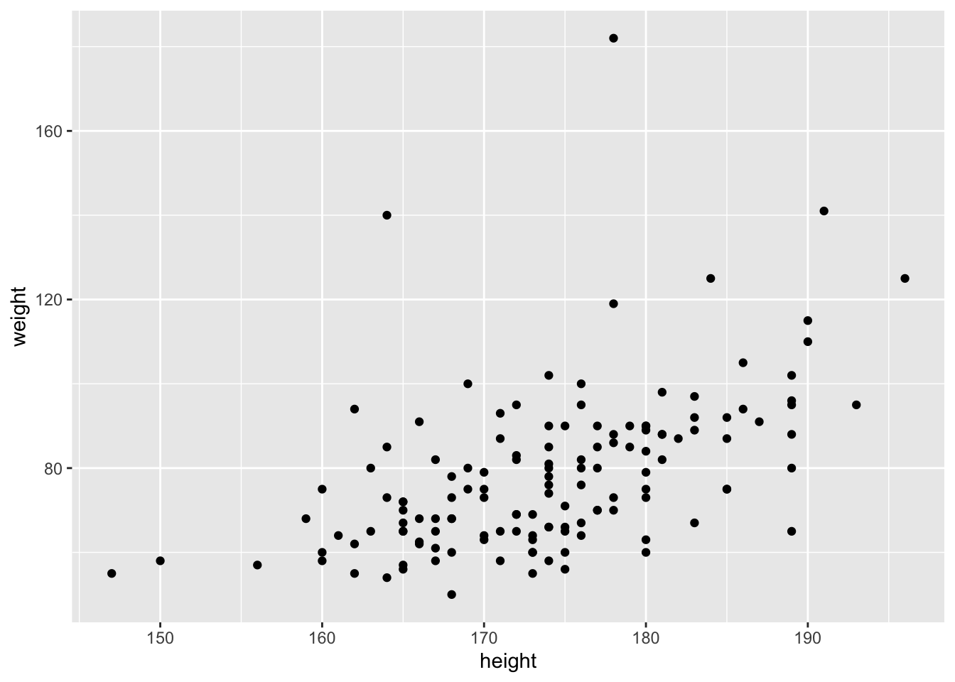
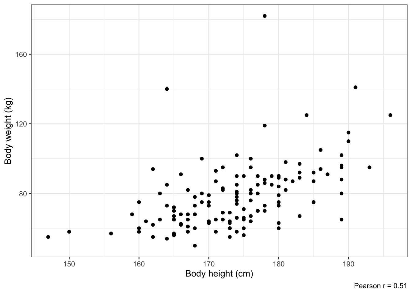
Once you you know what you are working with, take a look at the scatterplot below and the code that generated it:
ggplot(data = ess,
       aes(x = height, y = weight)) +
geom_point()Let’s go over the code and graph step-by-step so you understand what is going on here:
- The first function is the
ggplot()function — theggplot()function is the main function inggplot2. You use it to tellRthat you want to make a graph withggplot2, and it includes the main information needed for the graph:- Which dataset you want to use; in this case, you use
data = essto say that you want to want to use theessdataset; - You define the main ‘aesthetics’ (
aes()) of your graph — which variable goes on the horizontal x-axis (height) and which goes on the vertical y-axis (weight).
- Which dataset you want to use; in this case, you use
- Then notice the
+symbol at the end of the second line; this tellsRthat you want to add a layer to the graph; - This layer is defined with
geom_point()— you say that you want to graph the individual data points, which together form a scatterplot.
If this was a bit much, it might help to see what happens when you construct the graph one step at a time, which comes on the next page.
4.1.1 The graph window
Consider what happens when you only run the ggplot() function without anything else added:
All that happens is that you get an empty graph window with nothing in it — which is obvious because you have not told R what exactly you want to put into your graph.
4.1.2 Defining the dataset
Next, you add information about which dataset you want to use:
No real improvement — but, then again, what is R supposed to do if all it knows is which dataset it should work with, but not the variables and where in the graph they go?
4.1.3 Defining the variables and their roles (‘aesthetics’)
Now you add information about the main dimensions or ‘aesthetics’ of the graph. In this case, the relevant bits of information are which variables you want to graph and what roles they play in your graph:
In this case, you tell R that you want to use the height and weight variables, and that they are supposed to form the horizontal x-axis (height) and the vertical y-axis (weight). You see the effect in the form of labels on the axes, and a grid system inside the graph.
But still: No contents! Where are the data points the graph is supposed to show?
4.1.4 Defining the contents (‘geometric objects’)
In ggplot2, you add the actual contents of your graph — the points in a scatterplot, the lines in a line graph, or the bars in a bar graph — as additional layers of ‘geometric objects’ or ‘geoms’ (which makes sense: points, lines, and bars are geometric objects).
In the current case, you add a layer of points with geom_point():
And there it is: A rough but complete scatterplot.
Important: Notice again the plus-symbol (+) at the end of the line before geom_point(). You always use this symbol in ggplot2 to add additional graph layers.
You will see that functionality clearer when we add more layers like nice labels, which comes now.
4.1.5 Informative labels
The scatterplot you have now is acceptable if you would only like to visualize the data for yourself, as a part of getting to know your data. But the graph is not in a shape in which you could include it in a course paper, thesis, or report — it is not a “publication quality” graph.
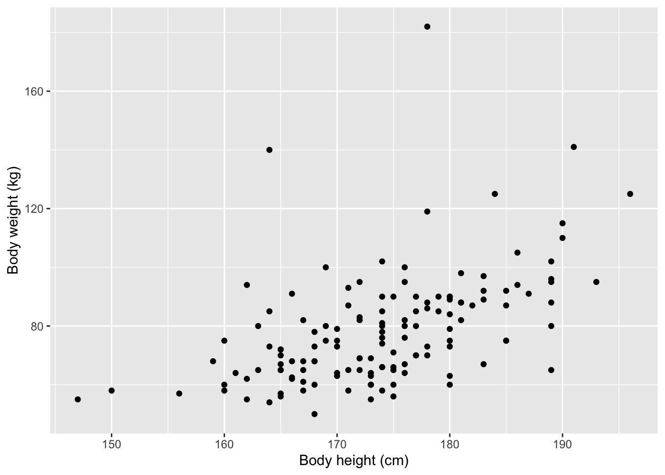
One thing that is missing are informative labels for the two axes. You can add these as additional layers to your graph with labs():
ggplot(data = ess,
       aes(x = height, y = weight)) +
geom_point() +
labs(x = "Body height (cm)",
y = "Body weight (kg)")
## Warning: Removed 5 rows containing missing values or values outside the scale range
## (`geom_point()`).Notice that the text that forms the axis labels is put within quotation marks. This is important: Text always goes within quotation marks!
If you want, you can also add other labels such as a title, a subtitle, or a note (“caption”). See ?ggplot2::labs() for details.
4.1.6 Changing the overall look of the graph (‘theme’)
Almost there — but the gray background makes the graph look a bit dull.4
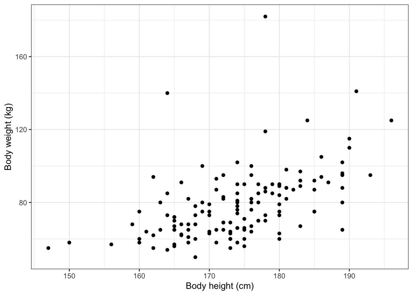
In ggplot2, you can overwrite the default theme by adding a theme layer. For example, to use a simple black and white theme, you would add theme_bw():
4.1.7 Calculating and showing the Pearson correlation coefficient
Just from looking at the graph, you can see that there is a positive relationship between body weight and body height in the data: The taller someone is, the heavier they are.
What the graph does not show is exactly how strong that relationship is. However, as you know, we can use the Pearson correlation coefficient \(r\) (also known as the Greek letter “rho”: \(\rho\)) to quantify the relationship between the two variables. You can use R to calculate this statistic and you can then directly add it to your graph.
To calculate the correlation coefficient, we use the cor() function.5 This function takes two variables that we need to specify as x and y and calculates their degree of correlation — but only if both variables are numeric! We also need to specify what we want to do with missing values (NAs) with the use option.
In our case, the two variables we want to work with are height and weight. and they both belong to to the ess dataset. We also want to use only complete observations, meaning those observations where we have data for body weight and height; all others where one or both variables are missing are excluded from the calculation. We also save the result as rho.
We specify this as follows:
rho <- cor(x = ess$height,
y = ess$weight,
use = "complete.obs")When we print out the saved result, we see the correlation coefficient:
rho[1] 0.5060853There is a moderately strong and positive degree of correlation in the data.
Now to add this to the graph. Here we use a very handy function that allows us to paste different things together and create a text label that we can add to the graph: paste0(). paste0(), simply put, takes different pieces of text or numbers and pastes them together to a single text string. We also use the round() function to make our correlation coefficient look a bit nicer.
For example, let’s construct a label that combines the text “Pearson r =” and our rounded correlation coefficient with paste0(). We save this as rho_label so that we can later use it in our graph:
rho_label <- paste0("Pearson r = ",round(rho, digits = 2))If we print this out, we see the formatted result:
rho_label[1] "Pearson r = 0.51"And now that we have this saved label and add it to the graph as a caption:
ggplot(data = ess,
aes(x = height, y = weight)) +
geom_point() +
labs(x = "Body height (cm)",
y = "Body weight (kg)",
caption = rho_label) +
theme_bw()Warning: Removed 5 rows containing missing values or values outside the scale range
(`geom_point()`).paste0() is very handy because you can use to add pretty much any statistic you want to show as part of a graph, be it a correlation coefficient or something else that is relevant.
And this is now a graph that you could include in a course paper, etc. Of course, there are many, many more ways to tweak this graph even further, but what you have is fine for now.
If you want to see what other themes you can choose from, visit https://ggplot2.tidyverse.org/reference/ggtheme.html
4.2 Bivariate boxplots
A scatterplot like the one you just created is a great way to visualize the relationship between two numeric (or metric) variables. But there may be situations where only one of your variables is numeric and the other is categorical or ordinal. In that case, a scatterplot will not be helpful.
But you can visualize the relationship between a categorical and a numeric variable with a boxplot (or “box-whisker plot”). A boxplot shows you the median (or “middle value”) but also the 1st and 3rd quartile and any outliers in the data. By drawing boxplots of a numeric variable (such as age) over the groups of a categorical variable (such as gender), you can visualize any relationships between these variables.
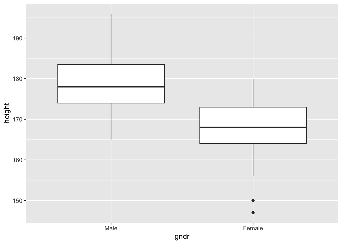
For example, let’s assume you are interested in the relationship between gender (a categorical variable) and body height (a numeric variable): Are men typically taller than women?
The code below shows how you can visualize this relationship using a boxplot:
This piece of code should now not be difficult to understand:
- As before, you need to specify a variable for the x- and one for the y-axis (just like in the scatterplot above). Here, you put
gndron the x-axis andheighton the y-axis; - Then just you let
Rdraw the boxplots withgeom_boxplot();
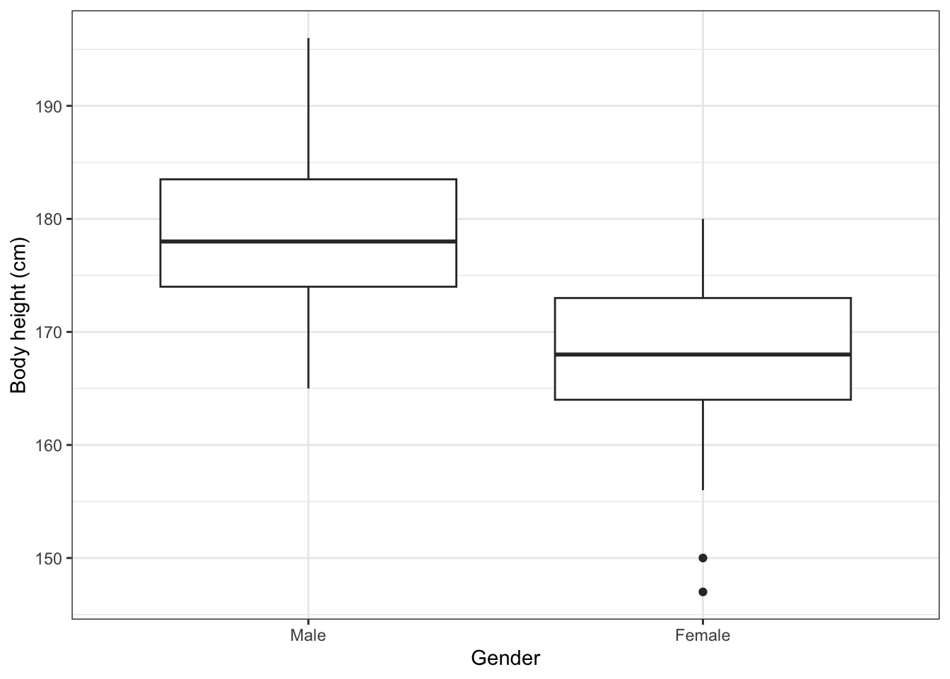
With some more polishing, you get a neat and informative graph:
ggplot(data = ess,
       aes(x = gndr, y = height)) +
geom_boxplot() +
labs(x = "Gender",
y = "Body height (cm)") +
theme_bw()What do you learn from the graph about the differences in body height between men and women?
4.3 Plotting overlapping points with geom_count()
When you work with survey data, you often deal with quasi-numerical scales like the 0-10 left-right political ideology scale, 0-10 scales of trust in political institutions, or 0-10 happiness scales. Technically, these variables are ordinal – but they have enough categories to allow us to treat them as numeric.
Visualizing relationships between two of such 0-10 or 1-7 scale variables can be difficult. In principle, you can use geom_point() to create a scatterplot, but this will often not be very informative because the individual observations will overlap and any patterns in the data will be difficult to see.
Luckily, there is an alternative: geom_count(), and two BSTAT students at UiS, Rosa Ottestad and Norman Sunde, have written a mini-tutorial on how to use this function to plot associations between two quasi-numeric 0-10 scale variables. You can read the tutorial here.
4.4 Univariate graphs: Histograms
The graphs you created so far were types of bivariate graphs: They show the relationship between two different variables.
You can of course also create graphs that describe single variables: univariate graphs such as histograms or bar graphs.
4.4.1 Drawing a histogram
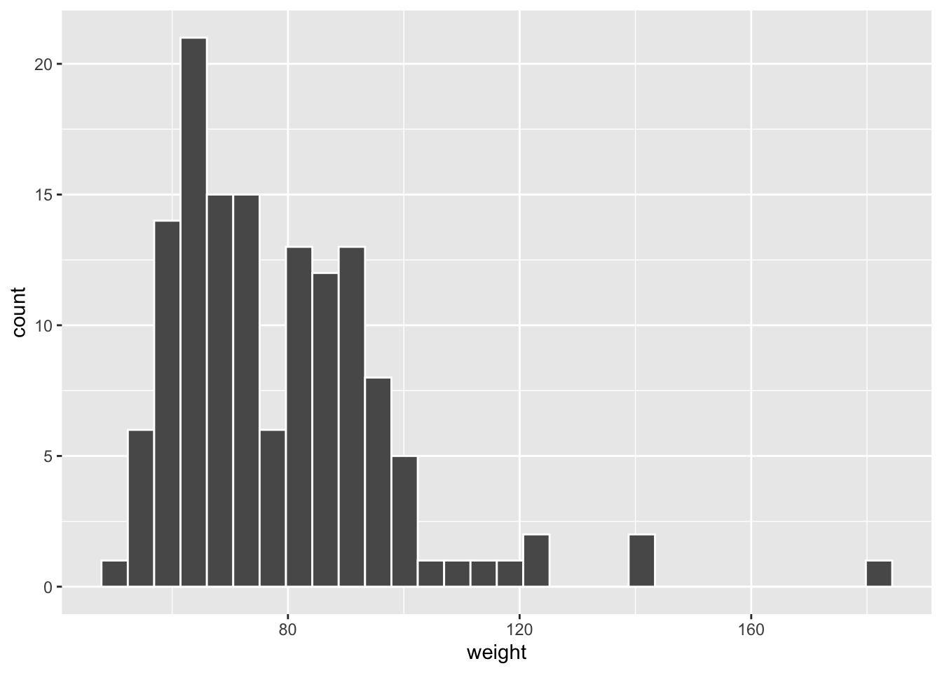
A histogram is a type of graph that is very useful to visualize the distribution of a single continuous or metric variable (see also Solbakken 2019, 59–60).
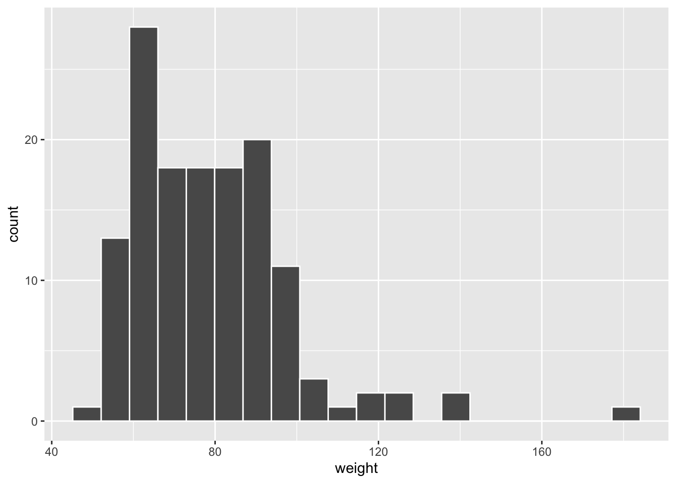
Since you have seen earlier how a ggplot-graph is built, you should now be able to look at the code below and understand how you can produce a histogram:
Much of the code is still the same (data = ess) as above, but there are some differences:
- Only one aesthetic (
aes()) is defined:x = weight. This is because the graph is univariate, it shows only the distribution of a single variable; - The geometric object is now a histogram (
geom_histogram());
4.4.2 Improving appearance
The graph on the previous page is quite dull and, more importantly, the individual “bins” are difficult to distinguish from each other. This is easy to fix, however.
All we need to do is to change the color of the bins’ outlines with the color argument (“option”). White is a good option here since it contrasts with the dark gray bins but does not add extra complexity to the graph:
4.4.3 Changing the number of “bins”
One important choice when drawing a histogram is the the number of “blocks” or “bins” into which we group the data, because this can really affect our impression of the variable we look at.
By default, geom_histogram() uses 30 bins, but this might obviously not be ideal in all situations. Fortunately, you can change the number of bins easily with the bins option.6
For example, we could set the number of bins to 20 instead of 30:
Feel free to play around with different numbers and see how the graph changes!
4.4.4 Final polishing
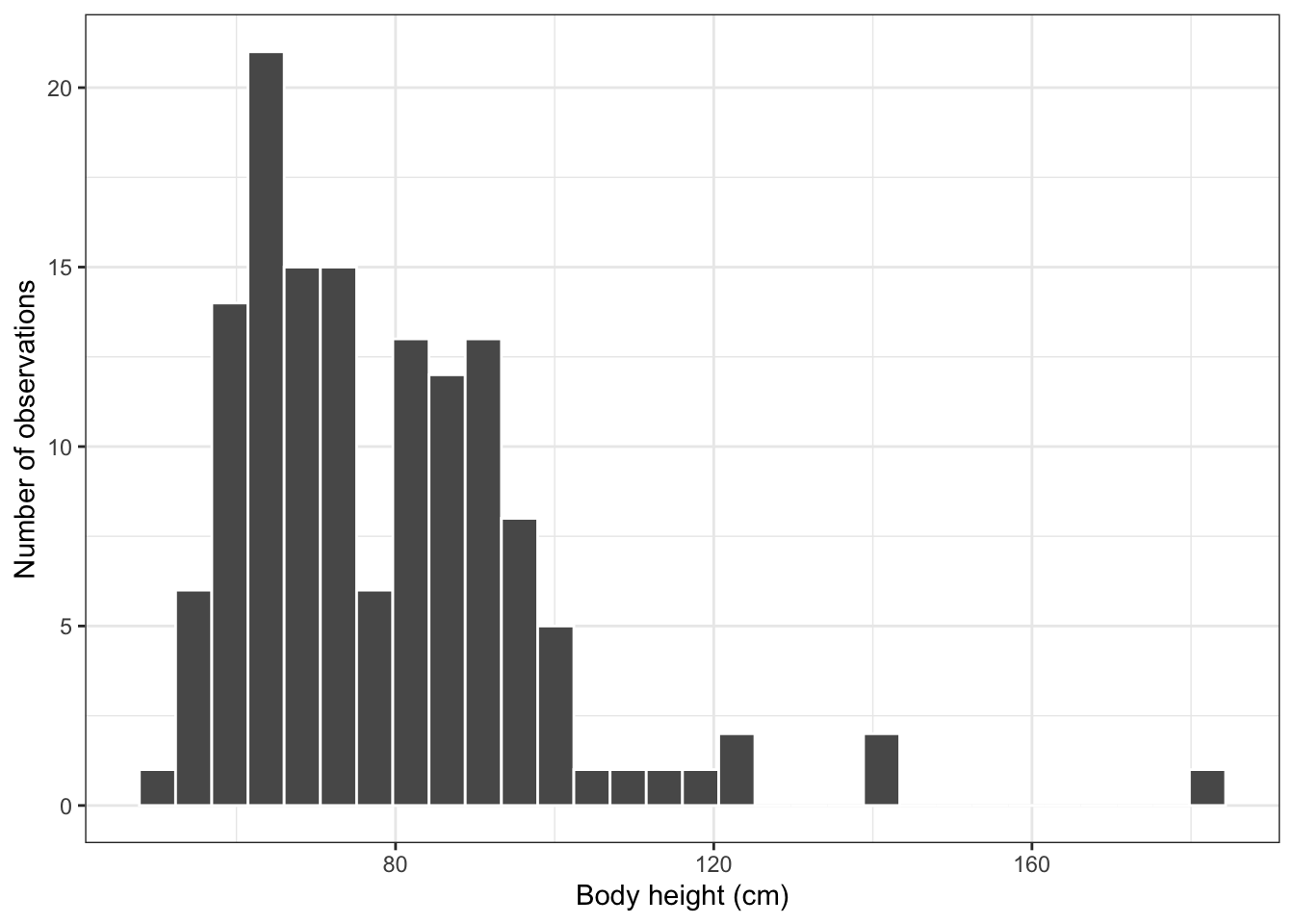
Finally, the histogram can also still be improved by changing the background theme and by adding axis labels:
ggplot(data = ess,
       aes(x = weight)) +
        geom_histogram(color = "white", bins = 30) +
        labs(x = "Body height (cm)",
             y = "Number of observations") +
        theme_bw()
Can you see what was changed?
- The graph now has informative labels and a simple black and white theme;
- The number of bins is changed back to 30.
As before, there are many more ways to make this graph prettier, but this is good enough for now.
4.5 Univariate graphs: Bar graphs
Next to histograms, bar graphs are another type of univariate graph to show the distribution of a single variable. Bar graphs are suited for categorical or ordinal variables — variables with a few distinct categories.
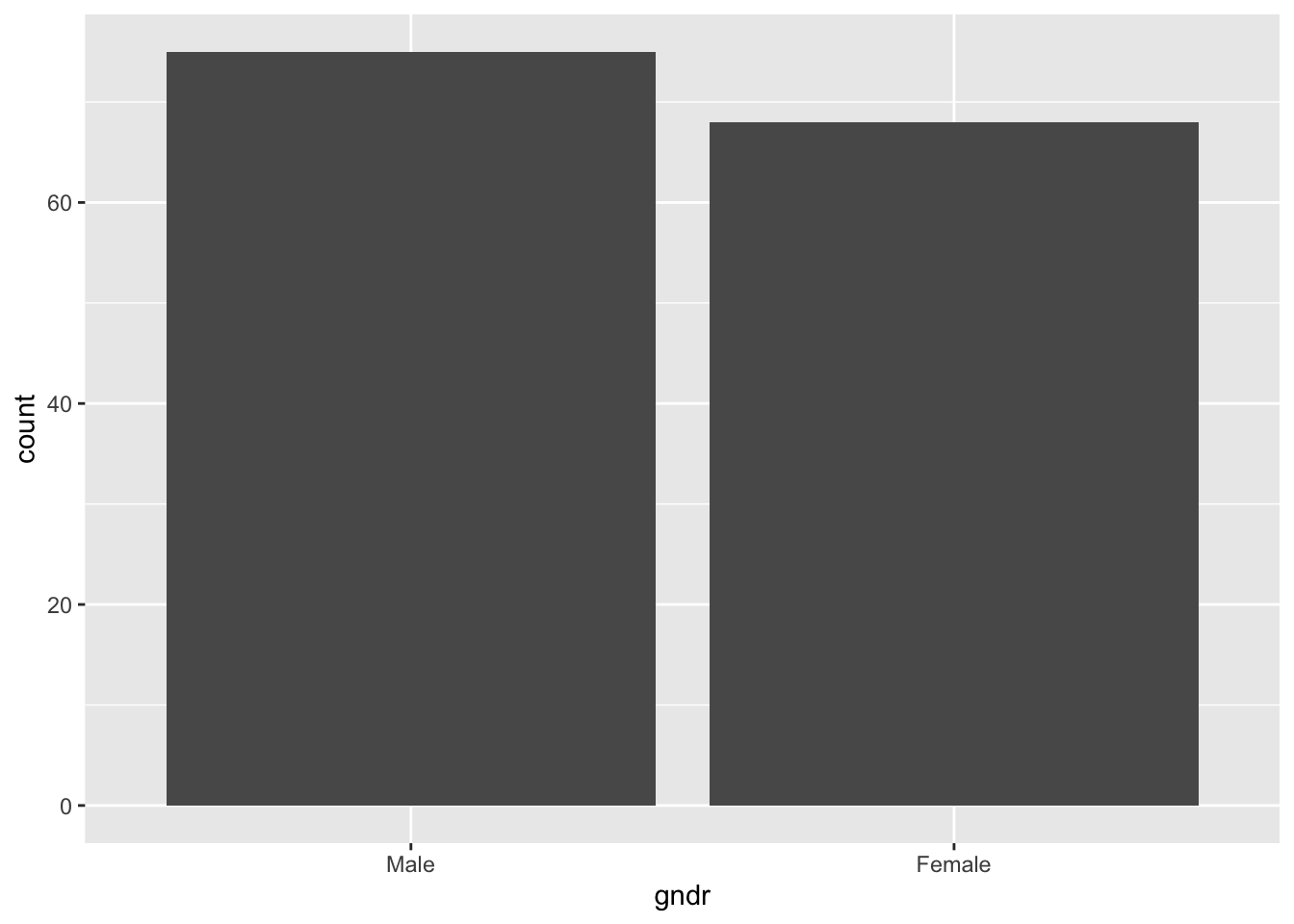
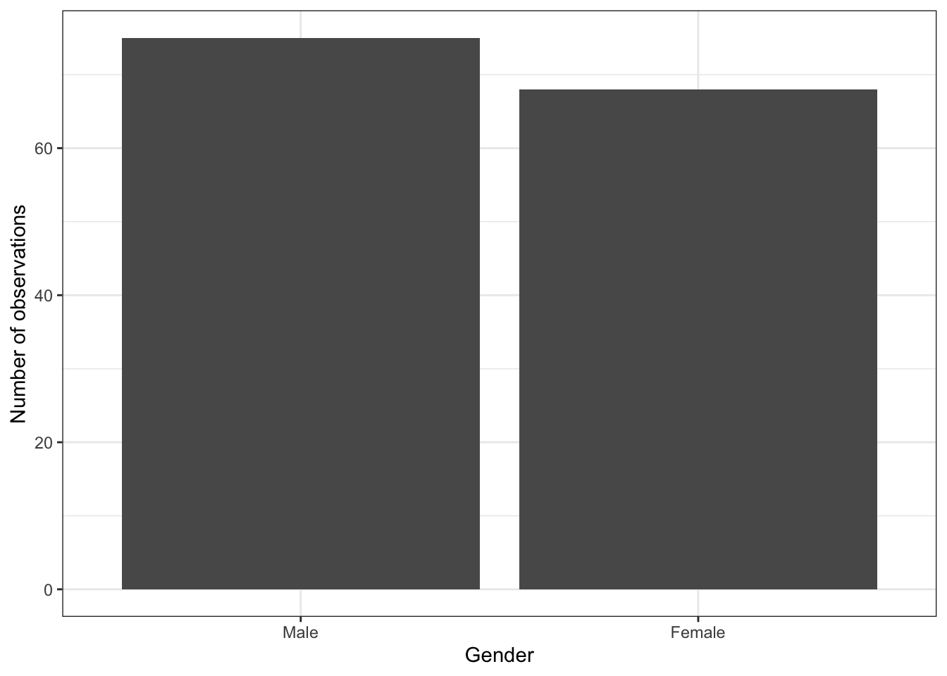
The code below produces a bar graph of the gender variable (gndr) — and it shows the number of men and women in the dataset:
You should be able to understand most of the code by now, but the geom_bar() part might require a bit of explanation.
- Obviously, to produce a bar graph, you would use the
geom_bar()layer; - By default,
geom_bar()shows the number of observations (‘counts’) in each of the two groups. One could also be more explicit and specifygeom_bar(stat = "count")to tellRvery clearly that it is supposed to show the number of observations (‘counts’) in each category of the gender variable. To see what else you can do withgeom_bar(), use the help file (?geom_bar).
And, once more, there are ways to make this graph ready for publication:
5 Linking data management and visualization
The previous tutorial on Data cleaning & management showed how you can use the pipe operator (%>%) to link different data management steps together, and it also mentioned that you can directly visualize the result of such a “data cleaning pipeline” with ggplot2.
Now that you know both how to clean data and how to visualize them, you have what you need to be able to understand how both parts can be linked together. This is important to know because it gives you a lot of flexibility: Whatever summary statistics you want to show, you can calculate them and then directly put them into a neat-looking graph.
To illustrate this, let’s go back to the issue of gender and body height. The boxplots above showed you that men are typically taller than women (surprise, surprise…) with a number of summary statistics (the median, the 1st and 3rd quartiles, etc). What a boxplot does not show you, however, is averages.
This might be a problem if, for some reason, you are specifically interested in whether men are on average taller than women.
To solve this problem, you can do the following:
- You calculate the average body heights of men and women using the tools you learned in the previous tutorial;
- Then you take the result of the previous step and directly “feed” it into a
ggplotgraph using the pipe operator (%>%);
5.1 Calculating summary statistics
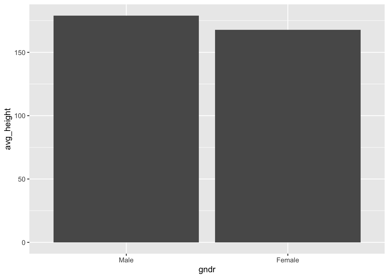
You may remember that you can use group_by() and summarize() to get summary statistics such as the average over groups of a categorical variable, but just to refresh your memory here is how you calculate the average body height for men and women in the ess dataset:
ess %>% # 1.
  group_by(gndr) %>% # 2.
  summarize(avg_height = mean(height, na.rm = TRUE)) # 3.
## # A tibble: 2 × 2
##   gndr   avg_height
##   <fct>       <dbl>
## 1 Male         179.
## 2 Female       168.
To put this into human language, you tell R to:
- “Take the
essdataset,…” - “…group the data by gender (
gndr),…” - “…calculate the average body height for each gender, and store the result as a new variable (called
avg_height).”
If you look carefully at the output, you can see that the result of the calculation is a so-called tibble. A tibble is a type of data.frame-object in R — i.e., a dataset.7 This means that the result you are looking at is, basically, a mini dataset that includes two observations (Male and Female) and two variables (gndr and avg_height). avg_height is here the average body height for men and women as identified by gndr. Important: Because the result is essentially a dataset, you can directly visualize it with ggplot!
5.2 Visualizing the result
Now that you have the numbers you want to show in your graph, all you need to do is to use the %>% operator to directly feed the numbers – the ‘mini dataset’ – into a graph:
ess %>%
  group_by(gndr) %>%
  summarize(avg_height = mean(height, na.rm = TRUE)) %>% # here is the link!
  ggplot(aes(x = gndr, y = avg_height)) +
    geom_bar(stat = "identity")
You see that the first part is just the code for the calculation from above: group_by(), then summarize(). We then add another pipe at the end to feed the result directly into a ggplot graph. In this graph, gndr is on the x-axis and the y-axis shows the average height for each gender. You then visualize the height per gender with a simple bar graph using geom_bar().
One thing is worth noticing: In this case, we need to tell R that geom_bar() should only show the pure numbers that we got from the previous step (the content of the new avg_height variable in the mini dataset), and not the number of observations or other statistics. We do this by specifying stat = "identity" within geom_bar().
Linking data cleaning and visualization can be very handy when want to visualize specific summary statistics (the average, the standard deviation,…), but especially when you want to create some more complicated graphs such as grouped bar graphs showing percentages.8
6 Exporting graphs with ggsave()
When you make graphs in R, you usually don’t do that because it is so much fun (not yet at least…) but because you want to present these graphs somewhere — in a course paper, thesis, report, presentation, etc. And to be able to include whatever graph you have created, you need to export it from R to an image file (e.g., PDF, JPEG, or PNG) that you can open in Word, PowerPoint, or any other software you use.
Exporting ggplot graphs is easy with the ggsave() function. This function simply exports the last graph you created and saves it under a name and in a file format that you decide. In practice, you create your graph with ggplot() and all the other functions and, once you are happy with the result, you run ggsave().
For example, let’s say you wanted to export the last bar graph from earlier, which was created with this code:
ess %>%
  group_by(gndr) %>%
  summarize(avg_height = mean(height, na.rm = TRUE)) %>%
  ggplot(aes(x = gndr, y = avg_height)) +
    geom_bar(stat = "identity")
Since the graph shows the average height of your survey respondents divided by gender, you want to call it “genderheight”, and you want to save it as a PDF file. That means, the file you want to get will be called “genderheight.pdf”.
To do that, you would simply add a ggsave() command in which you specify the file name in quotation marks after the code to create the graph itself:
# This creates the graph
ess %>%
  group_by(gndr) %>%
  summarize(avg_height = mean(height, na.rm = TRUE)) %>%
  ggplot(aes(x = gndr, y = avg_height)) +
    geom_bar(stat = "identity")

# This exports it
ggsave("genderheight.pdf")
ggsave() can automatically figure out which file format you want to use from the ending you provide. In this case, you used .pdf, so ggsave() saves the file as a PDF file. You could also have specified .png to get a PNG image file.
To see which file formats you can export to and how you can further customize the file, see the official documentation: https://ggplot2.tidyverse.org/reference/ggsave.html
7 Conclusion
Congrats, you now know the basics of data visualization with ggplot2! You can now directly practice your new skills by doing the de-bugging exercises (Tutorials, then “Data visualization”).
References
Footnotes
Others are the basic graphing tools that are built into
Ror thelatticepackage.↩︎See also https://support.microsoft.com/en-us/office/reduce-the-file-size-of-a-picture-in-microsoft-office-8db7211c-d958-457c-babd-194109eb9535↩︎
It is also generally not ideal to have a gray background because it may make it unnecessarily difficult to read finer details in more complex graphs (see Schneider & Jacoby 2018, “Graphical displays for public opinion research”, in Atkinson & Alvarez, The Oxford Handbook of Polling and Survey Methods, pages 439–479. Oxford: Oxford University Press.).↩︎
See also
?cor()for the help file.↩︎Alternatively, you can also change how wide the bins are with the
binwidthoption.↩︎See https://tibble.tidyverse.org/ in case you want to learn more.↩︎
See for example here: https://sebastiansauer.github.io/percentage_plot_ggplot2_V2/.↩︎
