library(tidyverse)Tutorial 7b: Correlation
1 Introduction
The last two tutorials showed you how you can study relationships between two categorical variables (with the \(\chi^2\) test) and between one binomial variable and one metric or linear variable (with the t-test). What is left: How do you analyze relationships between two continuous variables?
The correct statistic for such a relationship is of course Pearson’s correlation coefficient (Solbakken 2019, 4.5). In this tutorial, you will learn how you can calculate the correlation coefficient and test for its statistical significance (i.e., how confident you can be that the correlation coefficient you find in your data is different from, greater, or lower than 0) in R.
The research question for this tutorial is again about religiosity, but we will now look at the effect of age. In other words, we will see if there is a correlation between how old a person is and how religious she feels.
And, as before, we will start directly with the full ESS dataset (round 7, 2014).
Hvis du ønsker å lese en norsk tekst i tillegg: “Lær deg R”, Kapittel 5.3.3
2 Hypotheses
There is a debate among sociologists about whether societies are becoming less religious (or “secularized”). Some argue that this indeed the case, while others are a bit more sceptical.1 Those who support the idea that religion becomes less important in people’s lives point to generational replacement as a mechanism: Older generations are typically more religious, but this is less true for younger generations. As older generations die and newer are born, society overall becomes less religious.2
If the generational-replacement hypothesis is true, then we should be able to see that younger people are less religious than older people — or a positive correlation between religiosity and age: The higher one’s age, the more religious they are. This is the hypothesis we will test here.
The corresponding null hypothesis is then: There is no relationship between age and religiosity, or the correlation between age and religiosity is zero.
3 Setup, data import and management
You should at this point know quite well how you import data from the ESS and prepare them for analysis.
3.1 Setup
As before, you need the tidyverse for your data management and visualization:
3.2 Data import and management
You import the dataset with read_dta() from haven:
ess7 <- haven::read_dta("ess7.dta")Then you need to covert it to the regular format with labelled::unlabelled():
ess7 <- labelled::unlabelled(ess7)We will again work only with the data from Norway, and the following variables:
essround,cntry, andidno;agea, the respondent’s age in years;rlgdgr, the variable measuring how religious each respondent feels on a scale from 0 to 10;
This means, you apply the familiar “trimming” operations:
ess7 %>%
  filter(cntry=="NO") %>%
  select(essround,cntry,idno,agea,rlgdgr) -> ess7
3.3 Data cleaning
You probably also remember from the previous tutorial that the rlgdgr-variable is stored as a factor:
attributes(ess7$rlgdgr)
## $levels
##  [1] "Not at all religious" "1"                    "2"
##  [4] "3"                    "4"                    "5"
##  [7] "6"                    "7"                    "8"
## [10] "9"                    "Very religious"
##
## $label
## [1] "How religious are you"
##
## $class
## [1] "factor"
This means you have to convert it to numeric with as.numeric() while subtracting 1 to account for the divergence between labels and numerical values:
ess7$relig_num <- as.numeric(ess7$rlgdgr) - 1And again, you can use this opportunity to give the new numeric version a name that is easier to type.
The situation is easier when we look at agea:
class(ess7$agea)
## [1] "numeric"
It is already stored as numeric — and therefore ready to go. Still, it makes sense to look at a quick summary to get a sense of how the variable is distributed:
summary(ess7$agea)
##    Min. 1st Qu.  Median    Mean 3rd Qu.    Max.
##   15.00   32.00   47.00   46.77   61.25  104.00
The lowest age recorded is 15 years, while the oldest is 104 years. The average age in the sample is 46.7, and 75% of the respondents are 61.25 years old or younger (see 3rd Qu.).
4 Statistical analysis
We will jump right into the statistical analysis (but you can learn how to visualize the relationship between the two variables in the voluntary part below).
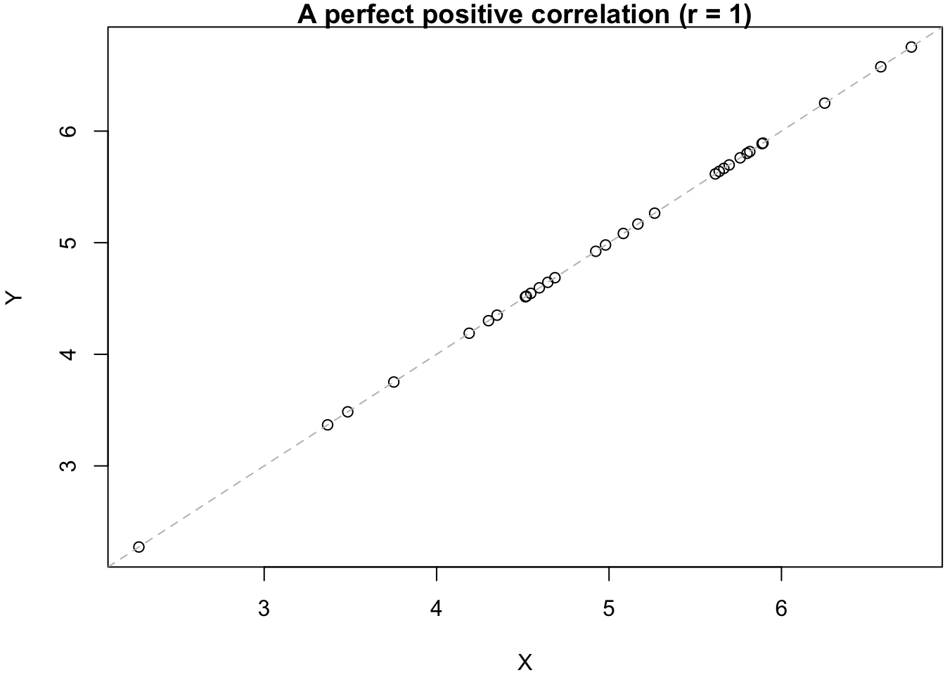
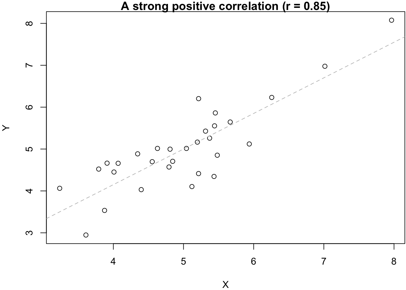
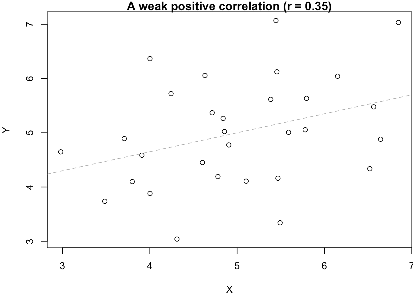
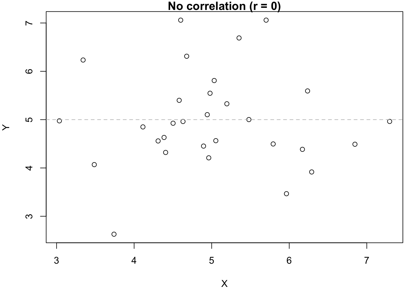
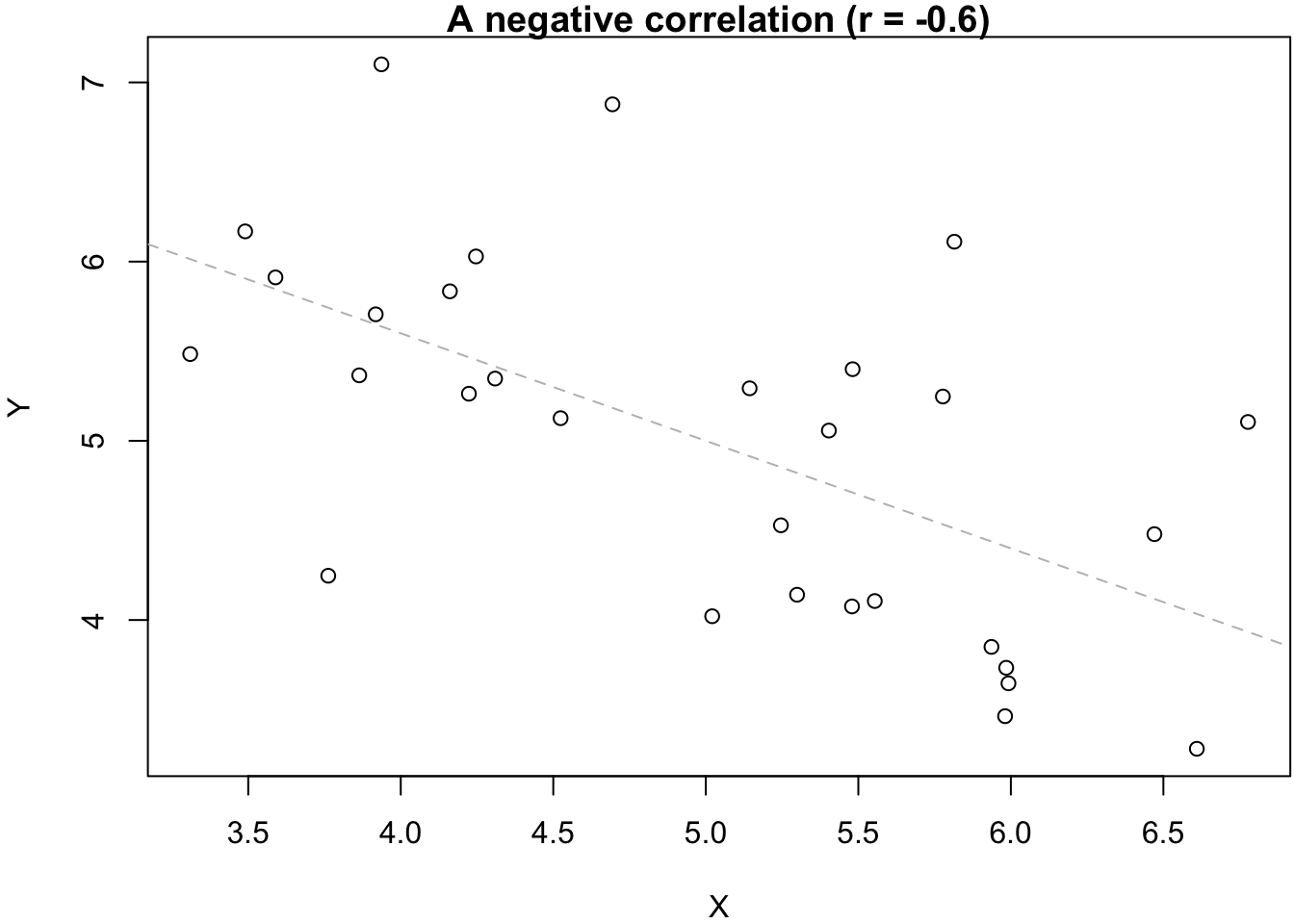
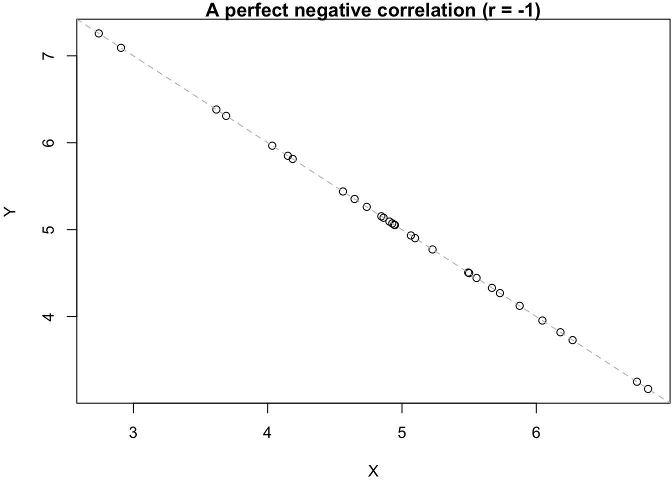
As mentioned in the Introduction, the appropriate measure for the strength of a relationship between two numeric variables is Pearson’s correlation coefficient (r), which can range between -1 and 1. Negative values of r reflect negative relationships (more X, less Y) while positive values of r indicate positive relationships (more X, more Y). An r of 0 indicates that the two variables are not correlated—that they are unrelated to each other. This is also illustrated in the six graphs below.
4.1 The cor() function
There are two ways to let R calculate the correlation coefficient. The first option is to only get the correlation coefficient by itself, without any additional statistical tests. To do this, you use the cor() function.
The cor() function is fairly easy to use:
- You need to state the two variables that you want to correlate (as
xandy); - You also need to tell
Rwhat to do with missing observations; you do this by specifying theuseoption. In this case, we tellRto use only non-missing observations (complete.obs). This is equivalent to usingna.rmin themean()orsd()functions.
cor(x = ess7$agea, y = ess7$relig_num,
    use = "complete.obs")
## [1] 0.219565
We get a correlation coefficient of 0.22. This means agea and relig_num are weakly positively correlated. This speaks for our hypothesis in general — but the relationship is not very strong.
4.2 Significance testing with cor.test()
Now that we know that there is a positive association between age and religiosity, the next question is: is this association statistically significant? In other words, is our finding only the result of random sampling variation, or is there really a systematic relationship between age and religiosity in the underlying population?
The cor.test() function allows you to run the significance test that is explained in Solbakken (2019, chhapter 5.10.2; see also Kellstedt and Whitten 2018, 183–84). To use this function, you just specify the two variables you want to use. It will take care of the NAs by itself.
- By default, the function tests if the correlation coefficient is different from 0 or not. In other words, it tests if the two variables are associated in some way, be it positive or negative. (This is also the procedure that is described by Solbakken).
- You can also let the function test more specifically if the correlation coefficient is larger than 0—if there is a positive correlation. To do that, you set the
alternativeoption to"greater". - And you can test specifically if the correlation coefficient is smaller than 0—if there is a negative relationship. In that case, you set
alternative="less".
4.2.1 Testing if the true r is equal to 0 or not (default setting)
For example, to test if there is any relationship, positive or negative, between agea and relig_num, you would just run the following:
cor.test(x = ess7$agea, y = ess7$relig_num)
##
##  Pearson's product-moment correlation
##
## data:  ess7$agea and ess7$relig_num
## t = 8.5076, df = 1429, p-value < 2.2e-16
## alternative hypothesis: true correlation is not equal to 0
## 95 percent confidence interval:
##  0.1696758 0.2683316
## sample estimates:
##      cor
## 0.219565
If you take a quick look at the output, you see under alternative what R has been testing:
- The alternative hypothesis is that the true r is not equal to 0.
- The corresponding null hypothesis (which is not specifically mentioned in the output) is then that the true r is equal to 0.
And, since you have now learned about two other statistical tests and their interpretation, you should know what to look for next: the p-value! Based on this result, can we reject the null hypothesis (see also Solbakken 2019, 5.10; Kellstedt and Whitten 2018, chap. 8)? As in the previous tutorial on the t-test, you can use format.pval() to translate the p-value into something that is a bit easier to interpret:
format.pval(2.2e-16, digits = 3, eps = 0.01)[1] "<0.01"As in the previous tutorial, the result is a very small number – smaller than 0.01.
You can read the other results as follows:
sample estimates:shows you the sample correlation coefficient, which you already know from earlier;95 percent confidence interval:is obviously the 95% confidence interval for the correlation coefficient.tis the t statistic. As explained in Solbakken (2019, 5.10; see also Kellstedt and Whitten 2018, 183), we use the t-test in this case to test if the correlation coefficient is equal to 0 or not;dfare the degrees of freedom;
4.2.2 Testing if the the true r is greater than 0
But we actually started from the more specific hypothesis that there is a positive relationship between age and relig_num—that r should be greater than 0.
To test if this is true, we need to run:
cor.test(x = ess7$agea, y = ess7$relig_num,
         alternative = "greater")
##
##  Pearson's product-moment correlation
##
## data:  ess7$agea and ess7$relig_num
## t = 8.5076, df = 1429, p-value < 2.2e-16
## alternative hypothesis: true correlation is greater than 0
## 95 percent confidence interval:
##  0.1777628 1.0000000
## sample estimates:
##      cor
## 0.219565
And if you take another quick look at the output, you see that R has been testing a different hypothesis now:
- The alternative hypothesis is now that the true r (in the population) is greater than 0.
- The corresponding null hypothesis is that the true r is equal to or smaller than 0.
As before, can we reject the null hypothesis here – and what would that mean substantively?
4.2.3 Testing if the true r is smaller than 0
Finally, let’s see what happens if we test if the true r is smaller than 0. In this case, the hypotheses are as follows:
- The alternative hypothesis is that the true r is smaller than 0.
- The corresponding null hypothesis is that the true r is equal to or larger than 0.
To test this, we set alternative="less":
cor.test(x = ess7$agea, y = ess7$relig_num,
         alternative = "less")
##
##  Pearson's product-moment correlation
##
## data:  ess7$agea and ess7$relig_num
## t = 8.5076, df = 1429, p-value = 1
## alternative hypothesis: true correlation is less than 0
## 95 percent confidence interval:
##  -1.0000000  0.2605762
## sample estimates:
##      cor
## 0.219565
Do you see the difference to the earlier results? Can you figure out what this means?
5 Visualization
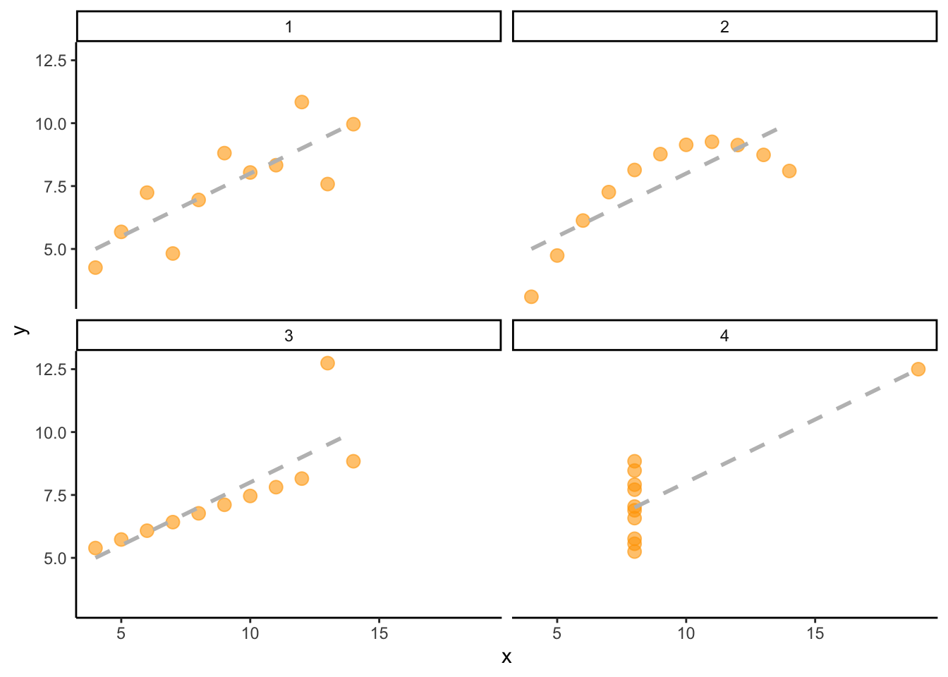
In addition to calculating correlation coefficients, it is also quite important to visualize the data. This is because two variables can have the exact same degree of correlation between them but the actual underlying relationship can be very different. The statistican Francis Anscombe famously illustrated this with the four graphs below (also known as “Anscombe’s Quartet”):3
There is technically speaking the same degree of correlation between the variables (indicated by the gray dashed lines) — but the underlying patterns are obviously very different. This is often the case when we work with real data, and it is therefore usually important to visualize relationships between two variables in addition to calculating correlation coefficients or (later) regression models.
The following parts of the tutorial show you different options for how to visualize the relationship between age and religiosity.
5.1 geom_point()
Perhaps you remember that it is fairly easy to visualize the relationship between two continuous variables with a scatter plot (i.e., with geom_point()). And this is true, in principle. In most cases, geom_point() will get the job done.
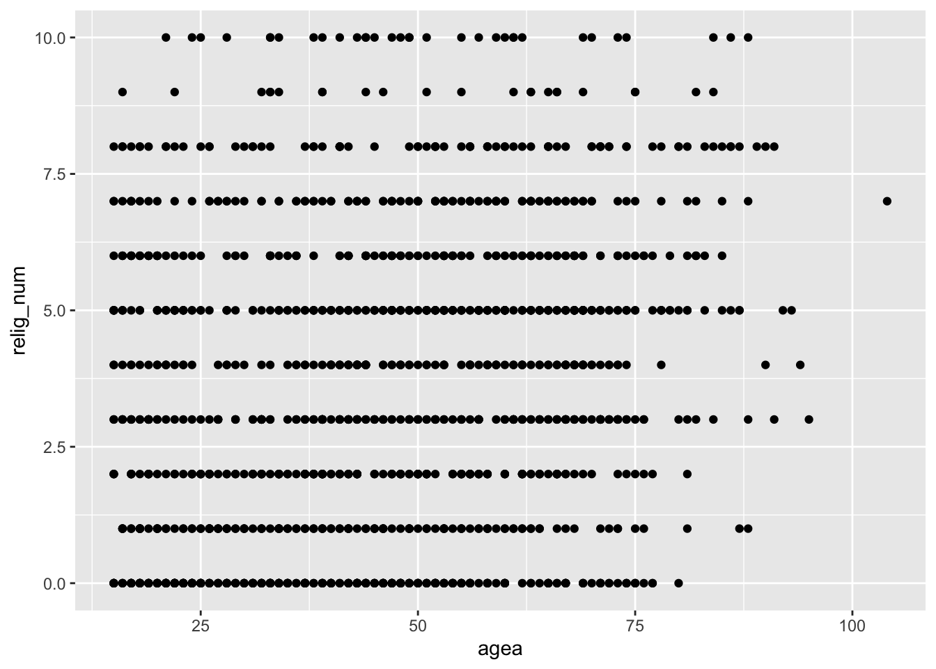
But, unfortunately, not in this case. Consider what happens when we try to visualize the data with geom_point():
ess7 %>%
  ggplot(aes(x = agea, y = relig_num)) +
    geom_point()
## Warning: Removed 5 rows containing missing values or values outside the scale range
## (`geom_point()`).
You can see clearly that, well, you cannot really see anything clearly.
The problem: While agea is a proper metric variable that can have any value between 0 and somewhere above 100, this is not the case for the relig_num variable. This variable is technically an ordinal variable and can only have whole numbers between 0 and 10 (1,2,3,…) but not any numbers in between (e.g., 1.2234, 6.2562). This means that the observations on the relig_num variable all fall into a few discrete categories, and this makes it very difficult to see where in the graph most observations are, and if there is any association in the data.
5.2 geom_jitter()
One thing you can do in this case is to “jitter” the data. “Jittering” means that you gently shake the data out of their discrete categories. In technical terms, you add a bit of random noise to the data.
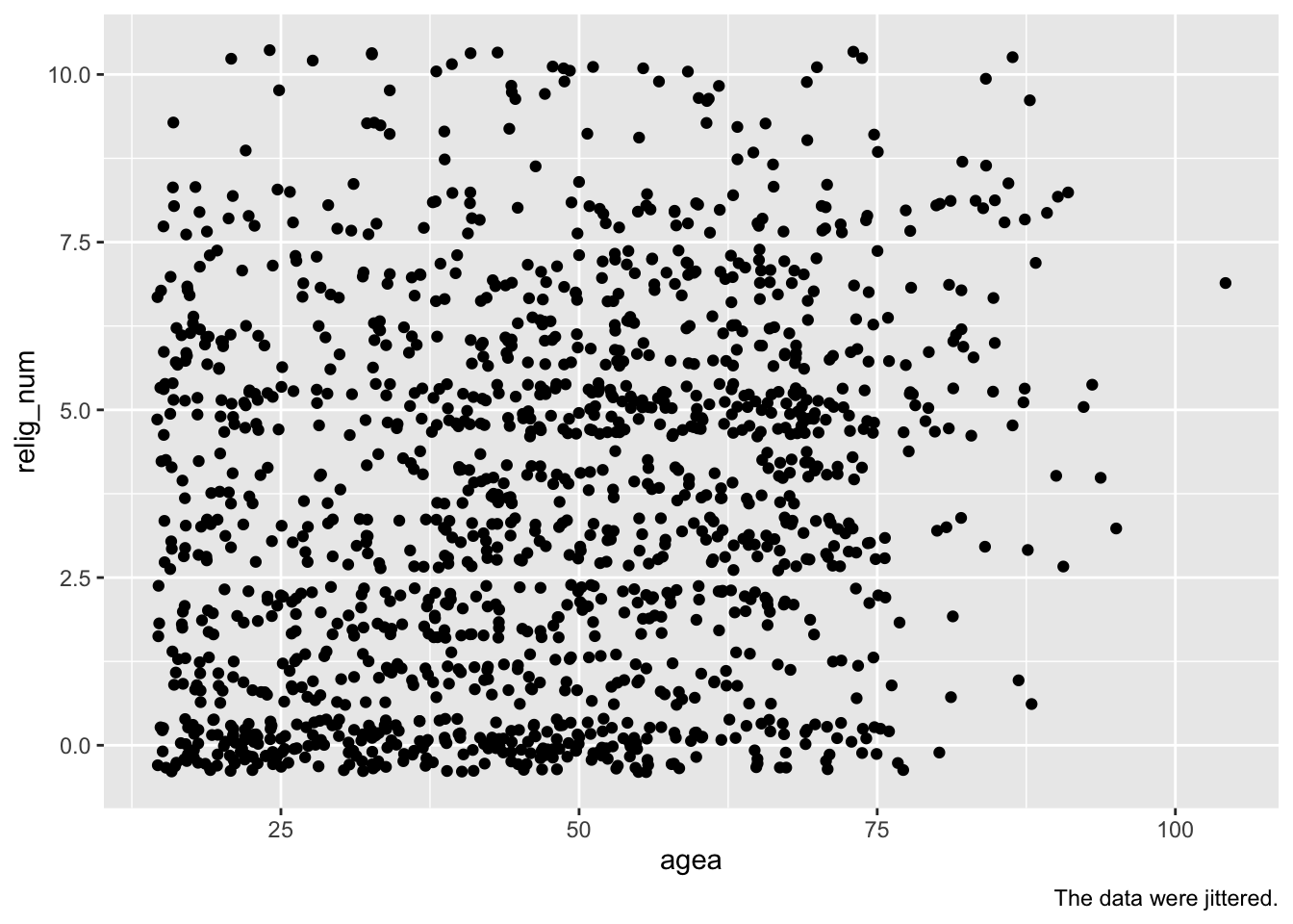
To “jitter” the data in the graph, you just replace geom_point() with geom_jitter():
ess7 %>%
  ggplot(aes(x = agea, y= relig_num)) +
    geom_jitter() +
    labs(caption = "The data were jittered.")
## Warning: Removed 5 rows containing missing values or values outside the scale range
## (`geom_point()`).
Now it is a bit easier to see where most of the observations are. Important: If you jitter your data, you need to tell your readers (e.g., by including a note with the caption option).
Still, the graph is hard to read and it is not clear what, if any, relationship there is between the data.
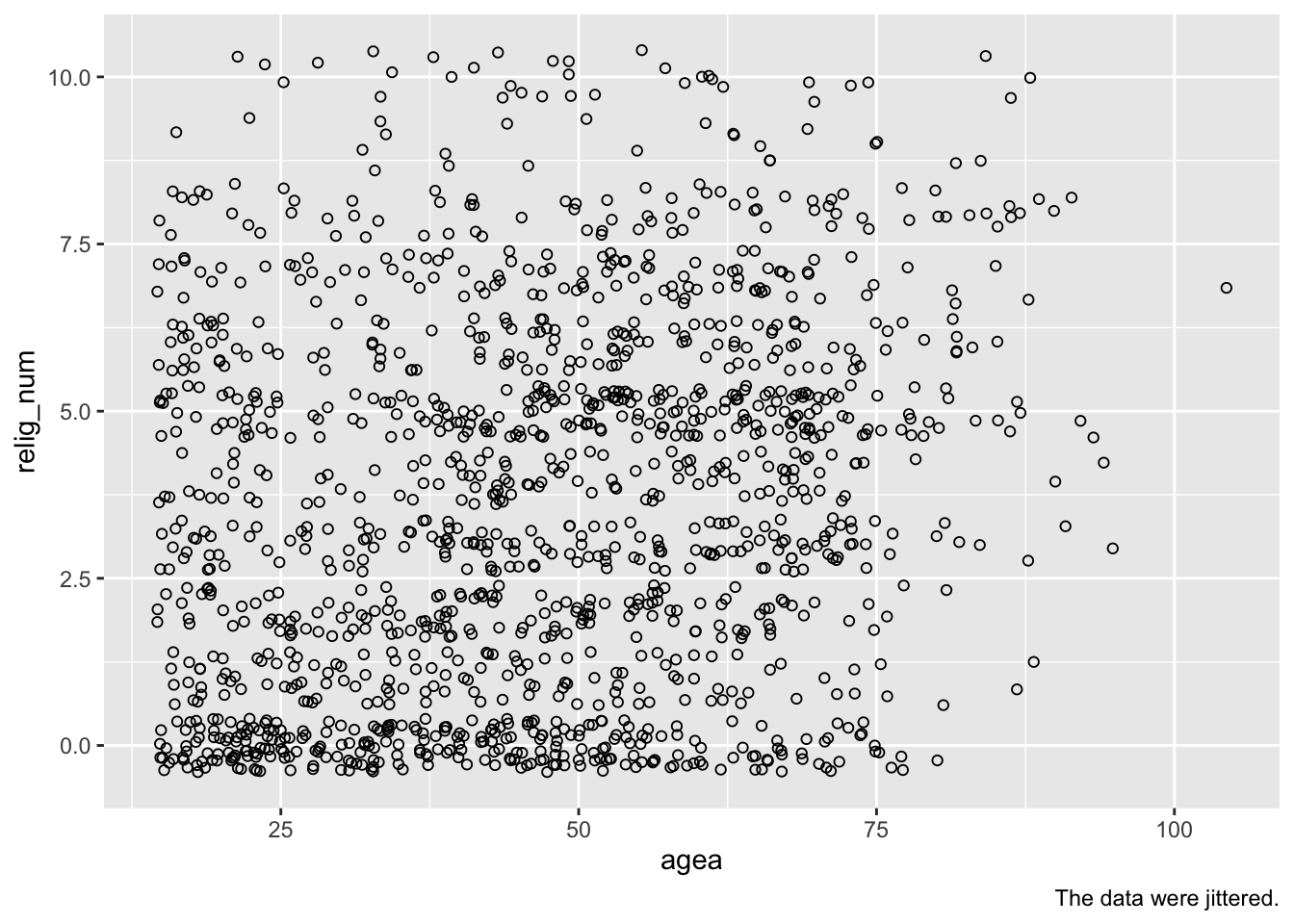
You can make it a bit easier to see where observations “pile up” by making the points more transparent. To do that, you use the alpha option within geom_jitter(). alpha can range from 0 (completely transparent/invisible) to 1 (completely intransparent/solid).
ess7 %>%
  ggplot(aes(x = agea, y = relig_num)) +
    geom_jitter(alpha = .3) +
    labs(caption = "The data were jittered.")
## Warning: Removed 5 rows containing missing values or values outside the scale range
## (`geom_point()`).
But again, the pattern in the data is still difficult to see.
5.3 geom_smooth()
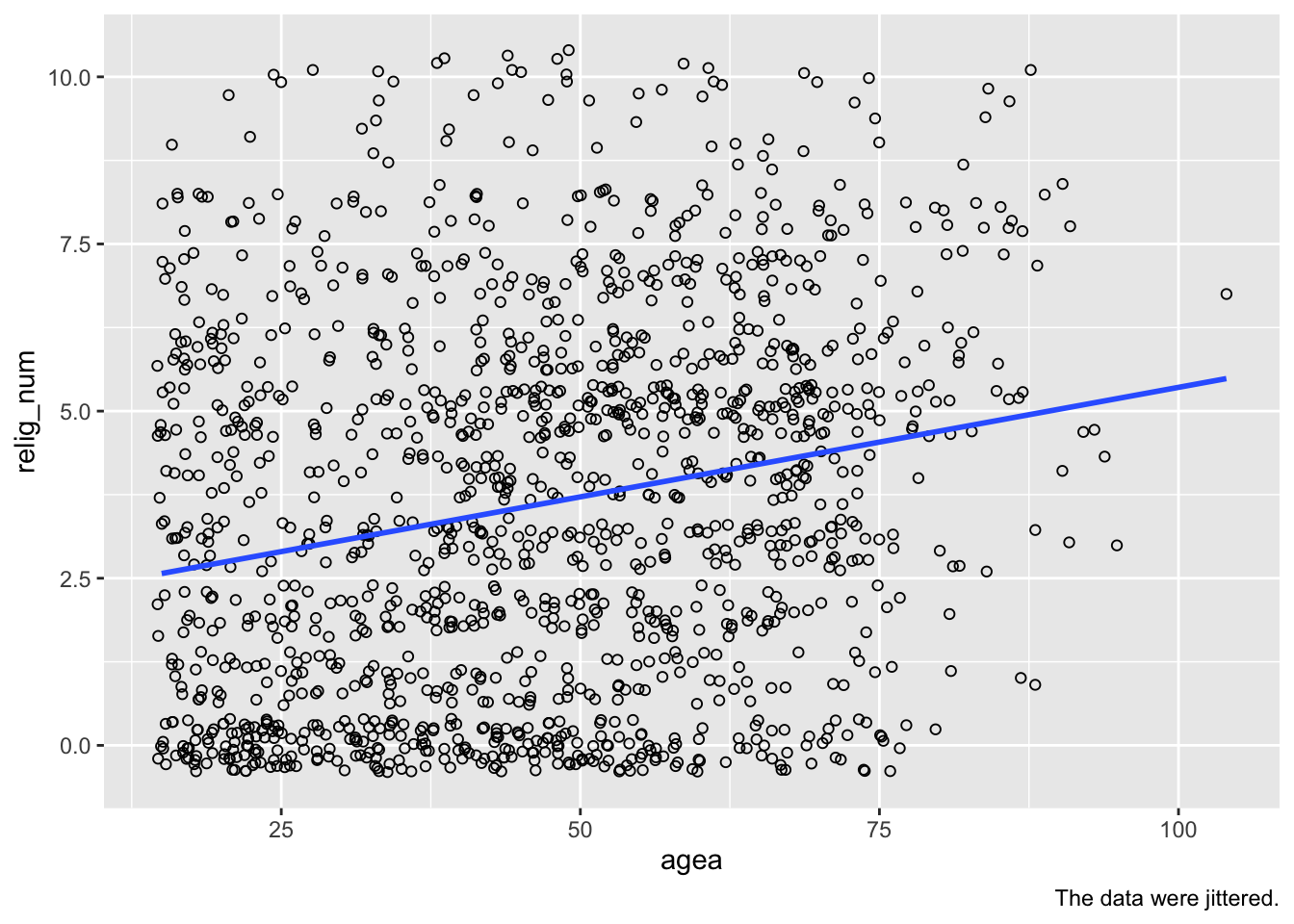
What you can do now is to add a “fitted line” to the graph. This means that R estimates a linear (i.e., OLS) regression (which you will learn about in the next weeks) and plots the predicted or “fitted” values from this estimation to the graph. This can show you more clearly any patterns in the data.
To add such a fitted line, you use geom_smooth(). Importantly, you also need to specify that you want this line to be based on a linear model (method = "lm").4 In this case, we also turn off the confidence intervals (se = FALSE), but you can of course show these if you like!
ess7 %>%
  ggplot(aes(x = agea, y = relig_num)) +
    geom_jitter(alpha = .3) +
    geom_smooth(method = "lm", se = FALSE) +
    labs(caption = "The data were jittered.")
And now you can clearly see the positive association between the two variables: As age (agea) increases, religiosity (relig_num) increases as well!
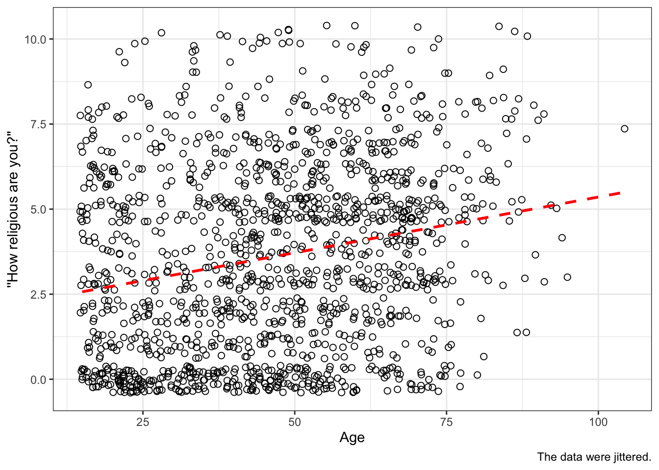
With some more polishing, we get a decent publication-quality graph:
ess7 %>%
  ggplot(aes(x = agea, y = relig_num)) +
    geom_jitter(size = 2, alpha = .3) +
    geom_smooth(method = "lm", se = FALSE,
                color = "black", linetype = "dashed") +
    labs(x = "Age", y = "''How religious are you?''",
         caption = "The data were jittered.") +
    theme_classic()
## `geom_smooth()` using formula = 'y ~ x'
## Warning: Removed 5 rows containing non-finite outside the scale range
## (`stat_smooth()`).
## Warning: Removed 5 rows containing missing values or values outside the scale range
## (`geom_point()`).
Note that we made the points a bit larger (size = 2) and changed the color and type of the fitted line.
5.4 geom_count
As mentioned in Tutorial 4, a second (and superior) way to plot relationships between quasi-numeric 0-10 scale variables is to use geom_count(). This mini-tutorial by Rosa Ottestad and Normal Sunde explains how you do that.
5.5 geom_hex()
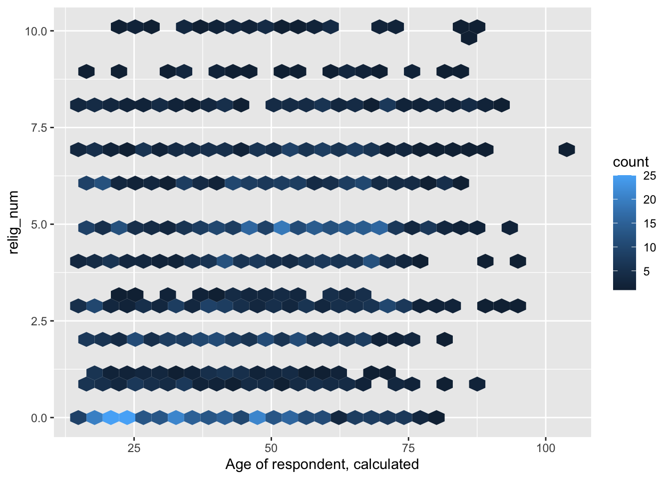
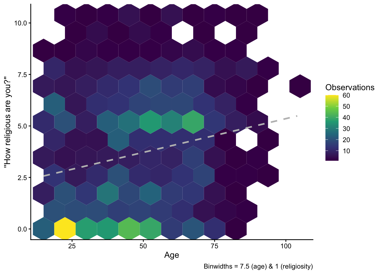
A final — and more fancy — way to visualize the data is with a so called hexbin plot. A hexbin plot is, in essence, a two-dimensional histogram: The computer (or you as the user) defines a set of “bins” to put the data into, and then visualizes the number of observations within each bin with a different shade or color. The difference to a regular histogram is that this happens in two dimensions, and the bins have a hexagonal shape.
To create a hexbin plot with ggplot(), you use geom_hex():
ess7 %>%
  ggplot(aes(x = agea, y = relig_num)) +
    geom_hex()
Warning: Removed 5 rows containing non-finite outside the scale range
(`stat_binhex()`).Obviously, this is not yet very fancy looking, so we have do a bit of polishing.
5.5.1 Adjusting the binsize
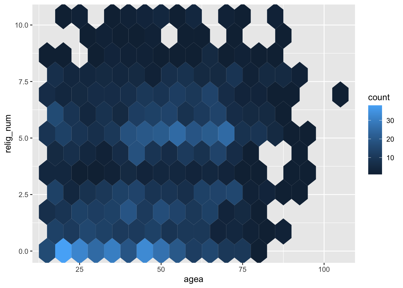
Just like with a regular histogram, we can adjust either the number of bins or the size of each bin. You may notice that the plot above uses relatively small hexagonals to group the data, and the pattern in the data might become clearer if we use larger bins. To do that, we adjust the binwidth option within geom_hex():
ess7 %>%
  ggplot(aes(x = agea, y = relig_num)) +
    geom_hex(binwidth = c(7.5,1))
Warning: Removed 5 rows containing non-finite outside the scale range
(`stat_binhex()`).Note that we specify two numbers here: The size of bins along the x-axis (7.5) and their size along the y-axis (1). Basically, we group the age-variable into 7.5-year intervals and the reliosity-variable into 1-step intervals. (You can play around with different bin sizes to see what makes most sense in your case.)
5.5.2 Adjusting the color
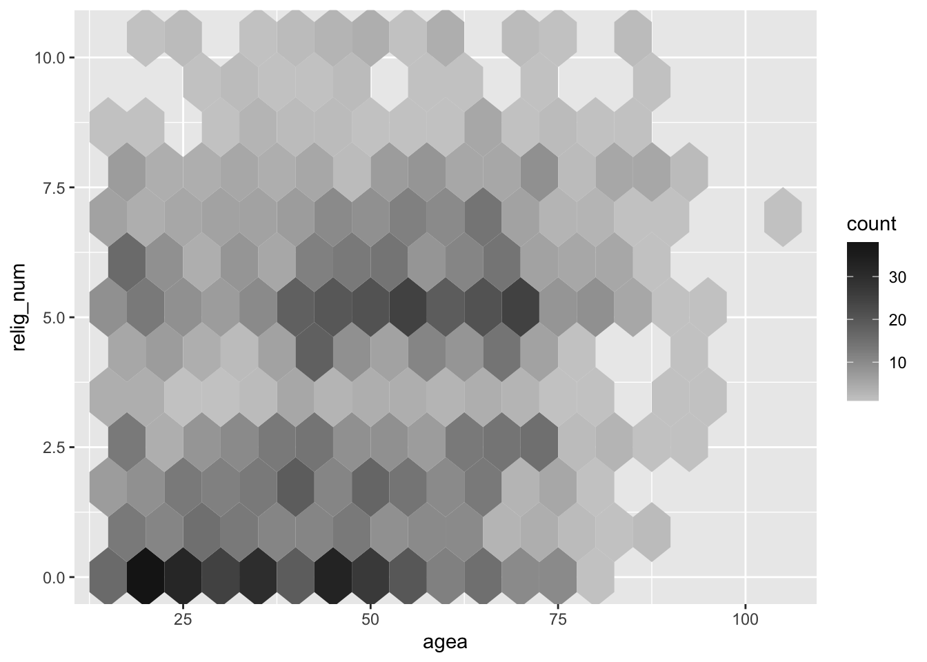
The standard blue fill color might not be ideal in all circumstances. It is also not ideal that a lighter shade means “more observations” — many readers might find the opposite more intuitive.
We can change the fill color with the scale_fill_gradient() option. Here, we specify a gray scheme (which is ideal if the result is supposed to be printed out on paper) and we declare that light shades should represent few observations and dark shades should indicate that there are many observations:
ess7 %>%
  ggplot(aes(x = agea, y = relig_num)) +
    geom_hex(binwidth = c(7.5,1)) +
    scale_fill_gradient(low = "grey80", high = "grey10")
Warning: Removed 5 rows containing non-finite outside the scale range
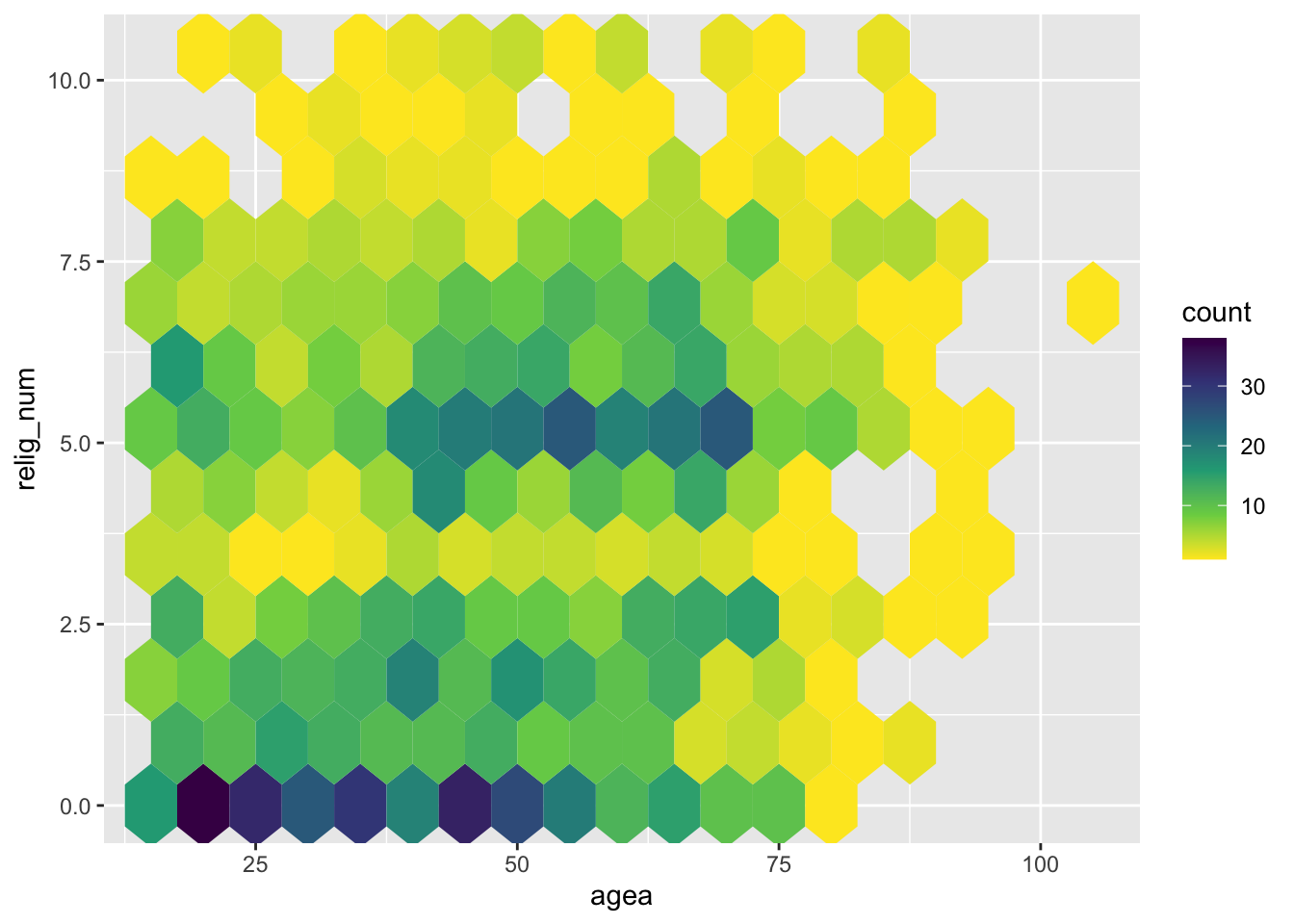
(`stat_binhex()`).Alternatively, if you really want colors, you can use the viridis color scheme, a colorblind-friendly scheme that you can call with scale_fill_viridis_c():
5.5.3 Final polishing
Finally, we can again add a fitted line, add informative labels, hide the legend, and adjust the overall theme to give the graph a more polished look:
ess7 %>%
  ggplot(aes(x = agea, y = relig_num)) +
    geom_hex(binwidth = c(7.5,1)) +
scale_fill_viridis_c() +
geom_smooth(method = "lm", se = FALSE,
color = "grey", linetype = "dashed") +
labs(x = "Age", y = "''How religious are you?''",
fill = "Observations",
caption = "Binwidths = 7.5 (age) & 1 (religiosity)") +
theme_classic()Warning: Removed 5 rows containing non-finite outside the scale range
(`stat_binhex()`).`geom_smooth()` using formula = 'y ~ x'Warning: Removed 5 rows containing non-finite outside the scale range
(`stat_smooth()`).As above, it is visible that there is a positive relationship between age and religiosity — older people tend to be more religius — but the relationship is driven mainly by two groups of observations: A larger group of younger people that is not religious at all, and people between 50 and 75 who are moderately religious. The pattern here roughly corresponds to case #3 in Anscombe’s Quartet above.
6 Conclusion
This was the last of the three tutorials on bivariate statistical tests and how you implement them in R. You now now how to look for relationships between different types of variables:
- Two categorical variables with the \(\chi^2\) test.
- One binominal and one continuous variable with the difference-of-means t-test.
- Two continuous variables with the Pearson correlation coefficient (r).
As before, there are de-bugging exercises you can do to practice more. You know the drill by now…this time: the correlation between body height and body weight.
References
Footnotes
Hout, M. and Fischer, C. S. (2014). Explaining why more Americans have no religious preference: Political backlash and generational succession, 1987-2012. Sociological Science, 1:423–447; Marwell, G. and Demerath, N. (2003). “Secularization” by any other name. American Sociological Review, 68(2):314–316.↩︎
See also Inglehart, R. (1971). The silent revolution in Europe: Intergenerational change in post-industrial societies. American Political Science Review, 65(4):991–1017.↩︎
Anscombe, F. J. (1973). Graphs in statistical analysis. The American Statistician, 27(1):17–21. The underlying data are available as a built-in dataset in
Rcalledanscombe.↩︎Otherwise,
Rwill use a fancy “smoothed” regression estimation procedure, which usually produces a very pretty result—but which is also difficult to understand. It is often better to keep it simple and just use the OLS method, which most people understand.↩︎
