library(tidyverse)Tutorial 7a: t-test
1 Introduction
The previous tutorial showed you how you can analyze relationships between two categorical variables (e.g., gender and joining a trade union). But, obviously, sometimes we are interested in relationships where the independent variable is binomial (has two distinct categories) and the dependent variable is numeric. The gender wage gap (gender and income) is one example, but there are also many others.1
This tutorial will show you how you study such relationships between binomial and numerical variables using R. More specifically, we will see if gender is related to religiosity: If women are more religious than men (or vice versa).
As in the previous tutorial, we will start right away with the real ESS dataset, but you will use the small practice dataset in the de-bugging exercises.
Hvis du ønsker å lese en norsk tekst i tillegg: “Lær deg R”, Kapittel 5.3.2
2 Hypotheses
Not long ago, women were more likely than men to have conservative social attitudes, to vote for conservative parties, and to be religious.2 More recently, this seems to have changed, however. Women are now more likely to vote for left parties and hold leftist political attitudes.3 Whether or not they have become less religious, however, is not clear.4 It is therefore worth checking if women are today still more religious than men.
Based on our (extremely brief) review of the existing scientific literature on this topic, one hypothesis would be that:
Women are more religious than men.
A second hypothesis would be that:
Women are less religious than men.
The corresponding null hypothesis is then:
Women are equally religious as men are.
3 Setup & data preparation
3.1 Setup
To do this tutorial, you only need one package: the tidyverse for data management and visualization.
3.2 Data preparation
As mentioned, we will be working with data from the ESS — as before, from round 7 (2014). And, also as previously, we will only use the data from Norway.
We will also work only with a few variables:
essround,cntry, andidno;gndr, the respondent’s gender;rlgdgr, a variable measuring how religious each respondent feels;
3.2.1 Importing the dataset
Importing the dataset works just the same way as before: You import the dataset file (here called ess7.sav) into R using haven::read_sav() and save the dataset in your Environment as ess7:
ess7 <- haven::read_dta("ess7.dta")3.2.2 Conversion & trimming
Then you convert the data to the familiar format with labelled::unlabelled():
ess7 <- labelled::unlabelled(ess7)Finally you trim the dataset to the relevant observations and variables and save the new trimmed dataset under the same name:
ess7 %>%
  filter(cntry=="NO") %>%
  select(essround,cntry,idno,gndr,rlgdgr) -> ess7
If you like, you can also create a dictionary for the final dataset:
dict <- labelled::generate_dictionary(ess7)3.3 Initial EDA
As before, it is important to take a look at the main variables and how they are stored so that you know if you may have to do further data transformations.
A good start is to use the attributes() function, starting here with the gndr variable:
attributes(ess7$gndr)
## $levels
## [1] "Male"   "Female"
##
## $label
## [1] "Gender"
##
## $class
## [1] "factor"
The gndr variable is stored as a factor, which is good because gender is a categorical variable.
Just to confirm, you can use the table() function to let R show you how many observations you have per category:
table(ess7$gndr)
##
##   Male Female
##    764    672
Now that gndr is taken care off, you can repeat the exercise with the rlgdgr (“How religious are you?”) variable, the dependent variable here:
attributes(ess7$rlgdgr)
## $levels
##  [1] "Not at all religious" "1"                    "2"
##  [4] "3"                    "4"                    "5"
##  [7] "6"                    "7"                    "8"
## [10] "9"                    "Very religious"
##
## $label
## [1] "How religious are you"
##
## $class
## [1] "factor"
The variable ranges from “Not at all religious” to “Very religious” on a scale from 0 to 10. Before proceeding, it makes sense to see how many observations you have per category:
table(ess7$rlgdgr)
##
## Not at all religious                    1                    2
##                  288                  128                  147
##                    3                    4                    5
##                  160                  116                  221
##                    6                    7                    8
##                  131                  104                   79
##                    9       Very religious
##                   23                   34
Luckily, the “missing” categories are empty!
Because the variable ranges from 0 to 10, you can treat it as a numeric variable. But: The output above tells you that the variable is stored as a factor, like the gndr variable. If you want to use in calculations or statistical tests, you first need to convert it to numeric — and here the problem is that the labels and underlying numerical values do not exactly correspond (you may recall the problem from Tutorial 3).
You can see this if you quickly use the visfactor() function from bst290 (loading the package is not needed):
bst290::visfactor(variable = "rlgdgr", dataset = ess7)
##  values               labels
##       1 Not at all religious
##       2                    1
##       3                    2
##       4                    3
##       5                    4
##       6                    5
##       7                    6
##       8                    7
##       9                    8
##      10                    9
##      11       Very religious
But you might also remember how you can fix this: Convert to numeric with as.numeric(), but subtract 1 to account for the label-value divergence:
ess7$relig_num <- as.numeric(ess7$rlgdgr) - 1This is also a good chance to save the new numeric version with a decent name — who wants to twist their fingers into a knot every time they type a variable name?!
4 Visual analysis
Now that you have both your variables ready to go, you can do a first visual inspection to see if there are interesting patterns in the data.
The hypotheses predict gender differences in religiosity, so it would make most sense to calculate the average level of religiosity for both men and women and see if they differ. That difference can then be shown graphically.
4.1 Option 1: Bar graph
You might remember (from Tutorials 3 and 4) how you can calculate summary statistics of one variable over the categories of another — and then directly visualize the result in a bar graph: with group_by() and summarize(), plus the pipe (%>%) to link all steps together!
First, the calculation:
ess7 %>%
  group_by(gndr) %>%
  summarize(avgrel = mean(relig_num, na.rm = T))
## # A tibble: 2 × 2
##   gndr   avgrel
##   <fct>   <dbl>
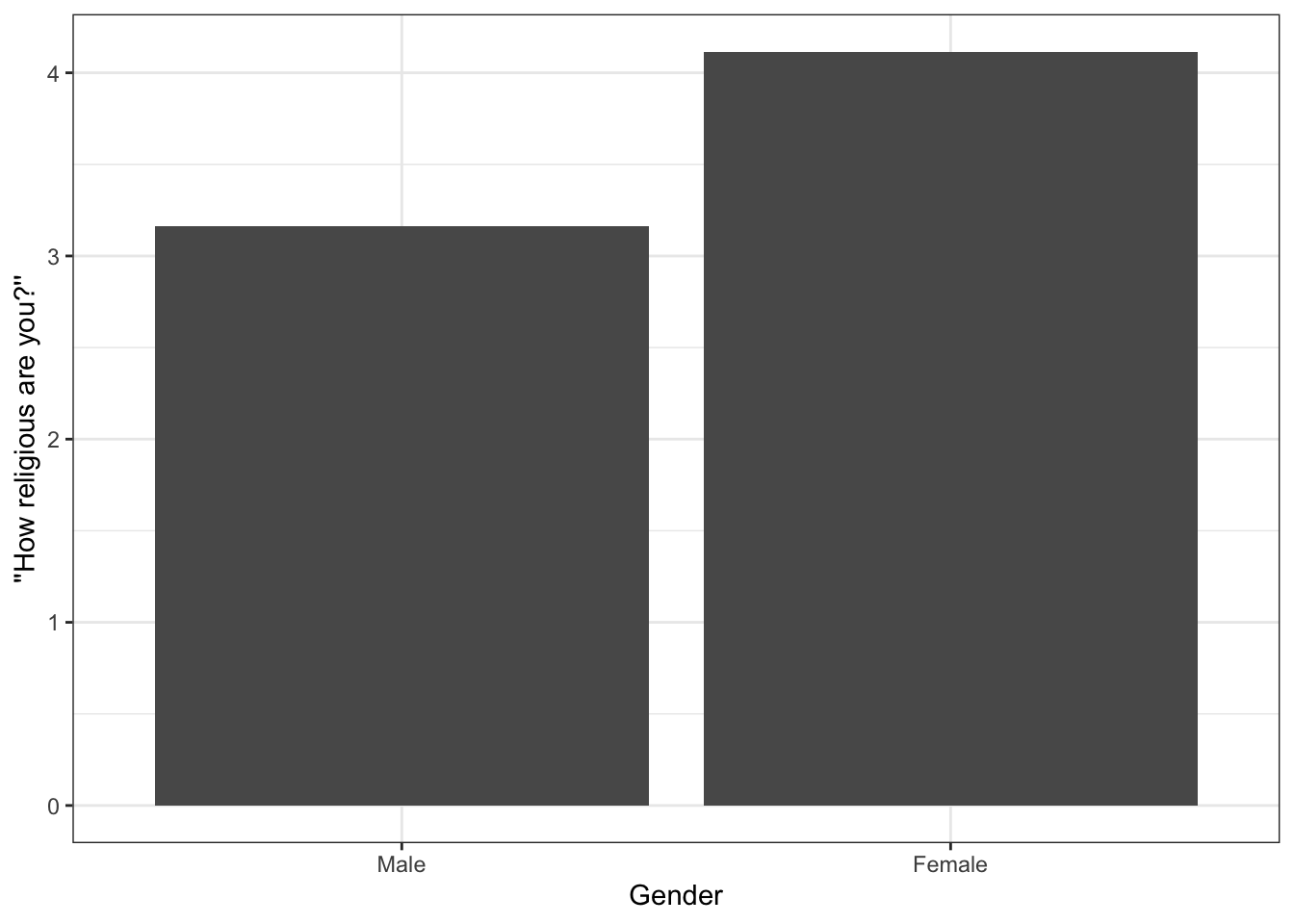
## 1 Male     3.16
## 2 Female   4.11
It turns out that women (in Norway) are indeed more religious, on average, than men.
As you know, you can then feed the result directly into a ggplot2 bar graph:
ess7 %>%
  group_by(gndr) %>%
  summarize(avgrel = mean(relig_num, na.rm = T)) %>%
  ggplot(aes(x = gndr, y = avgrel)) +
    geom_bar(stat = "identity") +
    labs(x = "Gender", y = "''How religious are you?''") +
    theme_bw()
The difference between men and women when it comes to their religiosity is directly apparent. Also interesting: Despite the between-gender differences, the two means are both relatively low (3 and 4 on a 0-10 scale). Overall, Norwegians are tending toward not being very religious.
4.2 Option 2: Boxplot
While a bar graph is a good way to represent group differences, you can also use a boxplot. As you know from the previous tutorial on Data Visualization, you can create a bivariate boxplot like this:
- You specify the grouping variable (
gndr) as the variable that goes on the x-axis, and… - …the outcome variable (
relig_num) as the variable for the y-axis; - Then you just add a
geom_boxplot()geometric object layer to draw the boxplots;
The code and result looks like this:
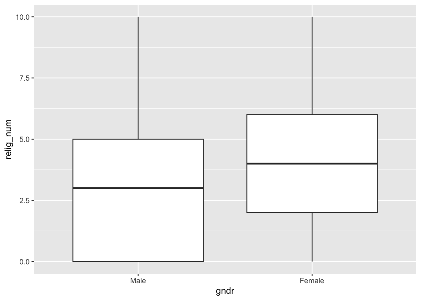
ess7 %>%
  ggplot(aes(y = relig_num, x = gndr)) +
    geom_boxplot()
## Warning: Removed 5 rows containing non-finite outside the scale range
## (`stat_boxplot()`).
The difference between the two groups is quite easy to see.
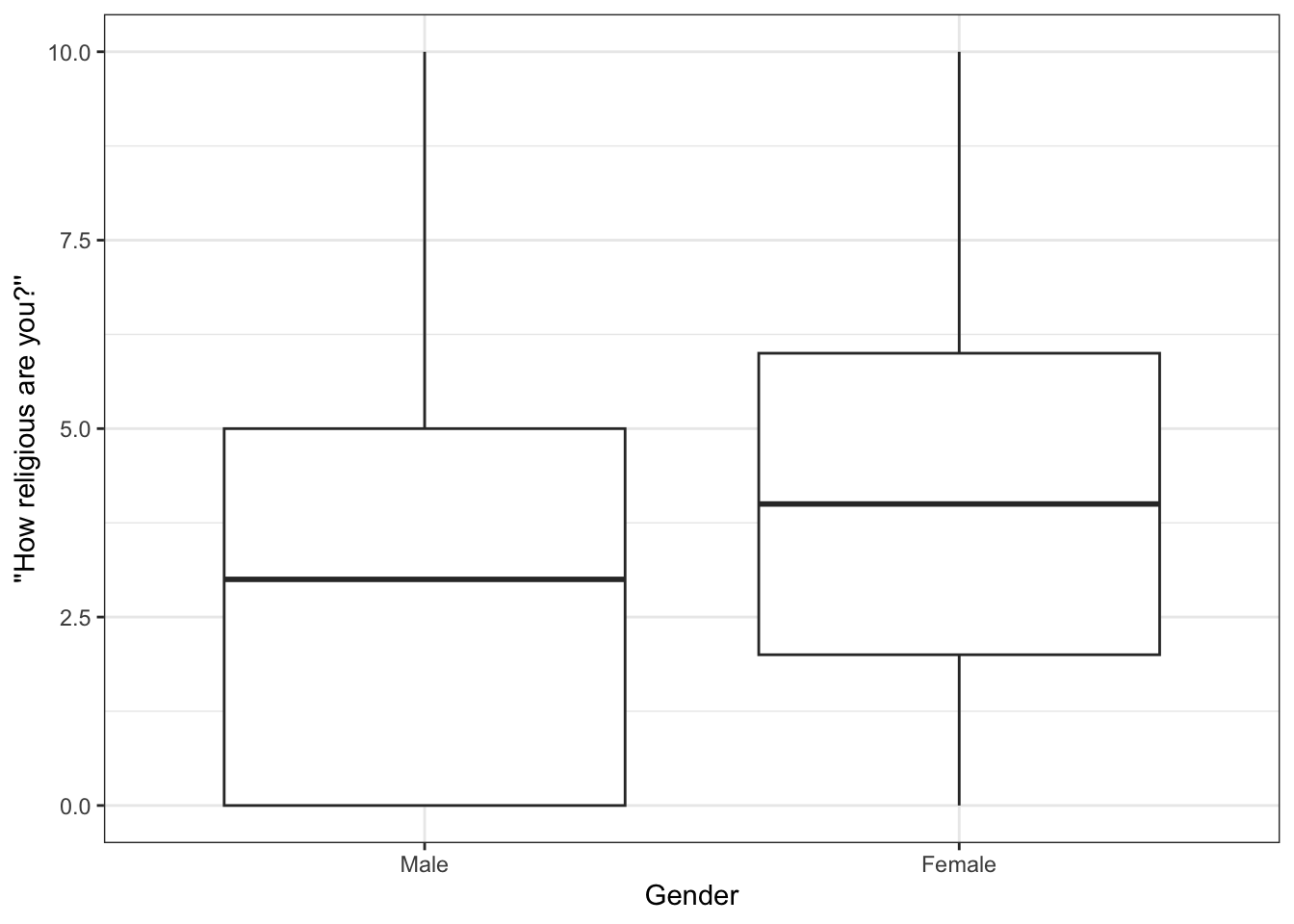
If you like, you can then also polish the graph a bit more:
5 Statistical test
We have found that the men and women in our sample differ in their average levels of religiosity, with women being on average more religious than men. But: Is this difference also statistically significant? In other words, does the difference we found in the ESS data really reflect a true difference in the general Norwegian population, or is it simply a result of sampling variation (the random variation in the data that result from the fact that we are only working with a sample of the entire population)?
We can find out with a formal statistical test. In this case, since our independent variable (gender) is binomial (categorical, with two distinct categories) and the dependent variable is numeric (religiosity), the appropriate test is the difference-of-means t-test.
5.1 The t.test() function
You already know the t.test() function from the tutorial on confidence intervals — and this is obviously also the function to use here.
To run a t-test with the t.test() function, you just have to enter your dependent and independent variables separated by a ~ (tilde) plus the dataset:
t.test(relig_num ~ gndr,
       data = ess7)
The most important part is the formula-part: relig_num ~ gndr. Here, we specify that we want to know if religiosity (relig_num) differs significantly between the genders (gndr). This is the part that you need to get right when you use this test! Generally: outcome ~ group (see also the help file under ?t.test()).
5.2 Interpretation
Let’s look at the result:
t.test(relig_num ~ gndr,
       data = ess7)
##
##  Welch Two Sample t-test
##
## data:  relig_num by gndr
## t = -6.5321, df = 1372.3, p-value = 9.11e-11
## alternative hypothesis: true difference in means between group Male and group Female is not equal to 0
## 95 percent confidence interval:
##  -1.2378751 -0.6660886
## sample estimates:
##   mean in group Male mean in group Female
##             3.162943             4.114925
As always in R, the output is not very polished but it just takes a bit of practice to read this:
- Start at the bottom, where it says
sample estimates: This reports the simple group averages in the dependent variable — and you already know these numbers: The average ofrelig_numfor men is around 3.16, while the average for women is around 4.11 (see also Section 4 above). - Under
alternative hypothesis,Rtells you what you are testing here: Is there a significant difference between the group averages for men and women? - Now to the ‘meat part’, right under
data:- You get the t-statistic: -6.532. In this case, this number reflects the ratio of the mean differences and their standard error — or the ‘signal-to-noise’ ratio (see also Solbakken 2019, 170).
dfare the degrees of freedom.p-valueis, obviously, the p-value.Rgives you this number in the scientific notation. It corresponds to 0.00000000009109578 or a 0 followed by 10 more 0s and then 9.1… — a very small number.
R has a little helper function called format.pval() that can be useful when you need to decipher a cryptic p-value shown in scientific notation. To use it, you just paste the p-value you get from t.test() (or any other test that returns a p-value) into format.pval(). It is also useful to specify the number of significant (non-zero) numbers after the comma you want shown and the level of precision you want. Here, we want up to three numbers after the comma (with digits=3) and that any p-value that is smaller than 0.01 should just be shown as < 0.01 (with eps=0.01):
format.pval(9.11e-11, digits = 3, eps = 0.01)[1] "<0.01"As above, the p-value we got is very small – smaller than 0.01 in any case.
Now to the interesting part: What does all of this mean? Try to interpret the results based on the explanation in Solbakken (2019, 5.10.3)
6 Conclusion
Many important political and social questions are about differences between groups: Do men earn more than women? Are workers more in favor of left parties than “capitalists”? Do immigrants experience more discrimination than the native-born?
You now know how you can answer this type of question using survey data and R, specifically using the difference-of-means t-test.
You can find de-bugging exercises in the usual spot. There, you will test if men and women differ in their body heights.
7 (Voluntary) “Welch test?!”
You may have noticed that the test result also says “Welch Two Sample t-test”, and you may wonder where the “Welch” comes from.
To explain: The conventional t-test procedure makes a particular assumption about the underlying data. Specifically, it assumes that the two groups you compare have equal variances — that the data are about equally ‘noisy’ in each group.
This assumption is obviously not always justified, however — and the “Welch’s” test procedure does not make this assumption. R runs by default the more flexible Welch test, just to be safe.
Despite the difference in assumptions, both tests are interpreted the same way and should (usually) produce about the same results.
You can tell R to use the conventional procedure if you set the var.equal option to TRUE (if you state explicitly that you are willing to assume that both groups have equal variances):
t.test(relig_num ~ gndr,
       data = ess7,
       var.equal = TRUE)
##
##  Two Sample t-test
##
## data:  relig_num by gndr
## t = -6.5639, df = 1429, p-value = 7.314e-11
## alternative hypothesis: true difference in means between group Male and group Female is not equal to 0
## 95 percent confidence interval:
##  -1.2364828 -0.6674809
## sample estimates:
##   mean in group Male mean in group Female
##             3.162943             4.114925
Now compare this result to the one from before:
t.test(relig_num ~ gndr,
       data = ess7)
##
##  Welch Two Sample t-test
##
## data:  relig_num by gndr
## t = -6.5321, df = 1372.3, p-value = 9.11e-11
## alternative hypothesis: true difference in means between group Male and group Female is not equal to 0
## 95 percent confidence interval:
##  -1.2378751 -0.6660886
## sample estimates:
##   mean in group Male mean in group Female
##             3.162943             4.114925
The results are basically the same as above.
References
Footnotes
On the gender wage gap see e.g., Blau and Kahn (2000). Gender differences in pay. Journal of Economic Perspectives, 14(4):75–99.↩︎
Inglehart and Norris (2000). The developmental theory of the gender gap: Women’s and men’s voting behavior in global perspective. International Political Science Review, 21(4):441–463.↩︎
Iversen, T. and Rosenbluth, F. (2010). Women, Work, & Politics: The Political Economy of Gender Inequality. Yale University Press, New Haven and London.↩︎
Voas, D., McAndrew, S., and Storm, I. (2013). Modernization and the gender gap in religiosity: Evidence from cross-national European surveys. KZfSS Kölner Zeitschrift für Soziologie und Sozialpsychologie, 65(1):259–283.↩︎


