The default way to visualize the relationship between two numeric variables is a scatterplot, which can be drawn with the geom_point() function in ggplot2. Often, however, we work with variables that are only quasi-numeric. These variables are, strictly speaking, not numeric but ordinal, yet they have enough categories to allow us to treat them as if they were numeric. Typical examples are measurements of political ideology on 0-10 left-right scales in public opinion surveys or measurements of trust in political actors in the European Social Survey (ESS), which are also on 0-10 scales.
The problem with these variables is that observations can only have a limited number of values: The (integer) numbers from 0 to 10, but nothing in between. When plotting these types of variables with geom_point(), this leads to overplotting: many different observations that have the exact same values are “stacked” on top of each other. In this case, any patterns or relationships between the variables that are plotted are often difficult to see.
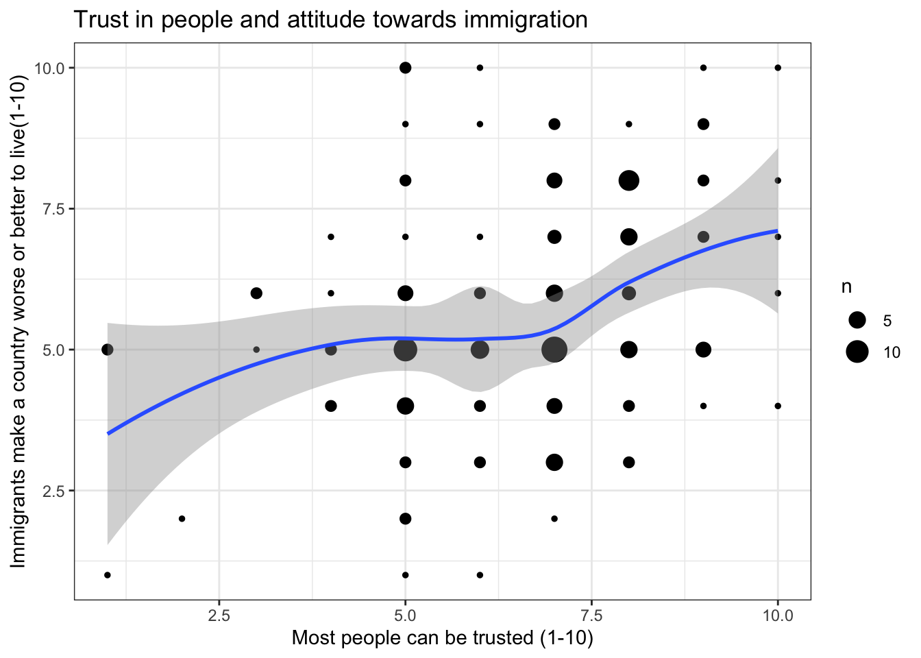
The geom_count() function in ggplot2 addresses this by adding up all duplicate values and then visualizing the number (“count”) of all observations with same values in the form of differently sized circles. A LOESS curve can then be added to show the overall pattern without assuming a linear relationship. This technique is especially useful for quasi-continuous variables, such as political trust, happiness, or attitudes toward immigrants in the ESS.
We show how to do this with example data from the ESS as contained in the bst290 package.
2 Example analysis
2.1 Setup & data management
The following two packages are required for this:
library(tidyverse)
── Attaching core tidyverse packages ──────────────────────── tidyverse 2.0.0 ──
✔ dplyr     1.1.4     ✔ readr     2.1.5
✔ forcats   1.0.0     ✔ stringr   1.5.1
✔ ggplot2   4.0.0     ✔ tibble    3.2.1
✔ lubridate 1.9.4     ✔ tidyr     1.3.1
✔ purrr     1.0.4
── Conflicts ────────────────────────────────────────── tidyverse_conflicts() ──
✖ dplyr::filter() masks stats::filter()
✖ dplyr::lag()    masks stats::lag()
ℹ Use the conflicted package (<http://conflicted.r-lib.org/>) to force all conflicts to become errors
library(bst290)
Then we load the dataset:
ess <- bst290::ess
We focus on the following two variables from the dataset:
ppltrst: Most people can be trusted (0-10)
imwbcnt: Immigrants make a country worse or better place to live (0-10)
Before plotting, we convert these variables to the numeric format:
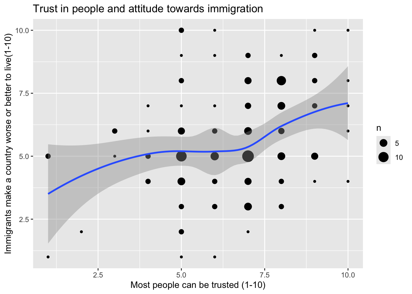
The code to plot the relationship between these variables (and the result) looks as follows:
ggplot(data = ess,aes(x = ppltrst,y = imwbcnt))+geom_count()+geom_smooth(method = loess)+labs(x ="Most people can be trusted (1-10)",y ="Immigrants make a country worse or better to live(1-10)",title ="Trust in people and attitude towards immigration")+theme_bw()
Warning: Removed 2 rows containing non-finite outside the scale range
(`stat_sum()`).
`geom_smooth()` using formula = 'y ~ x'
Warning: Removed 2 rows containing non-finite outside the scale range
(`stat_smooth()`).
2.3 The process, step-by-step
2.3.1 Starting with ggplot()
The ggplot() function is the foundation of any plot in ggplot2:
ggplot()
2.3.2 Define the dataset
Specify the dataset you want to use. In this case we are using the ESS practice dataset:
ggplot(data = ess)
2.3.3 Set the aesthetics (axes and variables)
Define which variables you’d like to use and on which axes:
ggplot(data = ess,aes(x = ppltrst, y = imwbcnt))
This places ppltrst on the x-axis and imwbcnt on the y-axis. Your independent variable should always be on the x-axis (bottom) and your dependent variable should always be on the y-axis (the left side).
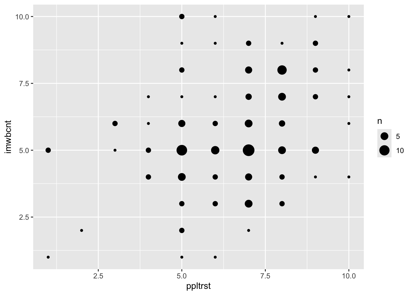
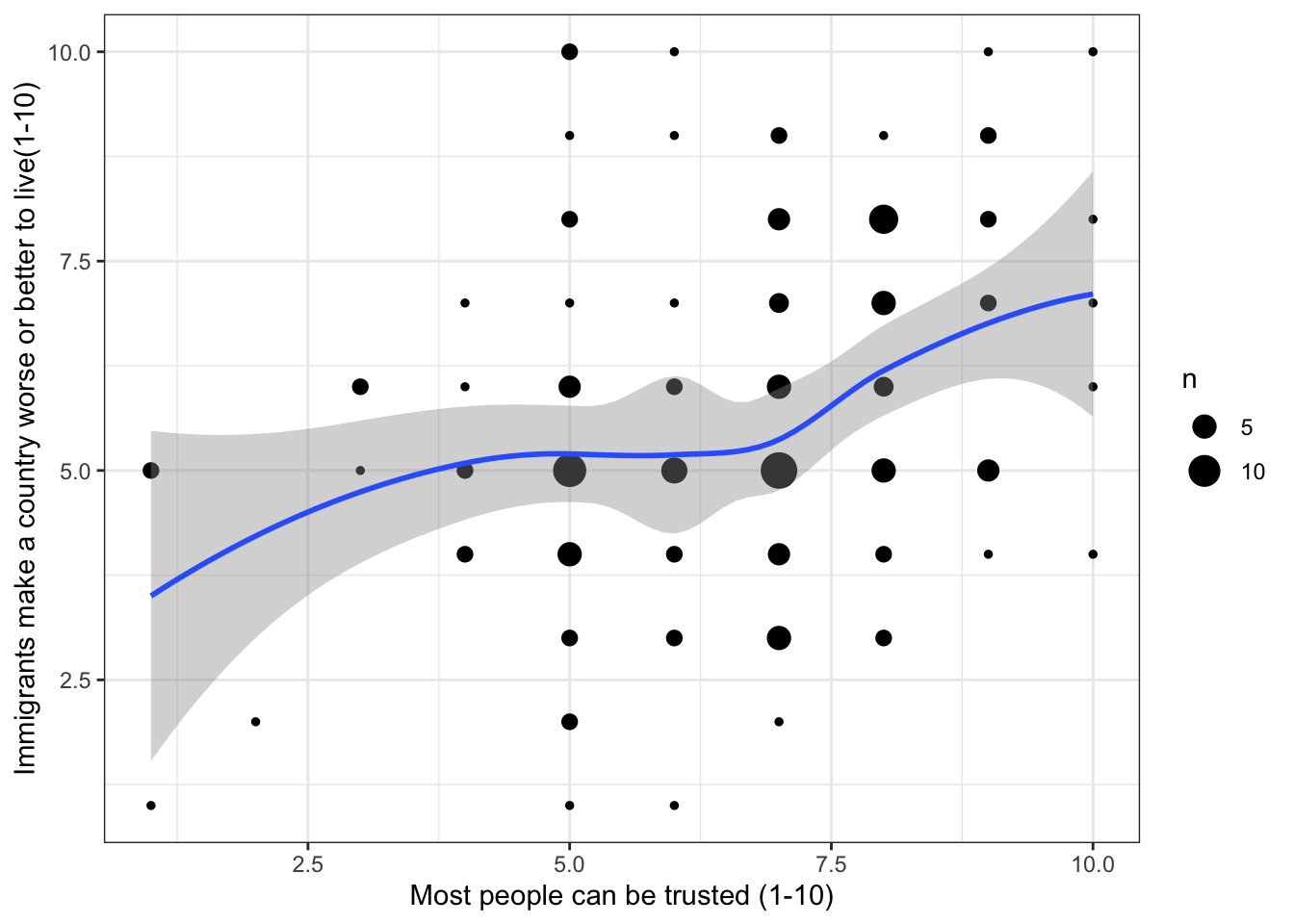
2.3.4 Add graph contents with geom_count()
The next step here is to add geom_count() to plot the overlapping points:
Warning: Removed 2 rows containing non-finite outside the scale range
(`stat_sum()`).
`geom_smooth()` using formula = 'y ~ x'
Warning: Removed 2 rows containing non-finite outside the scale range
(`stat_smooth()`).
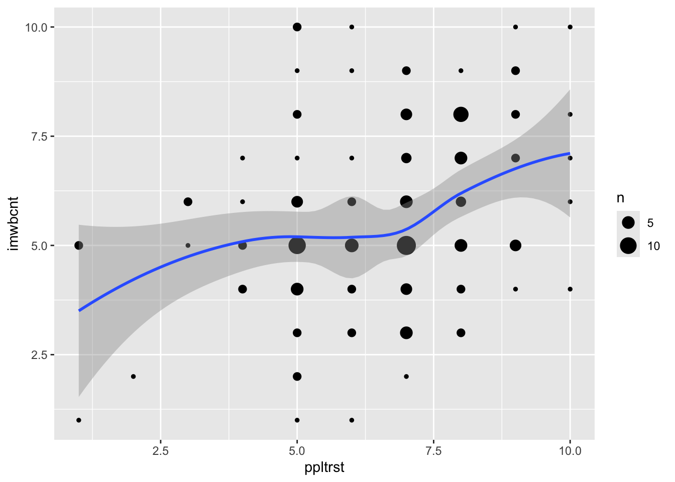
2.3.6 dd informative labels
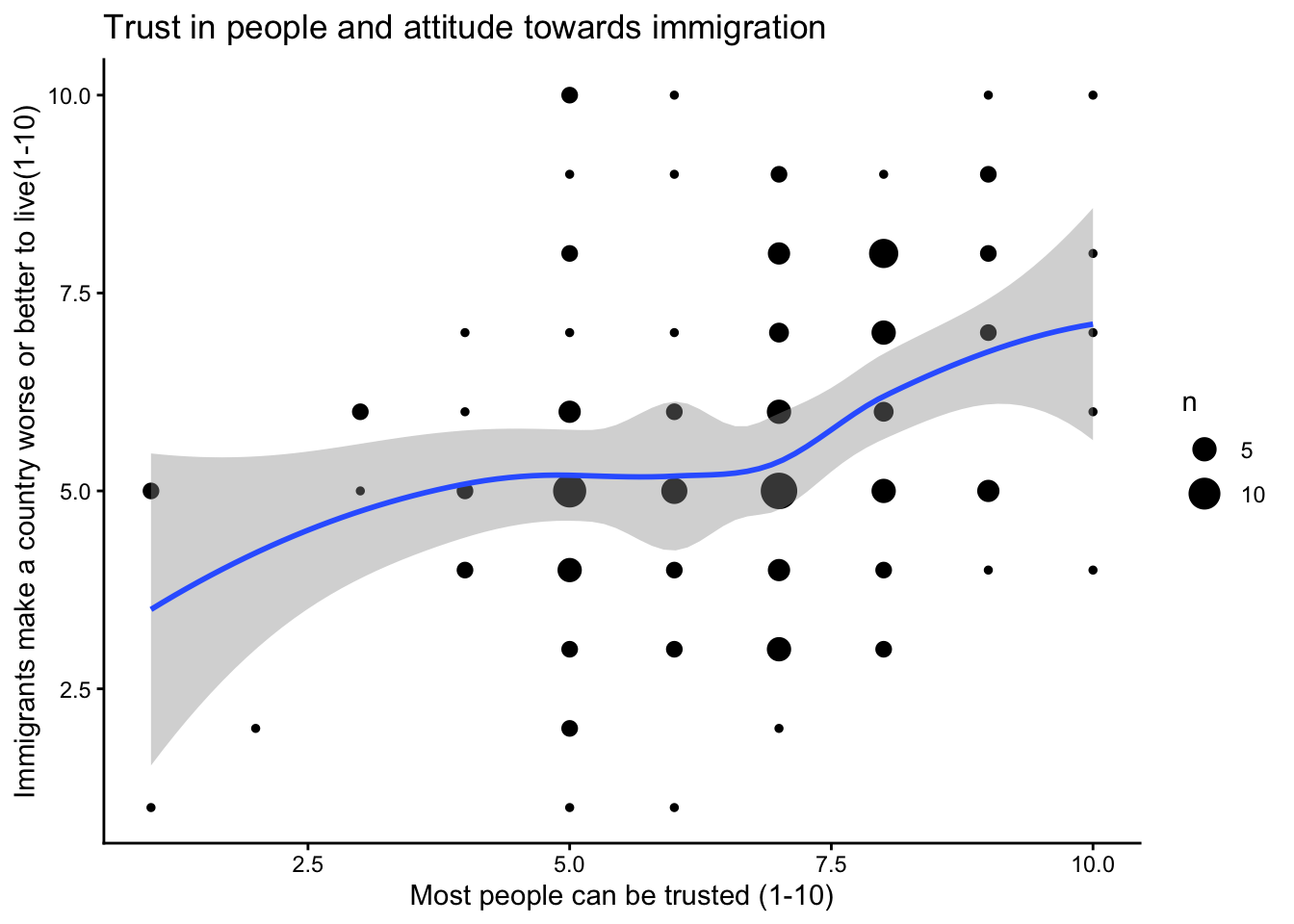
To finish your graph, add the labels to your axes and a title as you normally would:
ggplot(data = ess,aes(x = ppltrst,y = imwbcnt))+geom_count()+geom_smooth(method = loess)+labs(x ="Most people can be trusted (1-10)",y ="Immigrants make a country worse or better to live(1-10)",title ="Trust in people and attitude towards immigration")
Warning: Removed 2 rows containing non-finite outside the scale range
(`stat_sum()`).
`geom_smooth()` using formula = 'y ~ x'
Warning: Removed 2 rows containing non-finite outside the scale range
(`stat_smooth()`).
2.3.7 Add theme
Want to score some extra points with your professor? Add a more classic theme (look) to your graph:
ggplot(data = ess,aes(x = ppltrst,y = imwbcnt)) +geom_count()+geom_smooth(method = loess) +labs(x ="Most people can be trusted (1-10)",y ="Immigrants make a country worse or better to live(1-10)",Title ="Trust in people and attitude towards immigration") +theme_bw()
Ignoring unknown labels:
• Title : "Trust in people and attitude towards immigration"
Warning: Removed 2 rows containing non-finite outside the scale range
(`stat_sum()`).
`geom_smooth()` using formula = 'y ~ x'
Warning: Removed 2 rows containing non-finite outside the scale range
(`stat_smooth()`).
Or:
ggplot(data = ess,aes(x = ppltrst,y = imwbcnt))+geom_count()+geom_smooth(method = loess )+labs(x ="Most people can be trusted (1-10)",y ="Immigrants make a country worse or better to live(1-10)",title ="Trust in people and attitude towards immigration")+theme_classic()
Warning: Removed 2 rows containing non-finite outside the scale range
(`stat_sum()`).
`geom_smooth()` using formula = 'y ~ x'
Warning: Removed 2 rows containing non-finite outside the scale range
(`stat_smooth()`).