This tutorial shows how you can simulate many, many different iterations of a fictional survey study – and how the different results are, collectively, distributed. In other words, it shows you the main idea behind the Central Limit Theorem and how it is used in applied social research to learn about a population based on small random samples.
Important: Some of these simulations take a few minutes to run. Be patient.
1.1 Setup
These are the packages you’ll need (use install.packages() to install anything that is missing, which is likely ggpubr):
library(tidyverse)
── Attaching core tidyverse packages ──────────────────────── tidyverse 2.0.0 ──
✔ dplyr     1.1.4     ✔ readr     2.1.5
✔ forcats   1.0.0     ✔ stringr   1.5.1
✔ ggplot2   4.0.0     ✔ tibble    3.2.1
✔ lubridate 1.9.4     ✔ tidyr     1.3.1
✔ purrr     1.2.0
── Conflicts ────────────────────────────────────────── tidyverse_conflicts() ──
✖ dplyr::filter() masks stats::filter()
✖ dplyr::lag()    masks stats::lag()
ℹ Use the conflicted package (<http://conflicted.r-lib.org/>) to force all conflicts to become errors
theme_set(theme_classic())library(ggpubr)
2 Simulating a population and drawing many samples from it
2.1 Simulating our fictional population
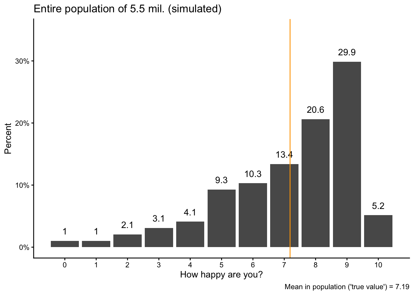
Imagine that we want to figure out the average level of happiness in a country similar to Norway, with a population of 5.5 million people. We measure happiness on a 0-10 scale.
In R, we can create or simulate a such a population of 5.5 million individuals and their levels of happiness with a few lines of code, as shown below. The main tool we use here is the sample() function, which – as the same suggests – samples randomly from a pre-specified set of numbers.1 In our case, we want to sample from the numbers 0 to 10, which we specify as seq(0,10,1) (“from 0 to 10, in steps of 1”), we want to do that 5.5 million times (size = 5.5*10^6), and we want the different numbers to have certain probabilities to be chosen (which all need to add up to 1, or 100%).
We run the sample() function within a function to create a data.frame and save the result as the variable happy. We also create another variable called idno, which is just a unique ID for each of the 5.5 million “individuals”. The resulting data.frame – our “population” – gets saved as pop.
Note that we also set a “seed” number so that we can always exactly reproduce the same results later; otherwise there will be small random variations in the results. You always need to run the set.seed() function together with the code immediately below for results to stay the same every time you run the analysis:
The “population” will now appear as pop in your Environment tab.
We can then calculate the “true” average level of happiness in our population. This is the “target” value we are after. In a real social scientific study, this is the value that we do not know (because we very rarely have data for an entire population) but want to measure with a social survey:
popmean <-mean(pop$happy)
We can also visualize the distribution of happiness in the population plus the average value as a vertical line:
pop |>group_by(happy) |>summarize(obs =n()) |>mutate(share = obs/sum(obs)) |>ggplot(aes(x = happy, y = share)) +geom_bar(stat ="identity") +geom_text(aes(label =round(100*share, digits =1)), vjust =-1) +geom_vline(xintercept = popmean, color ="orange") +scale_x_continuous(breaks =seq(0,10,1)) +scale_y_continuous(labels = scales::percent,limits =c(0,.35)) +labs(y ="Percent", x ="How happy are you?",title ="Entire population of 5.5 mil. (simulated)",caption =paste0("Mean in population ('true value') = ",round(popmean, digits =2))) -> popvispopvis
2.2 Taking a first sample
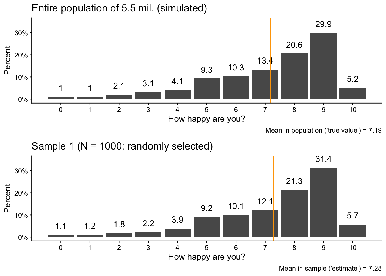
Now we pretend that we are doing a social science survey by taking a random sample of 1000 “respondents” from the population with slice_sample(). Here again, we set a seed number so that we get the same results every time.
set.seed(42)sam1 <- pop |>slice_sample(n =1000)
If you take a look at your Environment tab, you see the sample data as sam1: 1000 random picks from the “population” (pop) and their levels of happiness.
Then we also calculate the average level of happiness in the sample and visualize the sample data:
We can also use ggarrange() from the ggpubr package to directly compare the sample and population data:
ggpubr::ggarrange(popvis,sam1vis, nrow =2)
If you take a careful look, you see that the overall pattern is the same, but there are small variations in the percentages and in the average value.
2.3 Taking a second sample
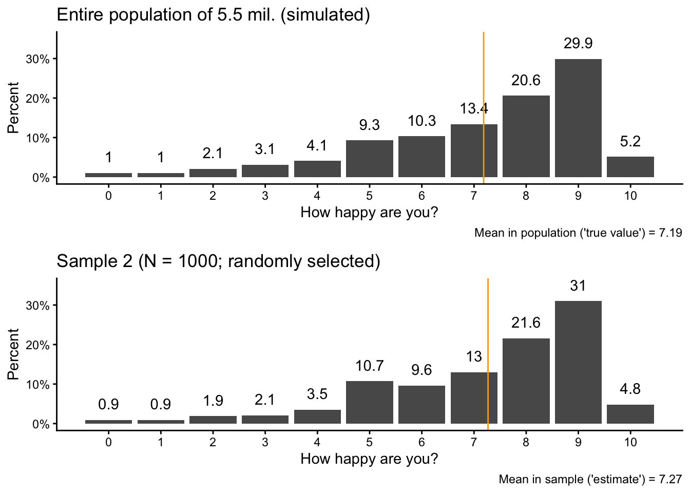
Let’s now take a second sample. Here, we specicy a different seed number so that we don’t get the same result again (but so that the entire analysis is still reproducible):
set.seed(17)sam2 <- pop |>slice_sample(n =1000)
Then we again calculate the sample mean in the second sample and visualize the new sample data next to the original population data:
You should see again that there are small differences between the sample and the population, but the overall patterns are very similar.
2.4 Comparing the samples
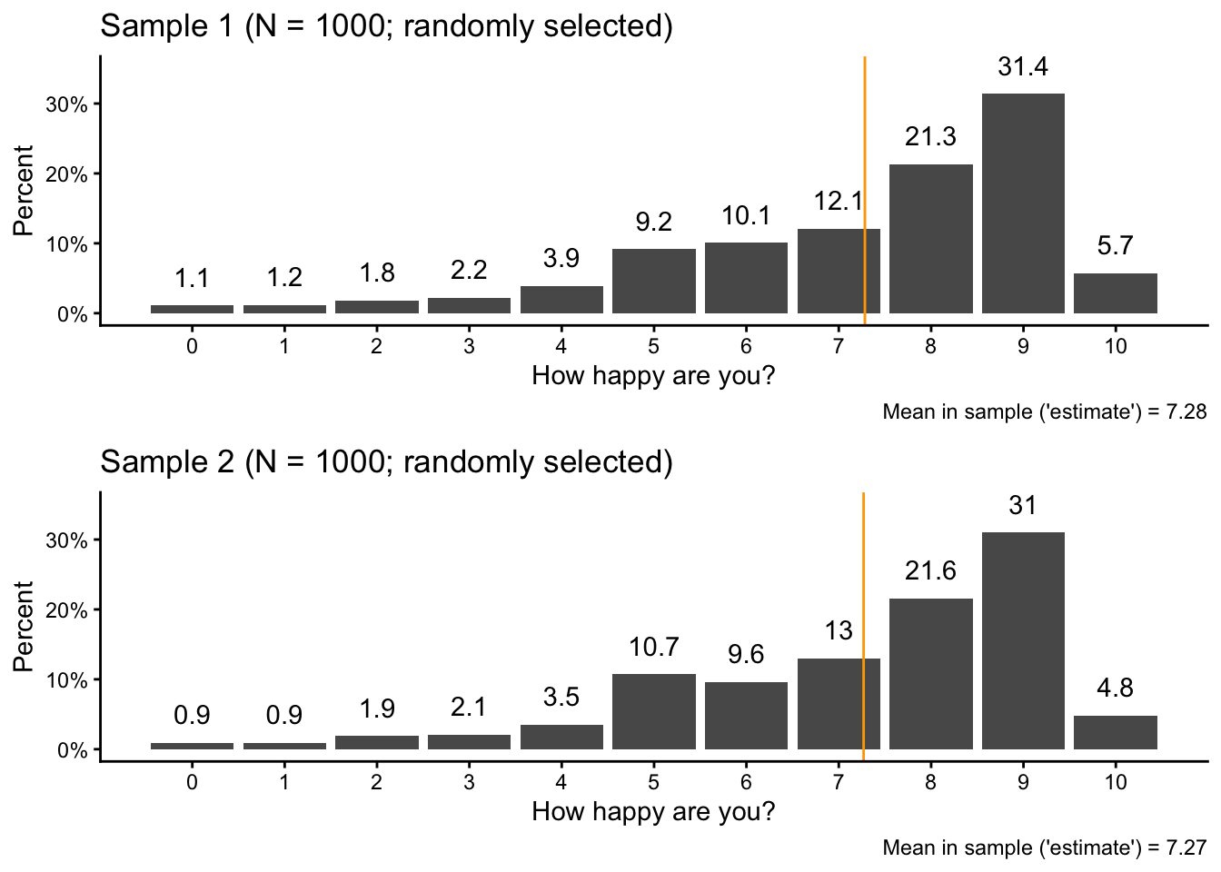
You can see these small differences also when we compare the two samples directly with each other:
ggpubr::ggarrange(sam1vis,sam2vis, nrow =2)
2.5 Scaling it up to 1000 samples
So far, we took only two random samples with 1000 observations (“respondents”) per sample. In a real-life scenario, this is about as much as we could realistically do.
Within this simulation, however, we can use R to take many, many samples from our “population” (almost) simultaneously and then see how the main statistic we are interested in, the sample average, varies between the different samples.
To do this, we first create a data.frame in which we later save the different simulation results: a dataset of results. We call this sampdist:
This dataset includes two variables, one is sample which simply tells us the number of each sample from 1 to 1000. The other variable (called result) stores the average happiness value from each sample. To create the results variable, we start with the first two sample means and then add 998 NA values to get a total of 1000.
Next, we use a loop to simulate 1000 samples. A loop is a fundamental concept in programming (also outside of R). It is, very simply put, an instruction to the computer to repeat a certain operation a certain number of times, one after the other.
In R, you can specify loops with the for() function, as shown below. What we are tell R with this code is, translated to human language:
For all values of k, which we define to be the numbers between 3 and 1000…
…go the pop dataset, draw a random sample from it, and store that sample as loopsam…
…calculate the mean of the happy variable in that sample…
…and then write the result, the mean of sample k, into the k-th row and the second column of our results dataset.
Notice that we put the code after the for() function within curly braces ({}) to show R that this all fits together and belows to the loop. We start at 3 because we already have values for the first two rows of the results dataset.
Be aware: Loops are not very efficient and this calculation can take a few moments.
for(k in3:1000) { loopsam <- pop |>slice_sample(n =1000) sampdist[k,2] <-mean(loopsam$happy)}
Let’s have a look at the first few observations in our results dataset:
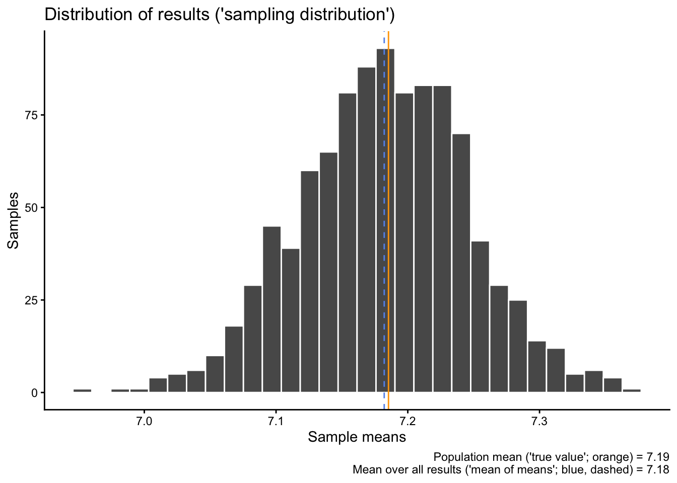
What you see here is the first 6 samples and their sample means. The first two are the same as above, and the other four were generated by the loop. You also see, and this is important, that the sample means vary slightly, but they are typically somewhere around 7.2.
Let’s now calculate the average over all of these averages – the “average result” – and compare that to the “true” population mean from earlier:
sampdistmean <-mean(sampdist$result)sampdistmean
[1] 7.182107
popmean
[1] 7.185346
The average result – the “mean of all means” – is 7.18.
Then we can also visualize the distribution of all our different test results together with the “true” population mean from earlier and the average result:
sampdist |>ggplot(aes(x = result)) +geom_histogram(color ="white") +geom_vline(xintercept = sampdistmean, color ="cornflowerblue", linetype ="dashed") +geom_vline(xintercept = popmean, color ="orange") +labs(x ="Sample means", y ="Samples",title ="Distribution of results ('sampling distribution')",caption =paste0("Population mean ('true value'; orange) = ",round(popmean, digits =2),"\n Mean over all results ('mean of means'; blue, dashed) = ",round(sampdistmean, digits =2)))
`stat_bin()` using `bins = 30`. Pick better value `binwidth`.
Do you notice something here? What does this distribution remind you of, and why do you think do we get this shape (especially since the original distribution does not at all look like that? If you can answer this question, you have understood the main idea behind the Central Limit Theorem).
2.6 Then we do 10’000 surveys
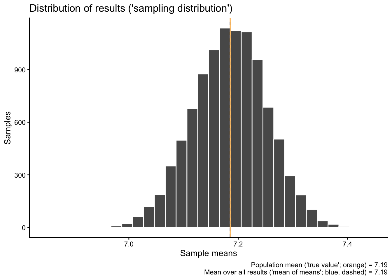
1000 simulated results are nice, but we can also go higher, let’s say to 10’000. To do that, we create a new results data.frame (which we save under the same name as before), but now with 10’000 rows instead of 1000:
Once we have that, we again run a loop, but from numbers 3 to 10’000. Caution, this now takes a bit longer still:
for(k in3:10000) { loopsam <- pop |>slice_sample(n =1000) sampdist[k,2] <-mean(loopsam$happy)}
Let’s have a look at new “mean of means” of the 10’000 new samples and compare it to the overall population mean:
sampdistmean <-mean(sampdist$result)sampdistmean
[1] 7.185184
popmean
[1] 7.185346
Notice how they are very close to each other, but still not exactly identical?
Then we also visualize the new distribution of all 10’000 sample means:
sampdist |>ggplot(aes(x = result)) +geom_histogram(color ="white") +geom_vline(xintercept = sampdistmean, color ="cornflowerblue", linetype ="dashed") +geom_vline(xintercept = popmean, color ="orange") +labs(x ="Sample means", y ="Samples",title ="Distribution of results ('sampling distribution')",caption =paste0("Population mean ('true value'; orange) = ",round(popmean, digits =2),"\n Mean over all results ('mean of means'; blue, dashed) = ",round(sampdistmean, digits =2)))
`stat_bin()` using `bins = 30`. Pick better value `binwidth`.
Do you notice what changed compared to the 1000 results earlier? Why would that be?
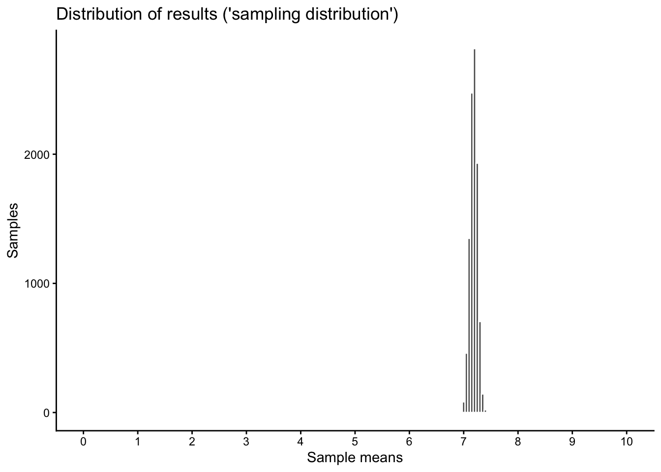
2.7 The results in context
You might now get the impression that there is quite a bit of variation between the different samples, that the result “jumps” quite a bit between different repetitions of our fictional survey. However, notice also that the scale of the above graph only covers a small part of the entire scale of our original happiness variable, which goes from 0 to 10.
To show the “sampling variation”, the random differences between our 10’000 samples, in context, we expand the scale of our x-axis to the true scale of the original variable with the limits option in the code below:
Warning: Removed 2 rows containing missing values or values outside the scale range
(`geom_bar()`).
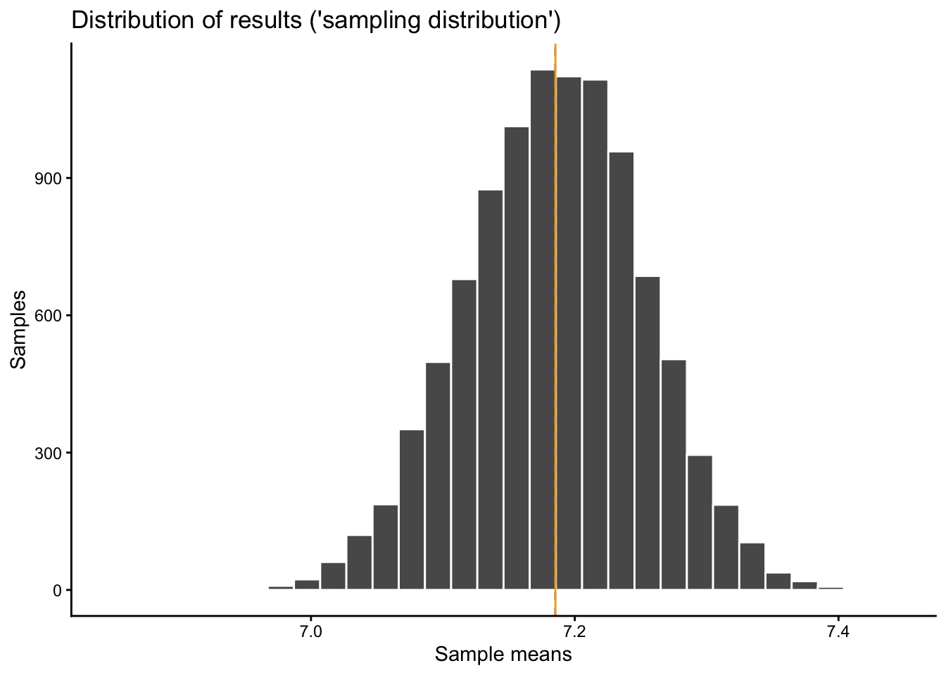
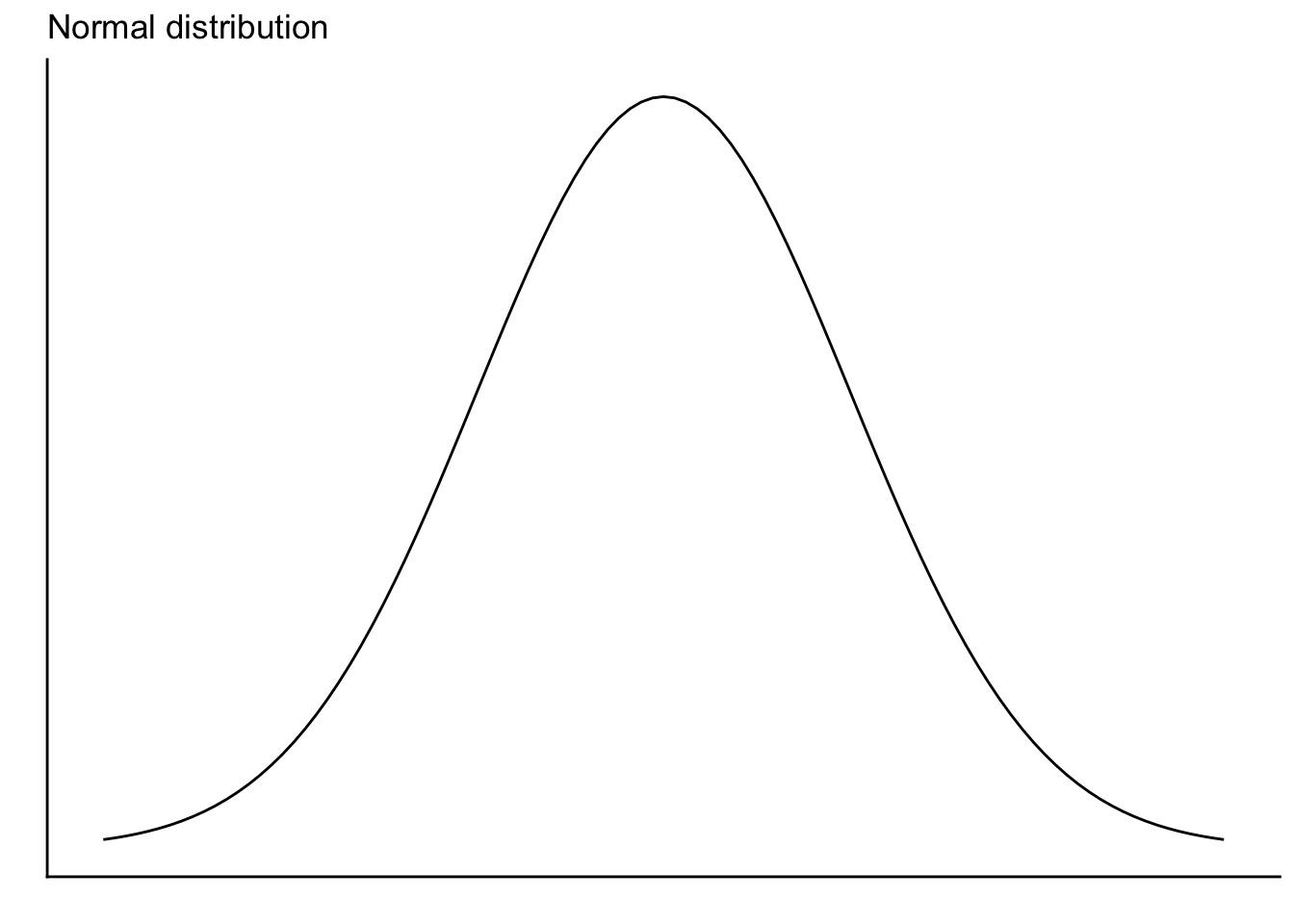
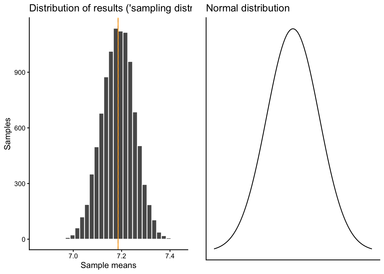
2.8 Comparing our results distribution (“sampling distribution”) to the Normal distribution
You might (should) have already noticed what how our different “survey” results are distributed, but just to make sure: Here is a comparison of our sampling distribution to the normal distribution:
sampdist |>ggplot(aes(x = result)) +geom_histogram(color ="white") +geom_vline(xintercept = sampdistmean, color ="cornflowerblue", linetype ="dashed") +geom_vline(xintercept = popmean, color ="orange") +labs(x ="Sample means", y ="Samples",title ="Distribution of results ('sampling distribution')") -> samdist10ksamdist10k
`stat_bin()` using `bins = 30`. Pick better value `binwidth`.
`stat_bin()` using `bins = 30`. Pick better value `binwidth`.
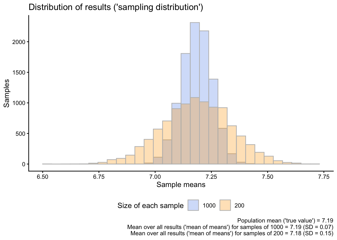
2.9 Now 10’000 new samples, but with a smaller sample size (200 instead of 1’000)
In the previous simulations, we always worked with a sample size of 1000. First, we took 1000 samples of 1000 “respondents” each, then we took 10’000 samples of 1000 respondents.
Let’s see what happens when we take 10’000 new samples, but now with a size of 200 “respondents” per sample:
The new “mean of means”, now based on 200 “respondents” per sample, is still very close to the “true” population mean.
To see what changes when we use smaller samples, we show both sampling distributions, the one for the samples with \(N = 1000\) and the new one for the samples with \(N = 200\), in the same graph. We also calculate the standard deviation of each of the distributions:
sampdist_SD <-sd(sampdist$result)sampdist_200_SD <-sd(sampdist_200$result)sampdist |>left_join(sampdist_200, by ="sample",suffix =c("1000","200")) |>pivot_longer(cols =-1,names_to ="size",values_to ="meanval") |>mutate(size =gsub("result","",size)) |>ggplot(aes(x = meanval,fill = size)) +geom_histogram(alpha=0.3, position="identity", color ="grey") +scale_fill_manual(values =c("cornflowerblue","orange")) +labs(x ="Sample means", y ="Samples",fill ="Size of each sample",title ="Distribution of results ('sampling distribution')",caption =paste0("Population mean ('true value') = ",round(popmean, digits =2),"\n Mean over all results ('mean of means') for samples of 1000 = ",round(sampdistmean, digits =2)," (SD = ",round(sampdist_SD, digits =2),")","\n Mean over all results ('mean of means') for samples of 200 = ",round(sampdist_200mean, digits =2)," (SD = ",round(sampdist_200_SD, digits =2),")")) +theme(legend.position ="bottom")
`stat_bin()` using `bins = 30`. Pick better value `binwidth`.
Figure 1: The variability of results when using different sample sizes
Do you notice where the main difference is between the sampling distribution based on \(N = 1000\) and the one based on \(N = 200\)?
If you had to design a social survey to measure happiness (or something else) in the Norwegian population, how could you use the results of this simulation to guide your study design?
3 How can we use this to say something about how confident we can be about our sample data?
The previous simulations illustrated a few important things about taking random samples from a population:
If you repeatedly take many, many random samples from a population and calculate the average value of some variable in each sample, then each sample will give you a different result.
All taken together, however, the different sample means are distributed normally around the true population mean: Some sample means are a little bit lower than the true population mean, some are a bit higher, but there are about as many higher ones than lower ones (the distribution is symmetric).
The average result — the average over all sample means — will be very close to the true population mean. If you would take an infinite number of samples, the average result would be identical to the true mean.
Sample means are most likely to be close to the true mean. It can happen that individual samples are far off target, but this is rare.
The larger the individual samples, the closer the individual sample means are to the true mean (see also Figure 1). Smaller samples are more “wiggly”, meaning that the individual means vary more strongly around the true population mean.
In a real-life survey study, we only ever work with a single sample, but we can use what we learned to say something about the results we get from that single sample. That is the foundation of inferential statistics.
3.1 Quantifying the variation between samples
In Figure 1, we used the standard deviation (SD) to quantify the spread or variability in our results. The main result was that there is less variability in results based on larger compared to smaller samples.
Just to reiterate what we did there, we calculate the standard deviations again:
# SD for sample means based on N=1000sd(sampdist$result)
[1] 0.06754951
# SD f or sample means based on N=200sd(sampdist_200$result)
[1] 0.1522054
This means that the “typical” result based on a sample size of \(N=1000\) is on average ca. 0.7 units away from the true population mean, while the typical result based on a sample size of \(N=200\) is on average ca. 0.15 units away from the true population mean. In other words, larger samples are less “wiggly” than smaller samples. In yet other words, increasing the sample size from 200 to 1000 cuts the “wiggliness” of our results in half.
These standard deviations of our sample means are also called standard errors. They quantify the extent to which our sample results vary by random chance across different repetitions of our survey. Again: Smaller sample size = more random variation, larger sample size = less random variation.
3.2 Calculating the standard error based on a single sample
In a real-life scenario, we cannot take repeated samples from a population — but we can still figure out what the standard error or the random variation in results would hypothetically be if we could draw many repeated samples using a simple formula.
As explained in Solbakken (2019, 5.7), the formula to calculate the standard error of a sample mean is:
\[ SE = \frac{SD}{\sqrt{N}}\] In human language, we calculate the sample standard deviation (SD) of whatever variable we are interested in, and then divide that by the square root of the sample size (\(N\)).
Let’s see if this works in our case. We go back to our very first sample (sam1), which included 1000 randomly drawn observations from the overall population.
We first calculate the standard deviation of the happy variable (the variable we are interested in):
sd_1000 <-sd(sam1$happy)
Then we divide the result by the square root of the sample size (1000):
se_1000 <- sd_1000/sqrt(1000)se_1000
[1] 0.06707764
The result is almost the same as the standard error we got based on the simulation above.
Let’s see what happens if we instead use a sample size of \(N=200\). To do that, we draw a single random sample of 200 observations from the population and repeat the calculation:
Again, we are very close to the value that we got from our simulation.
3.3 Margins of errors
The standard error basically tells us how far away the average or “typical” result is from the true population mean based on a given sample size.
That is useful, but we often want to be more certain or “confident”. We want to be able to confidently say that most results, say, 90 or 95% of all possible results, are within a certain range.
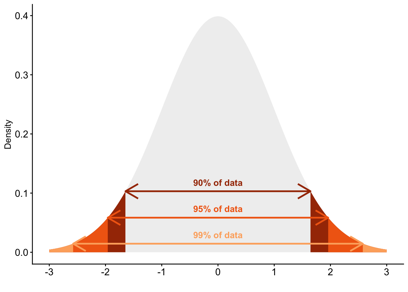
We can also do that. To do that, we use the fact that all sampling distributions — the distributions of many different sample results — based on random samples are approximately normal or “bell-shaped”, and that (thanks to Carl Gauss) we can exactly quantify how many observations of any normal distribution fall within a given range.
90% of all observations fall within a range of \(+1.645 \times SD\) and \(-1.645 \times SD\) around the mean
95% of all observations fall within a range of \(+1.96 \times SD\) and \(-1.96 \times SD\) around the mean
99% of all observations fall within a range of \(+2.576 \times SD\) and \(-2.576 \times SD\) around the mean
Figure 2: Standard normal distribution with critical values indicated
If we now combine this with the results of our calculation and simulation above, then we can construct so called margins of errors: They tell us, simply put, how certain or uncertain our result is.
Let’s illustrate this with the first sample of 1000 observations. We know based on the calculation and simulation above that the standard error (the SD of our sampling distribution) for a sample size of \(N=1000\) is roughly 0.07. We also know that, if we would repeat our survey many times over, 95% of all those hypothetical surveys will fall within +1.96 and -1.96 times this standard deviation of 0.07.
This means that the 95% margin of error for our first sample is therefore:
1.96*se_1000
[1] 0.1314722
In detail, this means that if we would repeat our survey 100 times, then 95 of those surveys would produce a sample average that is within [+0.13;-0.13] from the true population mean.
We can use the same procedure to calculate the 95% margin of error for the smaller sample with \(N=200\):
1.96*se_200
[1] 0.2964228
You see that the margin of error for the smaller sample is a bit more than twice that of the one for the larger sample. This means that if we would re-do our smaller survey with an \(N\) of 200, then 95% of all sample means would be in a range of [0.3;-0.3] from the true population mean. Clearly, larger samples are more accurate, and with margins of errors we can quantify exactly how (in-)accurate a sample of a given size is.
3.4 Confidence intervals
We can then extend this logic further to construct an interval that (most likely) contains the true population value. To do that, we simply take the sample mean and then add and subtract the margin of error. For example, for a 95% confidence interval, we use the values of the standard normal distribution that include 95% of that distribution (\(\pm1.96\)), multiply these with the standard error, and combine that with the sample mean (\(\bar{X}\)): \[
CI_{95} = \bar{X} \pm 1.96 \times SE
\]
For our large sample, this calculation looks as follows:
Just to make sure, we compare our calculation with the one we can get with t.test():
t.test(sam1$happy)
    One Sample t-test

data:  sam1$happy
t = 108.58, df = 999, p-value < 2.2e-16
alternative hypothesis: true mean is not equal to 0
95 percent confidence interval:
 7.151371 7.414629
sample estimates:
mean of x
    7.283
    One Sample t-test

data:  singsam_200$happy
t = 48.137, df = 199, p-value < 2.2e-16
alternative hypothesis: true mean is not equal to 0
95 percent confidence interval:
 6.981769 7.578231
sample estimates:
mean of x
     7.28
Once, again, the results are almost identical.
The differences between the larger and smaller sample are easier to see if we visualize the two results together:
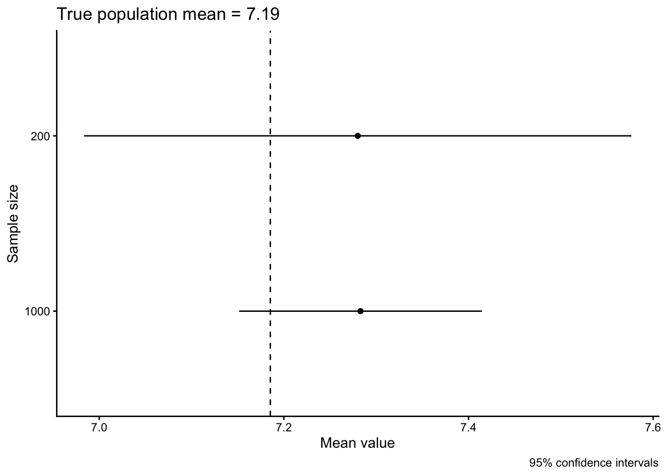
data.frame(sample =c("1000","200"),means =c(sam1mean,sam200_mean),lower =c(lower_1000,lower_200),upper =c(upper_1000,upper_200)) |>ggplot(aes(x = means, xmin = lower, xmax = upper, y = sample)) +geom_point() +geom_linerange() +geom_vline(xintercept = popmean, linetype ="dashed") +labs(x ="Mean value", y ="Sample size",caption ="95% confidence intervals",title =paste0("True population mean = ",round(popmean, digits =2)))
In this case, both of our confidence intervals include the true population mean and you see again how the larger sample has a smaller confidence interval.
3.5 How to read a confidence interval
If after all this simulating and math-ing your head is spinning wildly, you are definitely not alone or the first to experience this. Confidence intervals and margins of error are tricky and even “senior” researchers misunderstand how they work and what they really indicate (see e.g., Greenland et al. 2016; Belia et al. 2005; Austin and Hux 2002; Schenker and Gentleman 2001).
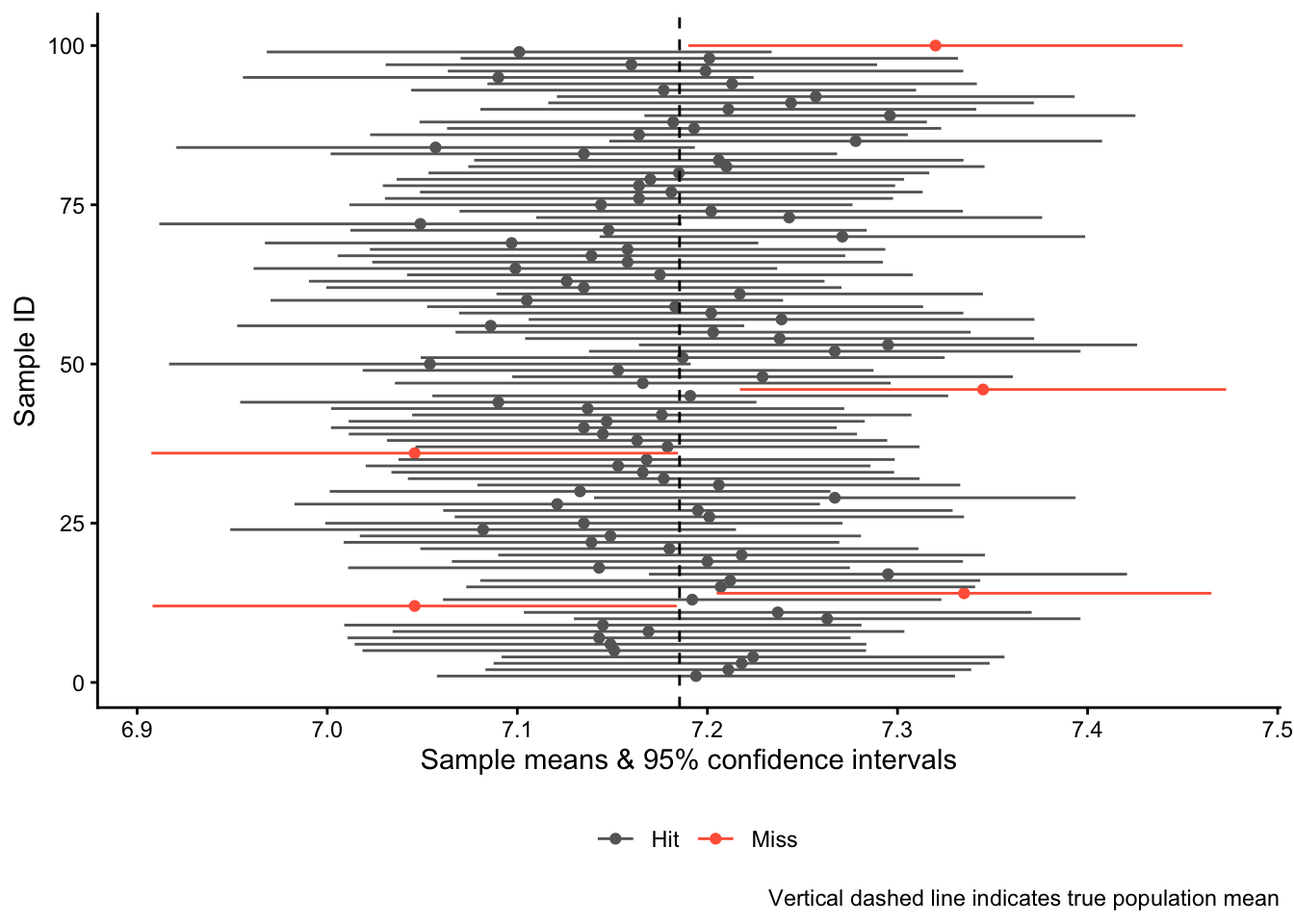
We can, however, again use simulations to clarify how to read a confidence interval. We start again from our original population and then draw 100 random samples of \(N=1000\) observations per sample. For each of the samples, we calculate the sample mean of the happy variable and a 95% confidence interval around it. Then we visualize all results together with the true population mean.
First, we create an empty data.frame to store the different results into:
  sample_id sample_means sample_lower sample_upper
1         1           NA           NA           NA
2         2           NA           NA           NA
3         3           NA           NA           NA
4         4           NA           NA           NA
5         5           NA           NA           NA
6         6           NA           NA           NA
Then we run a loop, as above, and calculate both the sample means and the confidence intervals from each sample and add them to the results data.frame:
set.seed(20)for(k in1:100){ pop |>slice_sample(n =1000) -> loopsamcidata[k,2] <-mean(loopsam$happy) # store the sample mean into the second column# Calculate CIloopci <-t.test(loopsam$happy)cidata[k,3] <- loopci$conf.int[1] # lower valuecidata[k,4] <- loopci$conf.int[2] # upper value}
Now we visualize the results, highlighting the confidence intervals that that were “misses” in red:
cidata |>ggplot(aes(x = sample_means, xmin = sample_lower,xmax = sample_upper, color = overlap,y = sample_id)) +geom_point() +geom_linerange() +geom_vline(xintercept = popmean, linetype ="dashed") +scale_color_manual(values =c("grey40","tomato")) +labs(x ="Sample means & 95% confidence intervals",y ="Sample ID", color ="",caption ="Vertical dashed line indicates true population mean") +theme(legend.position ="bottom")
You see that in 95 out of the 100 “studies” we did, the 95% confidence interval “hit” the mark and overlaps with the true population mean. In five cases, however, we were unlucky and “missed”: The confidence intervals do not overlap with the true population mean.
And this leads to one correct interpretation of a confidence interval: If we were to re-do our study many, many times, then in 95% of these studies, the 95% confidence interval would overlap with the true population mean.
This interpretation, however, is a bit clunky and not that helpful in practice. To get to a second and perhaps more helpful interpretation, we go back to the confidence interval for the very first sample we took from the population:
t.test(sam1$happy)
    One Sample t-test

data:  sam1$happy
t = 108.58, df = 999, p-value < 2.2e-16
alternative hypothesis: true mean is not equal to 0
95 percent confidence interval:
 7.151371 7.414629
sample estimates:
mean of x
    7.283
This is also what a real-life result would look like: We have one single sample, one single sample mean, and one single confidence interval. In this case, this interval ranges from 7.15 to 7.41.
But we also know now that this one confidence interval is one of many different possible confidence intervals that we could have gotten — and we know that each of these infinite hypothetical intervals has a 95% chance of including the true population mean. This means that our confidence interval from 7.15 to 7.41 has a 95% chance of including the true population mean. A less precise interpretation is that we are 95% confident that we have “captured” the true population mean with our confidence interval (see Kellstedt and Whitten 2018, 153).
Austin, Peter C., and Janet E. Hux. 2002. “A Brief Note on Overlapping Confidence Intervals.”Journal of Vascular Surgery 36 (1): 194–95.
Belia, Sarah, Fiona Fidler, Jennifer Williams, and Geoff Cumming. 2005. “Researchers Misunderstand Confidence Intervals and Standard Error Bars.”Psychological Methods 10 (4): 389–96.
Greenland, Sander, Stephen J Senn, Kenneth J Rothman, et al. 2016. “Statistical Tests, P Values, Confidence Intervals, and Power: A Guide to Misinterpretations.”European Journal of Epidemiology 31 (4): 337–50.
Kellstedt, Paul M, and Guy D Whitten. 2018. The Fundamentals of Political Science Research. Cambridge University Press.
Schenker, Nathaniel, and Jane F Gentleman. 2001. “On Judging the Significance of Differences by Examining the Overlap Between Confidence Intervals.”The American Statistician 55 (3): 182–86.
Solbakken, Simen Sørbøe. 2019. Statistikk for Nybegynnere. Fagbokforlaget.
The slight difference is because R uses a different type of distribution, the t distribution, which takes into account how many observations we really have in each of the two samples. The procedure we use here, which is based on the standard normal distribution, simply assumes that we have a “large” sample. In applied research, we usually (but not always) use the t-distribution.↩︎